Channel Deep Dive
Understand revenue contribution trends and investigate spending patterns for a Channel or Tactic
The Channel Deep Dive tab provides a granular view of an individual marketing channel's or tactic's performance within your Marketing Mix Model. Use this page to understand how a channel contributes to the model's output KPI — typically Revenue, orders, or Installs — to analyze its spend efficiency, detect anomalies, and discover optimization opportunities.
Accessing the Channel Deep Dive
You can navigate to the Channel Deep Dive for a specific channel in two ways:
- Through Model Insights tab: In the Contribution table, simply click on the name of any channel or tactic. You will be taken directly to the deep dive page for that selection.
- Direct Filtering: Navigate to the Channel Deepdive tab and and select the channel you wish to analyze.
View interactive demo
View a step-by-step walkthroughUse the interactive demo below to guide you through each element of the insights tab
Key Metrics
This section provides a quick snapshot of the channel's aggregate performance over the selected timeframe of data
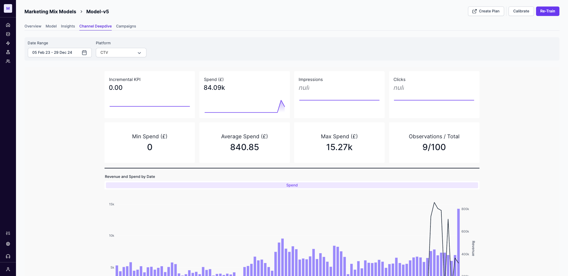
- Incremental Output KPI: The total incremental impact (e.g., Revenue, Orders, Installs) attributed to Channel or Tactic by the model.
- Spend: The total amount spent on the channel during the selected period.
- Impressions & Clicks: The total volume of impressions and clicks registered for this channel.
- Observations/Total: The total number of observations (e.g., days or weeks) for this channel in the model.
- Spend Range: The minimum, maximum, and average spend recorded for a single data point within the timeframe.
Revenue and Spend Trend Analysis
This chart displays the relationship between your spend on the selected Channel and the attributed output KPI over time. It allows you to visualize trends, seasonality, and the immediate impact of spending changes on performance.
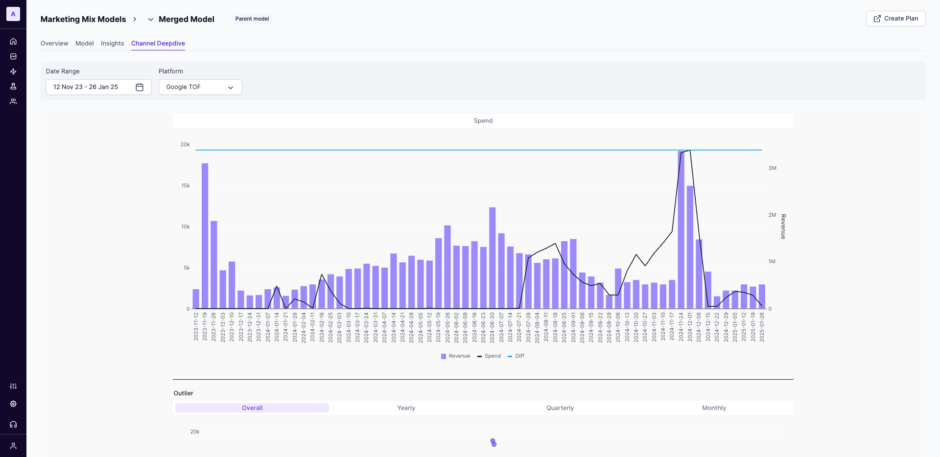
Use this chart to see if peaks in your spending correspond with peaks in your output KPI.
Outlier Detection
The Outliers table automatically flags data points where spending was unusually high or low compared to the channel's typical behavior. This helps you quickly identify and investigate potential data errors or significant one-off events.
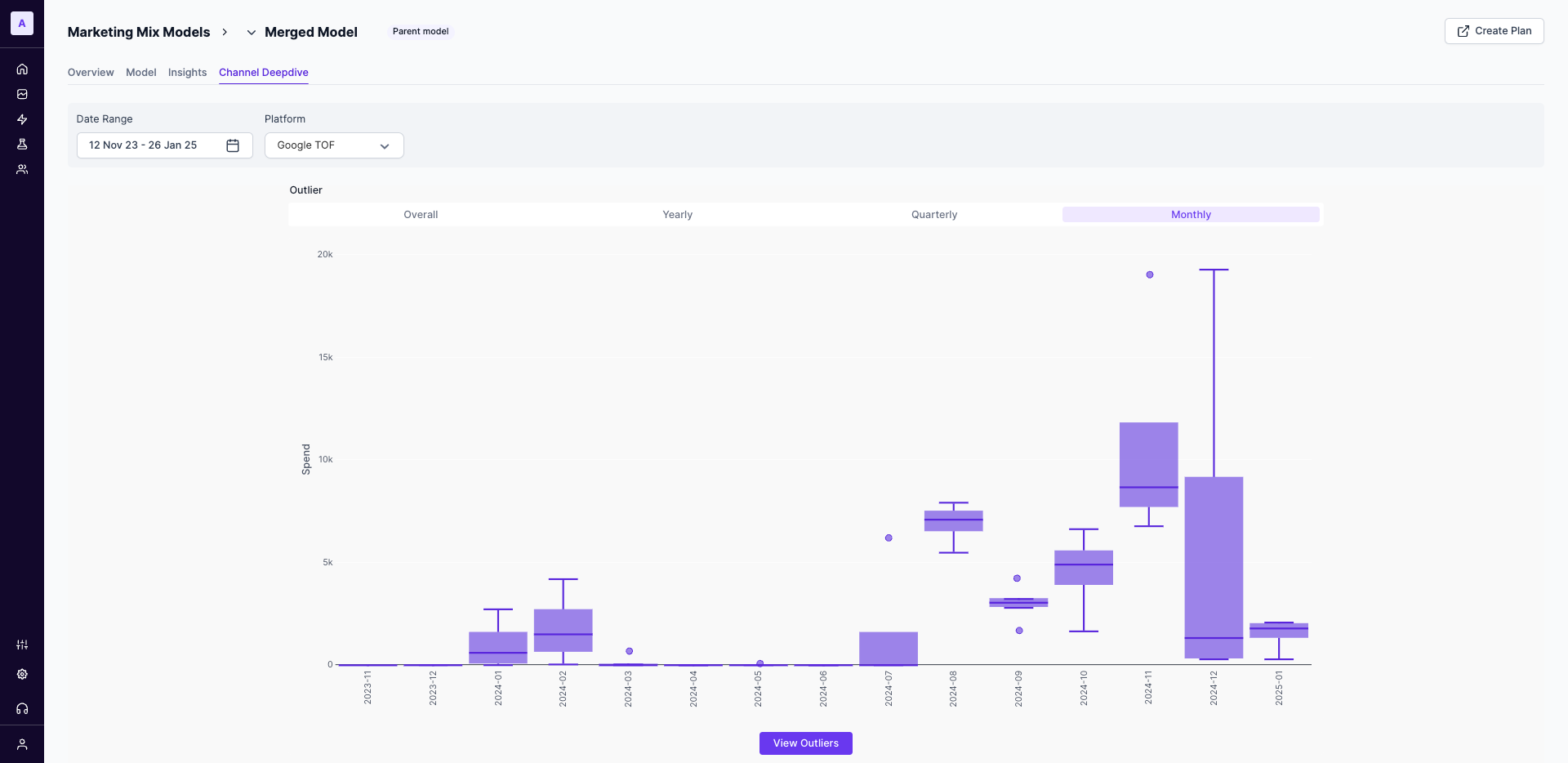
How Outliers are Calculated
A data point is flagged as an outlier if its spend is 1.5 times greater than the Interquartile Range (IQR) of the channel's spend for the selected period. This statistical measure helps to reliably identify significant deviations from the norm.
Spend vs. Shifted Revenue
This chart is a powerful tool for understanding the efficiency and saturation point of your channel's spend. It groups your spending into buckets and shows the resulting revenue and frequency for each.
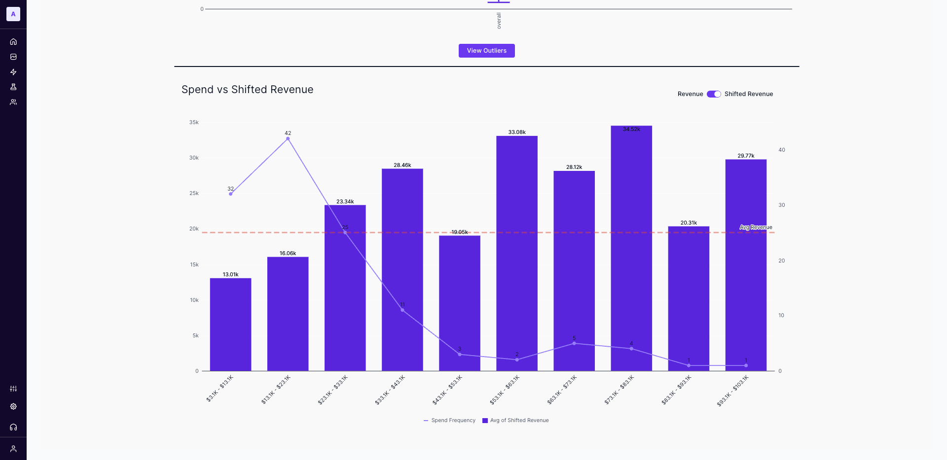
How to Interpret this Chart:
- X-Axis (Spend Buckets): Your historical spending is grouped into ranges (e.g.,
$10.7K - $22.3K). - Bars (Shifted Revenue): The height of each bar shows the average revenue generated when your spend fell within that specific bucket.
- Line (Spend Frequency): The line graph indicates how many times (i.e., data points) your spend has fallen into each bucket. This shows you where you most frequently operate.
- Dashed Line (Avg. Revenue): This line represents the average revenue across all spend levels, providing a clear benchmark to assess the performance of each spend bucket.
Your goal is to find the "sweet spot": a spend bucket that delivers a high revenue and can be achieved with reasonable frequency.
Updated 12 months ago