Insights
Understand baseline revenue, channel contribution and profit insights from your Mix Model
The Insights tab is designed to help you analyse and understand the performance of your marketing activities. It provides a detailed breakdown of your marketing spend, the revenue it generates, and the overall effectiveness of your marketing strategies.
View a step-by-step walkthroughUse the interactive demo below to guide you through each element of the insights tab
Key Filters in the Insights Tab:
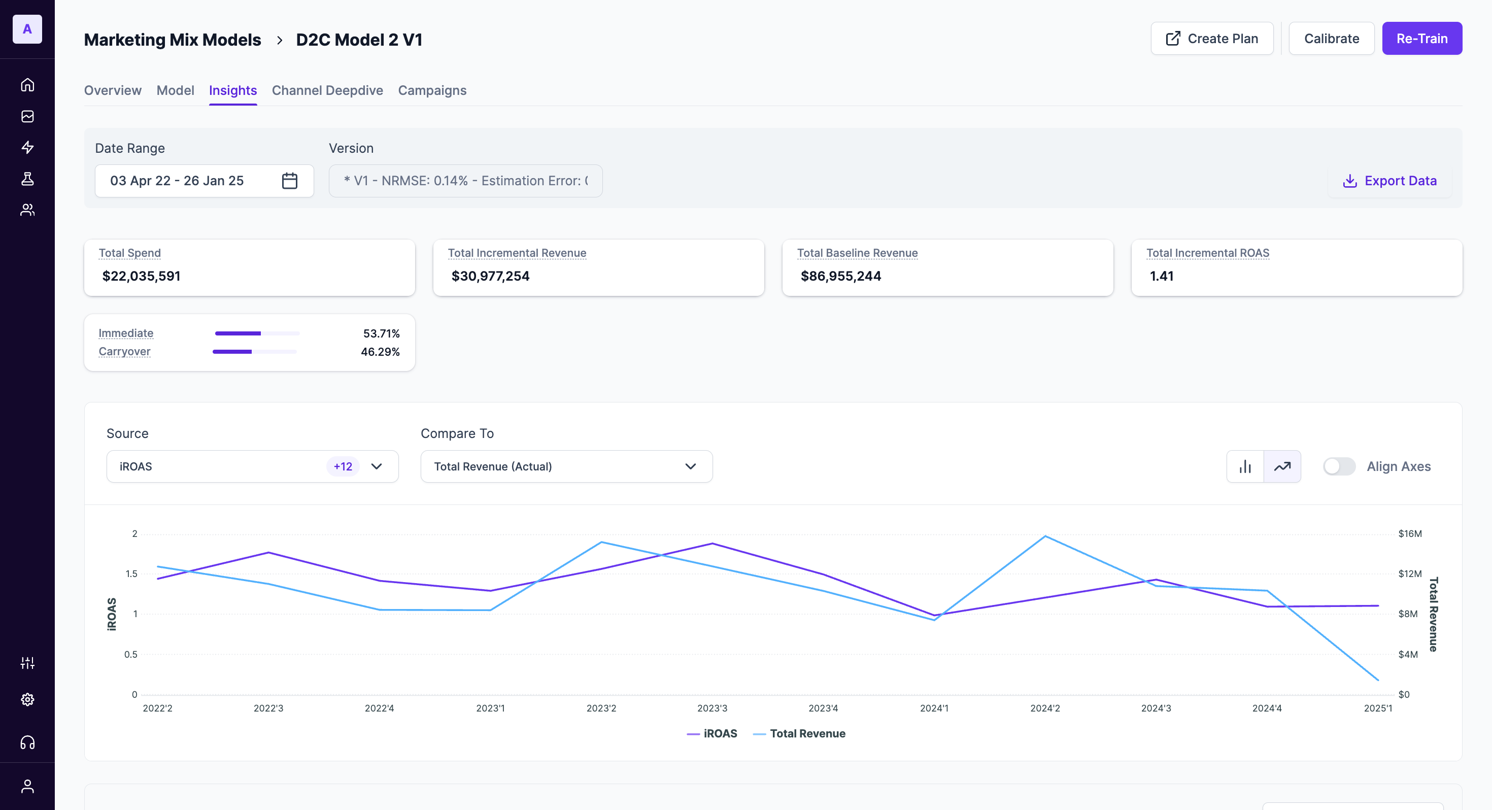
Date Range: This field allows you to select the specific period you want to analyse. Adjusting the date range can help you focus on particular time frames of interest.Version: Here, you can see the version of the model currently in use, along with important performance metrics like NRMSE (measures prediction accuracy on model input data) and estimation Error (Measures backtesting prediction error on unseen data). These metrics ensure you’re working with a reliable model.
Key Metrics Overview
Total Spend: Represents the total amount of money invested in marketing across all channels during the selected timeframe. It represents your overall marketing budget expenditure.Total Incremental Revenue: This metric showcases the additional revenue generated as a direct result of your marketing efforts during the selected timeframe. It isolates the revenue increase attributable to marketing activities, excluding any baseline revenue that would have been generated regardless.Total Baseline Revenue: This metric represents the estimated revenue your business would have earned during the selected timeframe without any marketing efforts. It serves as a benchmark to assess the incremental revenue generated by your marketing campaigns.Total Incremental ROAS: Measures the revenue generated specifically from the additional orders due to marketing efforts. This metric isolates the return on investment specifically for the additional revenue generated by your marketing activities.A higher total incremental ROAS indicates that more revenue is being generated per dollar spent on incremental orders.
Total Incremental ROAS = Total Incremental revenue / Total SpendImmediate vs Carryover: This metric represents the percentage split of your ad spend between Immediate & Carryover. The Immediate value represents the percentage of total spend that resulted in an immediate impact. A higher value indicates quicker returns from ad spend. Whereas the Carryover value represents the percentage of total spend that contributes to long-term effects over time. A higher value suggests sustained impact beyond the initial period.
Metric Comparison Chart
The Metric Comparison Chart is a powerful visualization tool that allows you to plot and compare any two key metrics from your MMM model on a single timeline. This flexibility is crucial for uncovering deeper insights and understanding the complex relationships between different aspects of your marketing performance. Instead of viewing metrics in isolation, you can now directly analyze how one metric influences another over time.
For instance, you can now answer critical strategic questions like:
- How did my
iROASchange when I increased myTotal Spendlast quarter? - Is there a direct correlation between the
Incremental Revenuefrom marketing and theTotal Revenueof the business? - How does the performance of a specific channel like Google compare against my overall
Total Revenue?
To get started, simply select your primary metric from the Source dropdown and a second metric from the Compare To dropdown.
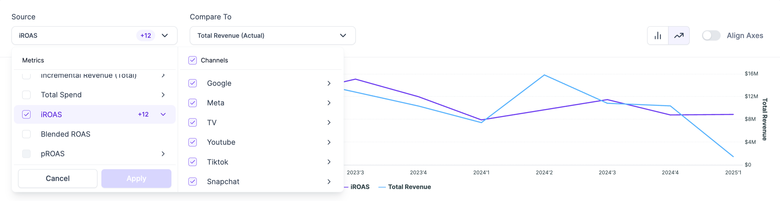
Dynamic Filtering for Granular Analysis
To help you drill down into specific areas of your marketing, the chart offers granular filtering. When you select a metric like iROAS, you can choose to view it for all your activities combined, or you can isolate specific Channels (e.g., Google, Meta, Tiktok) and even Platforms/ Tactics within those channels (e.g., Google BOF, Google MOF). You can even drill down to Organic & Contextual variables that were fed in the model.
This allows for highly specific comparisons, such as analyzing the iROAS for your Google Brand campaigns against your overall Total Spend.
Available Metrics for Comparison
You can compare any two of the following core metrics to customize your analysis:
Baseline RevenueTotal Revenue (Actual)Incremental Revenue (Total)Total SpendiROASBlended ROASpROAS
Contribution Breakdown
This section provides a detailed breakdown of how different aspects of your marketing strategy are contributing to your business KPIs (Revenue, Orders) and the profits insights for each channel.
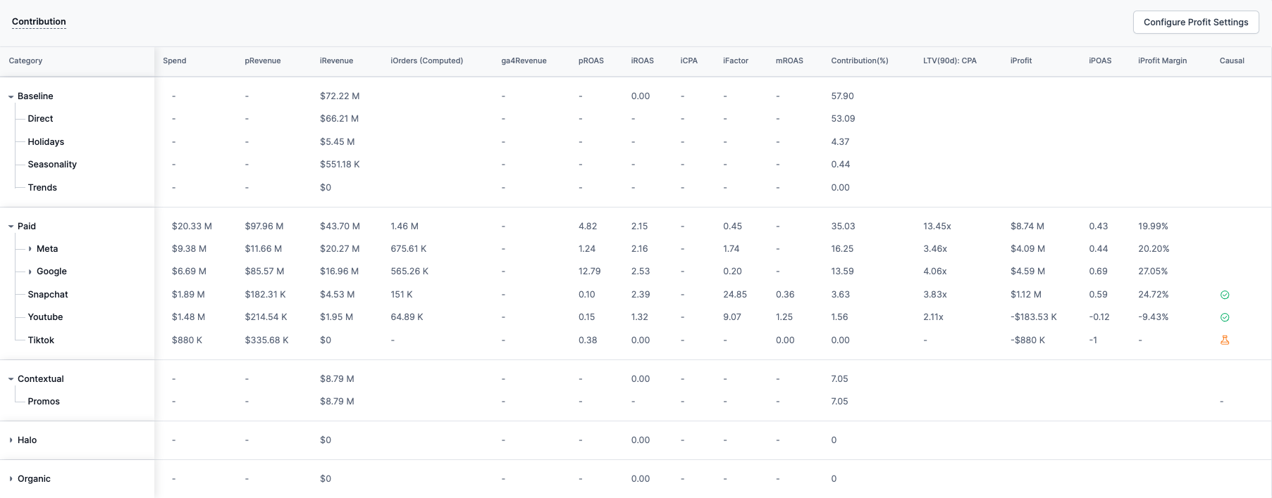
Category: This column lists the various categories of marketing efforts. Each category can be expanded to show more detailed data, such as specific channels within that category. Categories include:
-Paid
-Contextual
-Organic
-BaselineSpend: View the total spend associated with each channel. The amounts are shown in the local currency ($), which represents the total expenditure on that particular category. If there is no expenditure in a category, it is indicated with a dash (-). Currency can be changed while creating a model in the Configuration (step 3 of model creation)Revenue: The total revenue generated from each channel. For categories that do not directly generate revenue (like Baseline), this value may be negative or zero.- pRevenue - Platform Revenue is fetched from the ad platform itself to view the reported platform metrics. Most platform reports usually under or over-value conversion KPIs.
- iRevenue - The incremental revenue is calculated by the MMM model. This helps understand the additional revenue contributed solely by a specific marketing channel.
ROAS: Return on Ad Spend is a key metric used to measure the effectiveness of advertising campaigns. It calculates the revenue generated for every dollar spent on ads. A higher ROAS indicates a more efficient campaign, as more revenue is generated per advertising dollar.- pROAS - Platform ROAS is fetched from the ad platform. Most platform reports usually under or over-value ROAS metrics.
- iROAS - Incremental Return on Ad Spend shows the incremental return on ad spend for each channel. This metric is calculated as the ratio of incremental revenue to the ad spend. A value greater than 1 indicates a positive return, while a value of 0 or close to 0 indicates no return on the ad spend.
- mROAS - Marginal Return on Advertising Spend measures the additional revenue generated for every extra dollar spent on a particular marketing channel. The higher the mROAS the better, however, it's important to balance mROAS with overall business goals and profitability, as extremely high mROAS might indicate under-investment in that channel.
iFactor: Incrementality Factor refers to the additional impact or lift generated by a specific marketing channel or tactic beyond what would have occurred without it. It measures the true contribution of a channel to conversions or revenue, helping marketers understand how much value it adds. By assessing incrementality, marketers can identify which campaigns or channels are driving actual growth, allowing for more informed decisions on budget allocation and optimization. This ensures that marketing efforts focus on tactics that generate real, incremental value rather than just attributing success to activities that would have happened anyway.LTV:CPA Ratio: Based on your inputs in Profit settings configuration, the average ratio of Customer Lifetime Value to Cost Per Acquistion is computed for each channel. This metric helps you understand which brings high value customers at a controlled cost.Contribution (%): The percentage contribution of each category to the overall revenue.Causal: This flag reflects the causality or impact of each category's contribution to revenue. This can be either positive, negative, or neutral, depending on the category's influence on overall performance. This score helps determine which channels or tactics should be prioritized for experiments to better calibrate MMM models. It evaluates the quality of spend variables based on their correlation and contribution.
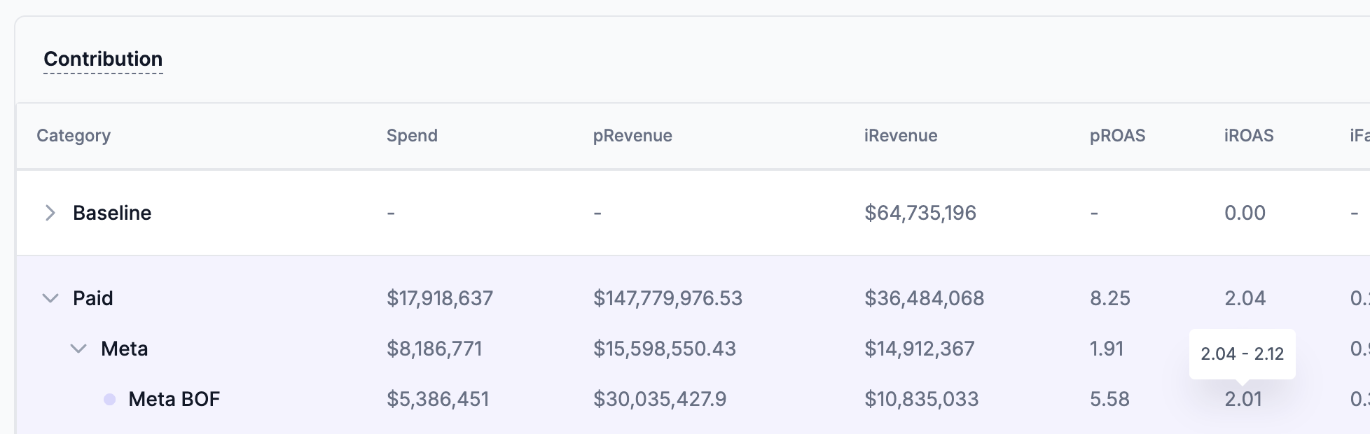
View confidence intervals for iROAS/iCPAHover over a specific channel tactic to view confidence interval. In this example, we see Meta BOF iROAS is 2.01 which is within the range (2.04-2.12) as estimated by the model.
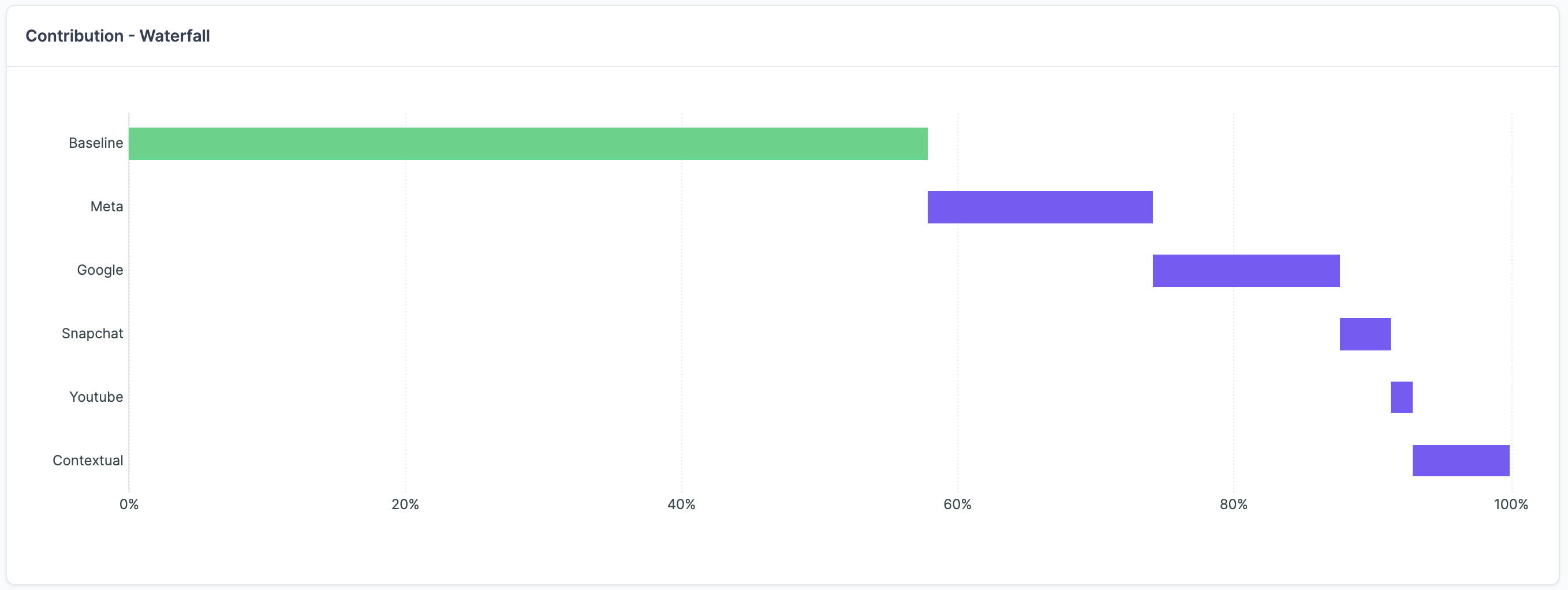
Contribution Waterfall Chart
The Contribution Waterfall chart provides a clear, aggregate view of how your total business outcomes are built. It visualizes how the baseline performance is augmented by the contributions from each of your marketing channels and other categories over the entire selected time period.
In simple terms, it tells the story of your revenue, starting from the foundation (Baseline) and stacking the incremental impact of each marketing activity on top to reach your total.
How to Read the Chart
- Starting Point (
Baseline): The chart begins with your baseline, which represents the predictable revenue or conversions you would have achieved without any marketing influence. This is the foundation of your business performance. - Building Blocks (Channels): Each subsequent block represents the incremental value added by a specific paid channel (e.g.,
Meta,Google,Snapchat) or category (e.g.,Contextual,Organic). - Understanding Scale: The length of each block is proportional to its contribution, making it easy to see at a glance which channels are your heaviest hitters and how your marketing efforts stack up against your baseline. This high-level view is perfect for quickly communicating the overall structure of your marketing engine to stakeholders.
Performance Plot
The Performance Plot is your strategic command center for budget allocation. It serves a powerful view, plotting the efficiency of each marketing tactic against its share of the total budget. This allows you to instantly identify which channels are true growth drivers, which are ripe for more investment, and which may need re-evaluation.
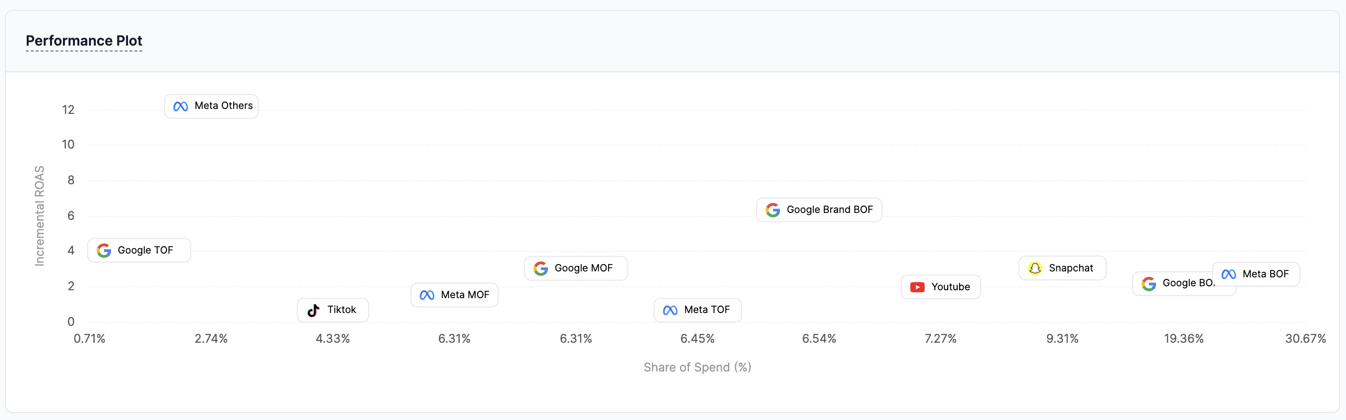
Reading the Plot: Efficiency vs. Investment
The plot is designed to be intuitive, helping you balance two critical questions: "How effective is this channel?" and "How much am I investing in it?"
-
Y-Axis (Efficiency):
Incremental ROASorCPA
This vertical axis measures the return you get from each tactic. For revenue-focused models, it showsiROAS(higher is better). For conversion-focused models, it showsCPA(lower is better).Note: The chart automatically inverts the
CPAaxis, so for both metric types, the top of the chart always represents the best-performing, most efficient channels. -
X-Axis (Investment):
Share of Spend (%)
This horizontal axis shows the percentage of your total marketing budget allocated to each tactic. Tactics further to the right have a larger share of your investment.
Deriving Strategic Insights
By analyzing a tactic's position on the chart, you can quickly categorize its performance and decide on the next steps:
- Leaders (Top-Right): High Efficiency, High Investment. These are your proven winners. You are investing significantly in them, and they are delivering strong returns. The goal here is to maintain and optimize their performance.
- Opportunities (Top-Left): High Efficiency, Low Investment. These tactics are highly effective but may be underfunded. They represent a significant growth opportunity. Ask yourself: "Can we scale our investment here to capture more value?"
- Re-evaluate (Bottom-Right): Low Efficiency, High Investment. This is a critical area for review. These tactics consume a large portion of your budget but provide poor returns. It's time to investigate what's wrong and consider optimizing the strategy or reallocating the budget.
- Niche / Testing (Bottom-Left): Low Efficiency, Low Investment. These may be experimental channels, new tactics, or smaller, niche platforms. The low investment is appropriate for their current return, and the goal is to monitor them and see if they can be moved into the "Opportunities" quadrant over time.
To get the exact numbers behind the visualisation, simply hover over any tactic on the plot to see a detailed tooltip with its specific Spend, Incremental Revenue, and iROAS.
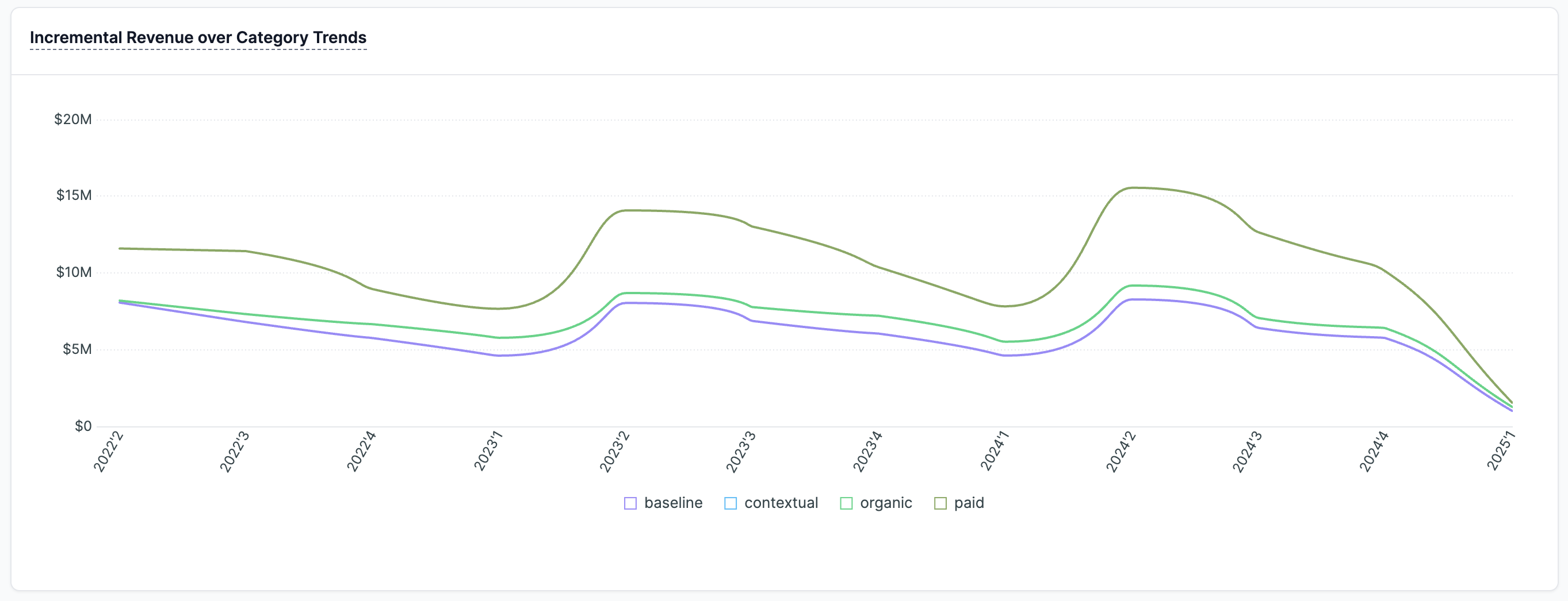
Incremental Revenue over Category Trends
This part of the Insights tab breaks down the incremental revenue by different categories, allowing you to see which areas are driving the most value over time.
Platform Marketing Contributions over Time
This section offers two powerful and complementary views for analyzing how your channels’ contributions evolve. You can now toggle between a detailed Heatmap Table (the default view) and a strategic Bump Chart to get a complete picture of your performance trends.
Heatmap Table: Spot Performance Trends at a Glance
The Heatmap Table breaks down the incremental revenue generated by each channel over your selected time periods. To help you instantly identify strengths and weaknesses, the table uses a simple, color-coded system.
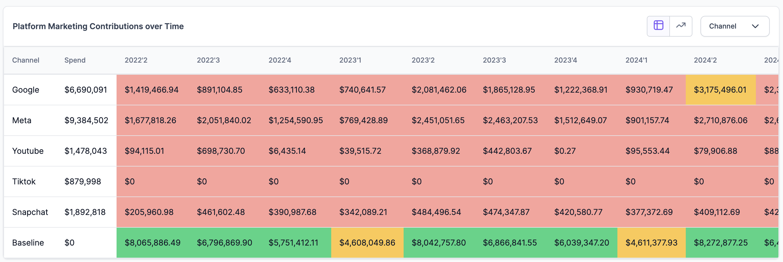
How to Read the Table:
- Rows and Columns: Each row represents a channel (like
Google,Meta, etc.), while the columns show distinct time periods (e.g., 2023'1, 2023'2). The cell where they intersect shows the incremental revenue for that channel in that specific period. - Total Spend: The
Spendcolumn shows the total investment in each channel across the entire date range, providing crucial context for its performance. - Color-Coded Performance: The colors act as a heatmap, making it easy to scan and interpret results without reading every number. The system automatically identifies the highest and lowest performing periods in your selected date range and color-codes the cells accordingly:
- Green: Represents periods of high performance (top-tier contribution).
- Yellow: Represents periods of medium performance.
- Red: Represents periods of low performance (bottom-tier contribution).
This view is perfect for quickly spotting when a specific channel was particularly hot or cold and identifying patterns in its performance over time.
Bump Chart: Visualize Channel Rank and Momentum
Toggle from the table view to the Bump Chart to see the story of your channel performance from a different angle. Instead of focusing on raw revenue numbers, this chart visualizes the rank of each channel's contribution over time. It’s the perfect tool for understanding shifts in channel dominance and the competitive momentum within your marketing mix.
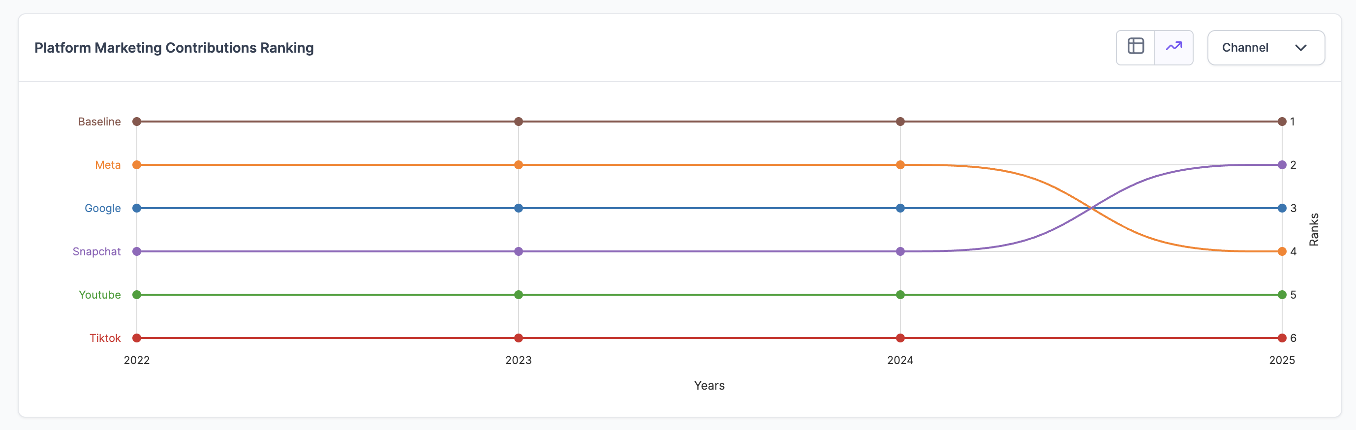
How to Read the Chart:
- Vertical Axis (Ranks): This axis shows the performance rank, with the #1 spot at the top. A channel with a higher rank contributed more to your incremental revenue in that period than channels ranked below it.
- Horizontal Axis (Time): This axis displays the time periods. To ensure the chart is always clear and insightful, the timeline is intelligently aggregated. For example, if you select a long date range, the chart may automatically group weekly data into months or quarters to show you the most meaningful high-level trends.
- Channel Lines: Each colored line represents a channel. By tracking a line, you can see its journey over time:
- A line moving up: The channel's rank is improving.
- A line moving down: The channel's rank is declining relative to others.
- A flat line: The channel is maintaining a stable rank.
The Bump Chart excels at answering strategic questions like: "Did Meta overtake Google as our top-contributing channel this year?" or "Is TikTok's influence consistently growing, even if its total incremental revenue is still small?" It turns your data into a clear narrative of which channels are gaining momentum and which are losing ground.
Incremental ROAS Analysis
This analysis provides a visual representation of the relationship between incremental revenue and ROAS across different tactics or platforms. The size of the visual elements often represents the amount of spend, making it easier to identify the most efficient marketing activities.
- iROAS is a marketing metric that measures revenue earned for every dollar you spend on advertising. The ROAS Analysis chart represents the ad spend, KPI, and ROAS/CPA of each platform in one chart. The x-axis represents the Incremental Return on Ad Spend (ROAS) and y-axis represents the Conversion Value (attributed incremental revenue or orders) on y-axis. Additionally, the size of each bubble on the chart corresponds to the amount spent on that specific platform: larger bubbles denote greater expenditure.
- Blended iROAS (vertical reference dotted line) represents the average of Lifesight iROAS across all sources used in the graph. The chart provides a clear comparison of platforms, showing which ones deliver higher incremental revenue and better ROAS. It also helps in identifying outliers or underperforming platforms that may require optimization or reevaluation.

What is a good return on ad spend?
Pinning down a “good” ROAS is difficult, but in general, you want to have a ROAS that is over 100%. If you have a ROAS of 100%, you break even with your ad spend and your ad return.
A Return on Ad Spend (ROAS) below 100% suggests that your advertising campaign is incurring costs exceeding its revenue, necessitating a strategic review and potential adjustments to enhance its effectiveness and profitability. Conversely, a ROAS exceeding 100% indicates a profitable campaign, reflecting successful strategy and execution, yet it remains important to continuously monitor and optimize the campaign to sustain or further improve its success.
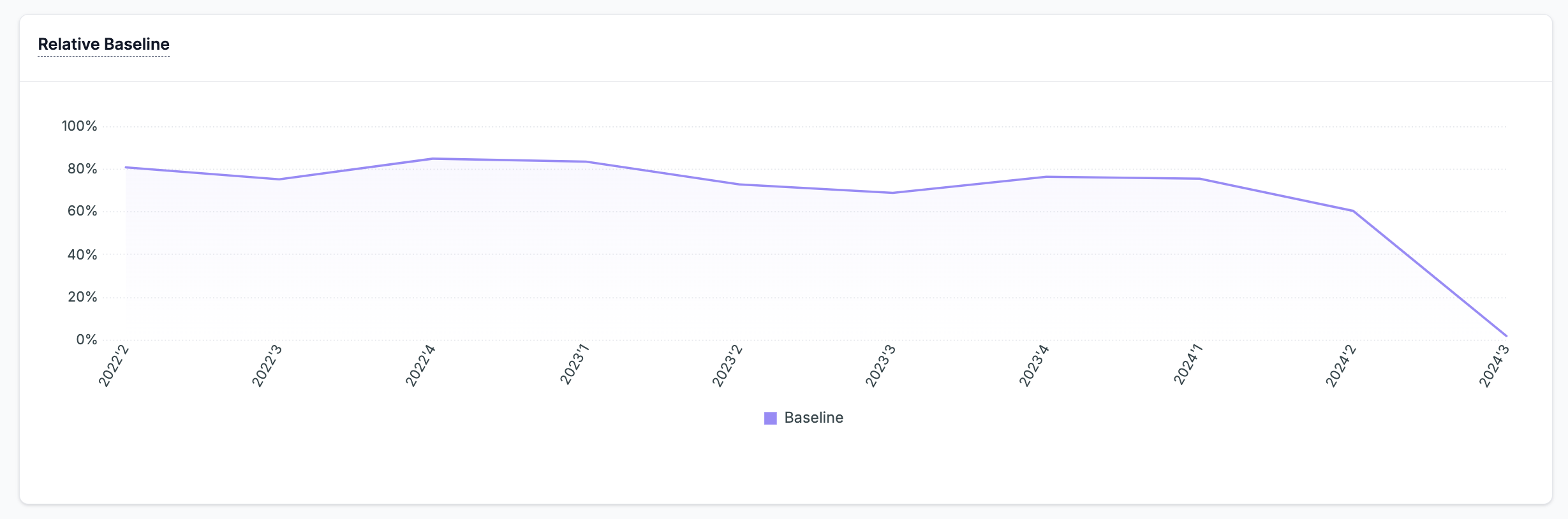
Relative Baseline
This chart shows baseline revenue as a percentage over time, revealing trends in organic revenue. It's a key indicator of brand equity. Ideally, an upward trend suggests higher brand value, meaning more consumers convert without marketing influence.
If your business stops marketing altogether, it still generates sales which is attributed to brand equity due consumer brand affinity.
Updated 12 months ago