Visualizations
Visualizations are graphical data elements that add visual context to your analysis. They allow you to create, explore, and view your data in a more focused and digestible format.
By adding visualizations to a Dashboard, you can reveal patterns, trends, outliers, and correlations crucial to creating a compelling data narrative. Build each visualization to deliver specific data insights and answer important questions that help you make better business decisions.
This document introduces the types of visualizations Lifesight offers and explains where to configure element properties and formatting.
Visualization types
Effective visualizations are essential to telling meaningful data stories, but choosing the right types of visualizations can be a challenge. Consider the data type you want to visualize, the questions you need to answer, and the users who will view and consume your analysis.
The following information can help you choose visualizations for a clear and detailed narrative.
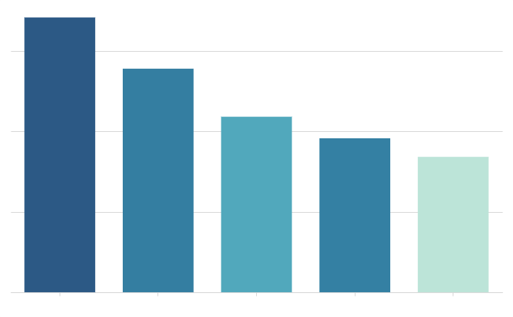
Bar chart
Show how values vary across categories or groups of data. Compare values against each other, to a reference mark, or as proportions of a whole.

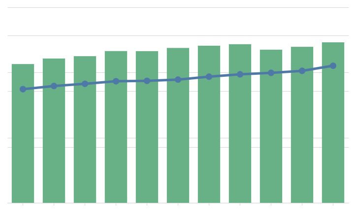
Line chart
Show how the values of one or more metrics change over time. Spot trends and identify anomalies in your dataset.
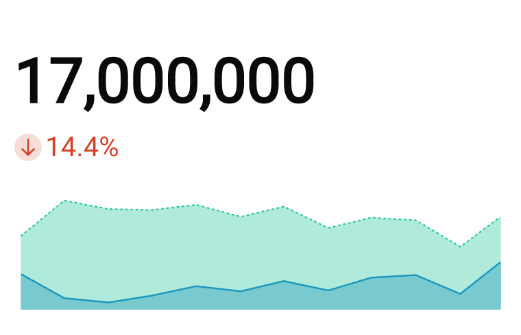
KPI chart
Highlight a single metric value to measure performance or progress toward a goal. Summarize the total value for a specific period, compare the value over time, or measure it against a benchmark or target.
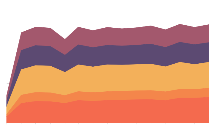
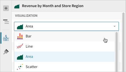
Area chart
Illustrate the magnitude or cumulative values of one or more metrics over time. Compare categories or groups of data, or evaluate the data composition or part-to-whole relationship.
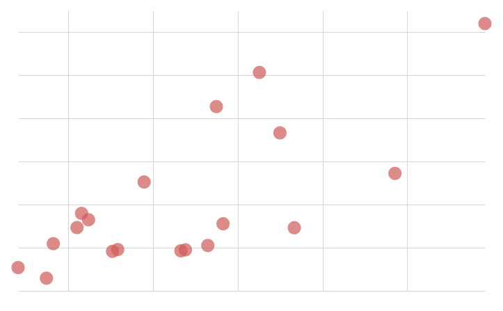
Scatter plot
Demonstrate the presence and strength of a correlation between metrics. Analyze patterns, understand distribution, and identify outliers in your dataset.
Combo chart
Combine bar, line, area, and/or point marks to compare multiple types of metrics. Evaluate the relationship to identify correlations and variations between the datasets.
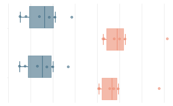
Box chart
Show the value distribution of one or more metrics. Mark the minimum, median, and maximum values, and identify outliers in your dataset.
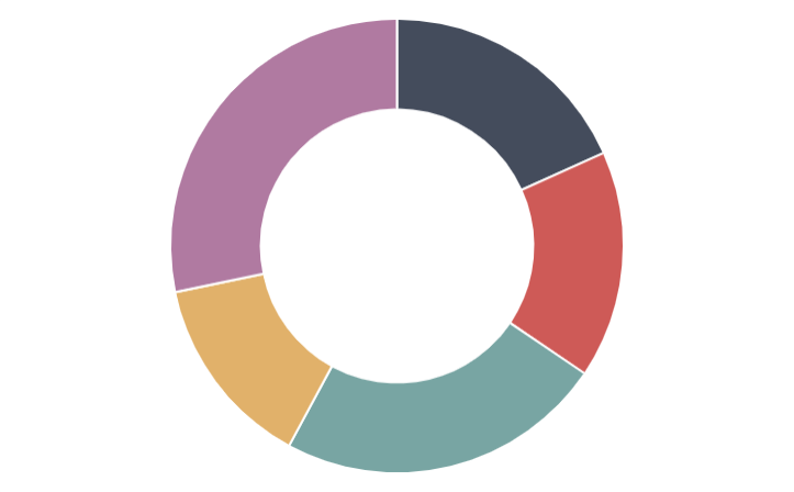
Pie and Donut charts
Portray values as proportions of a whole to convey the data distribution and part-to-whole relationship.
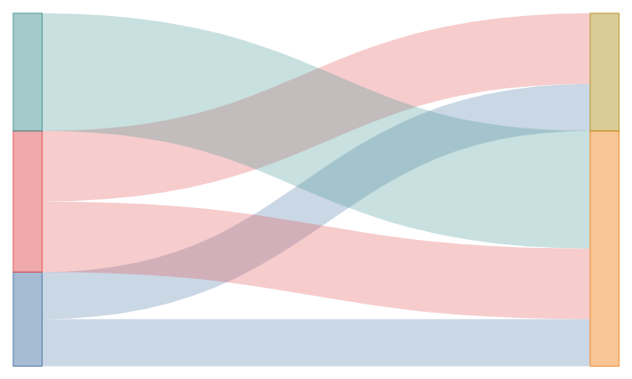
Sankey diagram
Show how data flows and changes throughout a process or system. Compare the movements and proportions of data across different paths to analyze distributions, workflow, networks, and more.

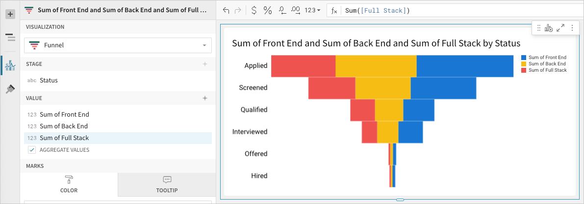
Funnel chart
Measure values across sequential stages in a linear process. Gain insight into inputs across stages, identify bottlenecks and other issues, and assess the overall health of the process.
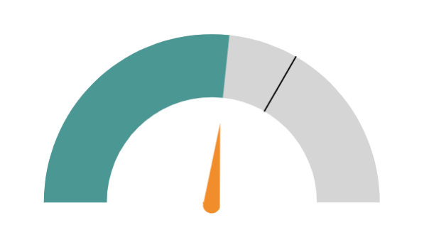
Gauge chart
Measure a single-value metric against a radial scale. Evaluate growth, assess performance, and track progress toward a goal.

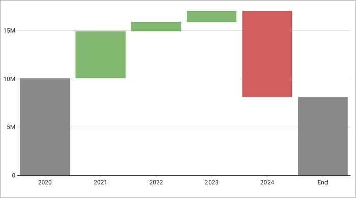
Waterfall chart
Show changes in one or two categories of data over a time period.
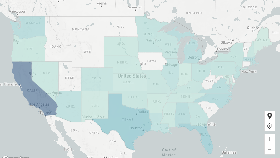
Region map
Illustrate data distribution by region, including country, state, county, and city. Compare scale to identify variability and patterns across distinct geographical areas.
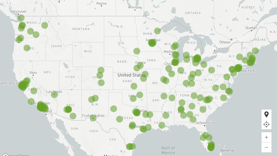
Point map
Illustrate data distribution with precise positioning based on latitude and longitude coordinates. Reveal geospatial patterns and identify outliers in your dataset.

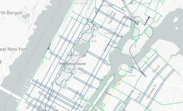
Geography map
Illustrate geospatial objects on a map using geography (WKT) or variant (GeoJSON) data. Demonstrate data distribution, reveal patterns, illustrate spatial networks, or assess data variability across distinct geographical areas.
Custom configurations
Visualizations feature various properties and formatting options that determine how your data is represented. With a wide range of customizable configurations, you can enhance your visualizations and ensure they present meaningful and actionable information.
Properties
The Element Properties panel requires selecting a visualization type and configuring source columns to define chart properties, including axis categories, metrics, colors, and tooltips.
You can convert data value types, change the data aggregation or truncation, and customize chart markers and tooltips. Depending on the visualization type selected, you may also have options to change the chart orientation, modify data stacking, and add trellis rows and columns.
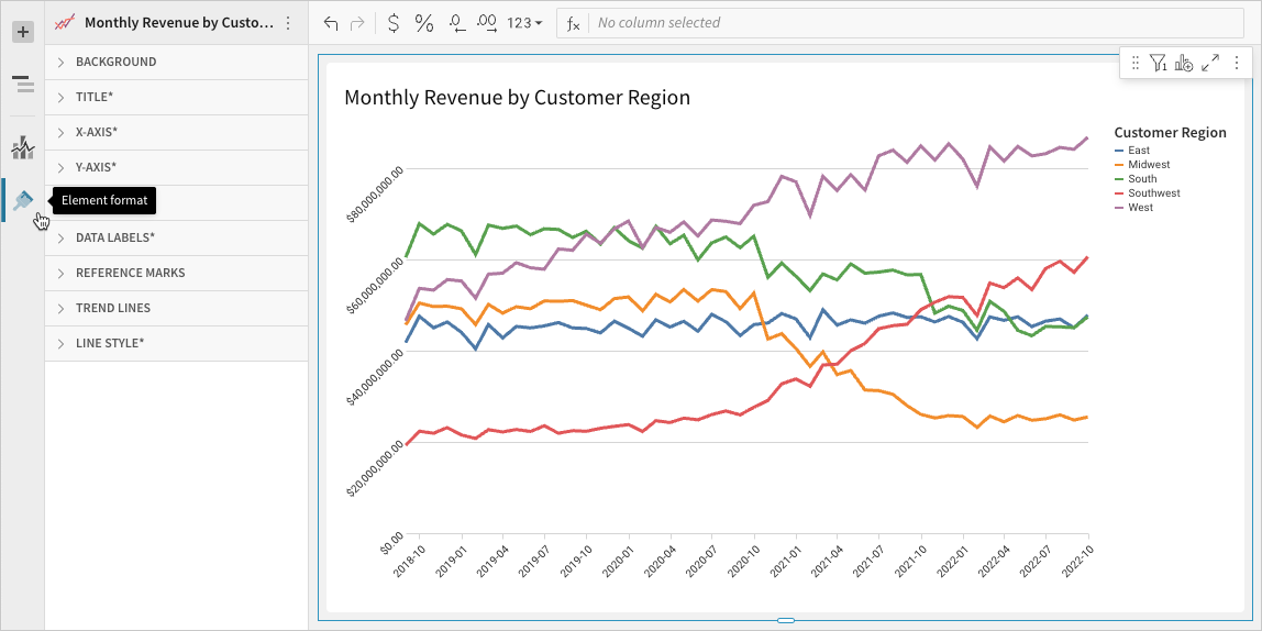
_Element properties panel in Edit mode_Formatting
The Element format panel allows you to customize the appearance of various components, including the visualization title’s content, size, and alignment. Depending on the visualization type selected, you may also be able to format the background, axes, legend, data labels, reference marks, trend lines, and more.
_Element format panel in Edit model_Build a bar chart
Bar charts are typically used to compare values across categories or groups of data. Create basic single-series bar charts, or build advanced charts to compare multiple variables, measure values against reference marks, evaluate parts of a whole, and more.
This document details basic bar chart requirements and introduces key properties and format options to help you enhance your Dashboard visualizations.
NoteUse cases examples:
- Store analytics: Measure total sales by product category to identify top and bottom-performing categories.
- Marketing analytics: Track unique website page views by ad referral site (such as LinkedIn and GoogleAds) to understand ad performance trends and referral site effectiveness.
- Accounting analytics: Monitor travel expenses by spend category to understand travel spend and identify categories that exceed expectations.
- Education analytics (histogram): Count student exam results by score range to analyze frequency distribution and understand performance variability.
User requirements
The ability to create bar charts and other visualizations requires the following:
- You must be assigned an account type with the Edit Dashboard and/or Explore Dashboard permission enabled.
- You must be the Dashboard owner or be granted Can explore or Can edit
Basic bar chart requirements
To plot a bar chart, configure the following properties in the Element properties tab:
Chart Chart type displayed in the Dashboard
X-axis Source column that defines the x-axis (horizontal axis) categories or variable
Y-axis Source column that defines the y-axis (vertical axis) categories or variable
In a bar chart, one axis typically represents ordinal or nominal categories (like stages, regions, and departments) presented as vertical or horizontal bars. The other axis represents a variable that measures a value (like sales, leads, expenses) for each category and determines the height or length of the corresponding bar. The type of data affiliated with each axis depends on the chart orientation, which you can modify at any time.
NoteAt the core of every visualization is an underlying data table (derived from the data source) that supplies the information visualized by the chart. As you build a bar chart, Lifesight automatically calculates and structures the data to map the element properties to source columns in the underlying data table.
Add a bar chart
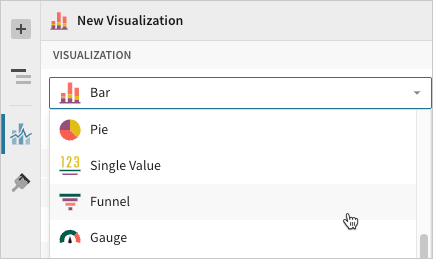
Create a new visualization element and designate it as a bar chart.
- Open a Dashboard in Explore or Edit mode and add a new visualization element.
- In the Visualization property, click the dropdown field and select Bar from the list.
Define the categories
Configure a source column to define the chart categories.
When building a vertical bar chart (default orientation), apply the following steps to the X-axis property. When building a horizontal bar chart, apply the steps to the Y-axis property.
-
In the applicable axis property, click Add column and select an option from the menu:
- To generate categories based on distinct values in an existing column, search or scroll the Select column list and select the preferred column name.
- To generate categories based on a custom formula, select New column and enter the formula in the toolbar. For example, when building a histogram, create a custom formula using the BinRange or BinFixed function to generate categories based on value ranges.
-
`[optional]` Control how the source column data is categorized and displayed in the chart:
- Hover over the source column name, then click the caret () to open the column menu.
- Hover over any of the following items, then select the preferred option:
- Truncate date Categorize date values by the selected interval or unit of measure.
- Transform Convert the column to the selected data value type .
- Format Display axis and data labels in the selected format.
NoteAvailability of column menu items and corresponding options varies depending on the column’s data value type (for example, Truncate date is available for date values only).
Define the variable
Configure a source column to define the chart variable. Lifesight automatically aggregates values associated with the same chart category.
Apply the following steps to the Y-axis property when building a vertical bar chart (default orientation) or the X-axis property when building a horizontal bar chart.
- In the applicable axis property, click Add calculation and select an option from the menu:
- To aggregate values of an existing column, search or scroll the Aggregate column list and select the preferred column name.
- To calculate values based on a custom formula, select New column and enter the formula in the toolbar.
- To count the number of rows associated with each category, select Row count.
- `[optional]` Control how the source column data is calculated and displayed in the chart:
- Hover over the source column name, then click the caret to open the column menu.
- Hover over any of the following items, then select the preferred option:
- Set aggregate Calculate values based on the selected aggregation method.
- Transform Convert the column to the selected data value type.
- Format Display axis and data labels in the selected format.
- `[optional]` Repeat the previous steps to add multiple y-axis source columns. Lifesight plots the columns as stacked or clustered series.
- `[optional]` Lifesight auto-generates source column names and chart titles to reflect the visualized data, but you can customize these fields as needed:
- To rename a source column, double-click the column name in the X-axis or Y-axis property, then enter a new name. Changes are reflected in the default chart title.
- To edit the chart title, double-click the title in the visualization, then enter a new title.
Advanced bar chart properties and formatting
Lifesight features various properties and format options that give you the flexibility to build advanced bar charts and variations, including stacked, percent stacked, clustered (grouped), and dual-axis bar charts.
The following sections introduce configurations that can enhance your bar charts and help you deliver specific insights with meaningful and actionable information.
Change orientation and stacking
Change bar chart orientation and stacking in the Element properties
Visualization property to optimize the way you compare data across and within categories.
Orientation
- Vertical - Categorize data on the x-axis and measure values on the y-axis to create vertical bar marks.
- Horizontal - Categorize data on the y-axis and measure values on the x-axis to create horizontal bar marks.
Stacking
- No stacking - Plot multiple data series as separate bars within categories. Compare values across and within categories in the resulting clustered bar chart.
- Stacked - Plot multiple data series as cumulative bar segments. Compare subcategory contributions to each category’s total sum value in the resulting stacked bar chart.
- Stacked 100% - Plot multiple data series as stacked bars totaling 100% of each category’s total sum value. Compare subcategory distribution in the resulting percent stacked bar chart.
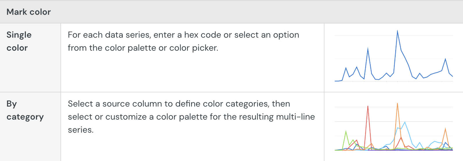
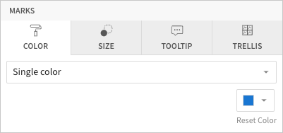
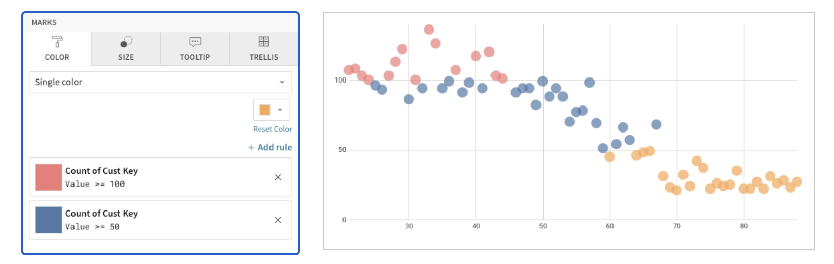
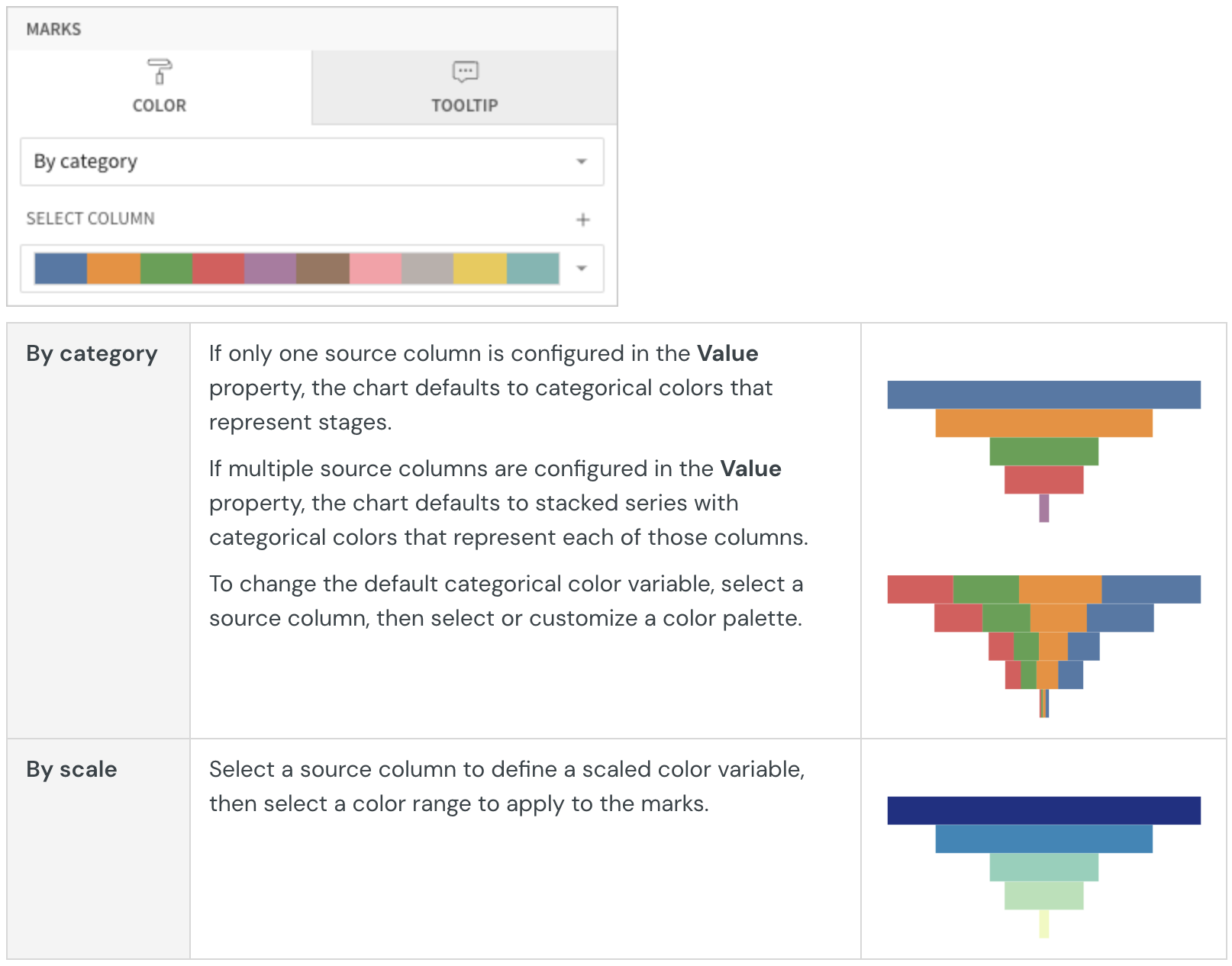
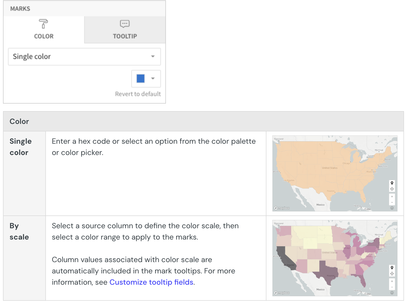
Configure mark colors
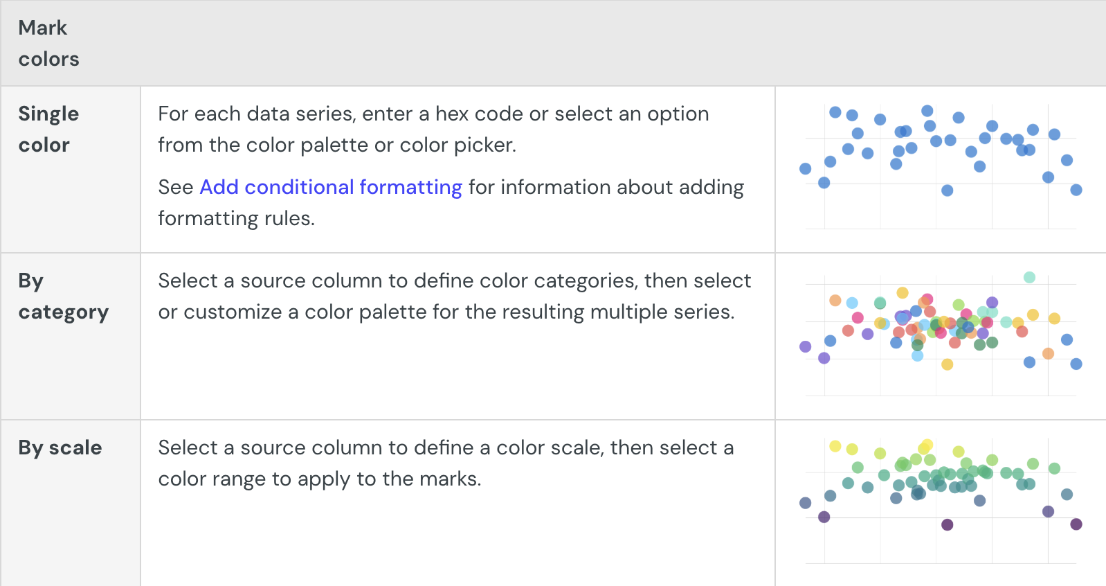
You can configure the bar mark colors in the Element properties > Marks > Color tab to differentiate data, highlight specific values, use color to split bar values by category, or apply a color scale.
Mark color
- Single color - For each data series, enter a hex code or select an option from the color palette or color picker.
- By category - Select a source column to define color categories, then select or customize a color palette for the resulting stacks or clusters.
- By scale - Select a source column to define the color scale, then select a color range to apply to the marks.
NoteMultiple variables in the y-axis (in a vertical bar chart) or x-axis (in a horizontal bar chart) result in a stacked or clustered bar chart in which each data series represents a measure of a different variable. The By category color setting can also generate bar stacks or clusters, but the resulting series represent sub-categories (within the configured chart categories) that measure the same variable.
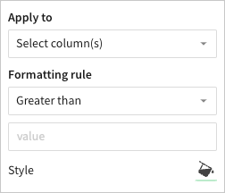
Add conditional formatting
When you select Single color in the Element properties
Marks > Color tab, you can configure formatting rules (+ Add rule) that determine bar mark colors according to value-based conditions. This creates exceptions to the single-color selection, allowing you to highlight values that meet the specified conditions.
Example:
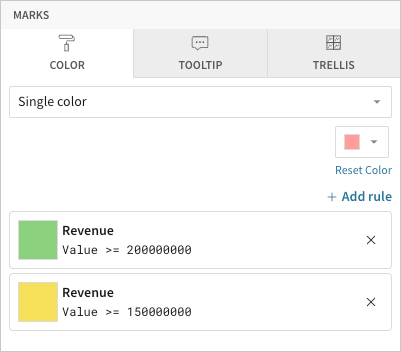
NoteWhen the conditions of multiple rules are met, Lifesight applies the formatting rules in order of precedence, from top to bottom. Drag and drop rule blocks to reorder them as needed.
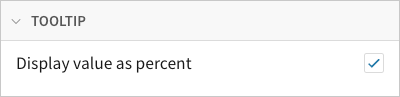
Customize tooltip fields and values
Customize chart mark tooltip fields in the Element properties
Marks > Tooltip tab to display the most relevant metrics and data attributes. For more information, see Customize chart mark tooltip fields in this document.
When you apply chart stacking, you can also customize tooltips in the Element format > Tooltip section to display the variable value as a percentage of the cumulative stack.
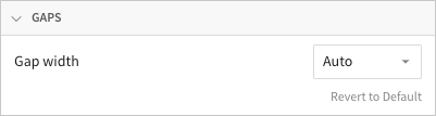
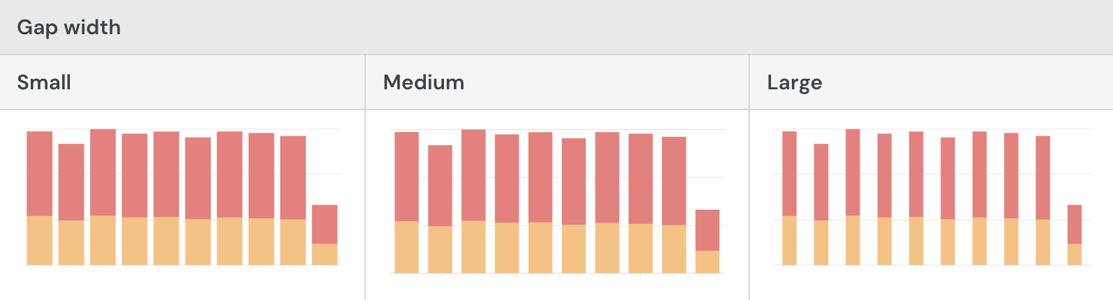
Resize gap width
Resize gaps between bar marks in the Element format > Gaps section. Gap widths are auto-sized to optimize readability, but Lifesight gives you the flexibility to customize bar chart spacing.
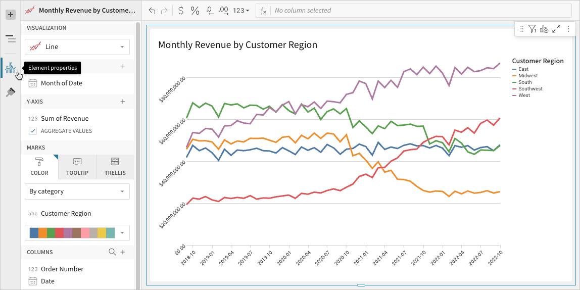
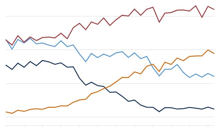
Build a line chart
Line charts are typically used to assess how values change over time. Create basic single-line charts to spot trends and identify anomalies in your dataset. You can also build advanced multi-line charts to analyze and compare multiple variables over the same period of time.
This document details basic line chart requirements and introduces key properties and format options to help you enhance your Dashboard visualizations.
NoteUse cases example:
- Consumer packaged goods (CPG) analytics: Compare monthly profit margins by product category to understand profit trends and gain insight into overall business profitability.
- Manufacturing analytics: Track machine uptime percentage by the hour to identify productivity lapses and reliability issues.
- Air travel analytics: Assess monthly percentage of on-time flight departures by airline to understand seasonal patterns and compare operational efficiency across companies.
User Requirements
The ability to create line charts and other visualizations requires the following:
- You must be assigned an account type with the Edit Dashboard and/or Explore Dashboard permission enabled.
- You must be the Dashboard owner or be granted Can explore or Can edit Dashboard permission.
Dashboard prerequisite
Before you can build a line chart, you must add a new visualization element and select a data source.
At the core of every visualization is an underlying data table (derived from the data source) that supplies the information visualized by the chart. Lifesight automatically groups, aggregates, and calculates the underlying data to create source columns for various visualization properties as you build a line chart. You can view the underlying data table while configuring the chart to see how the data is applied.
NoteLine charts support up to 25,000 data points. If the configurations result in a data set that exceeds this limit, the chart displays the first 25,000 data points, and a warning message indicates that the chart is incomplete. To reduce the number of data points, aggregate the values or apply data filters to the visualization or source element.
Basic line chart requirements
To plot a line chart, configure the following properties in the Element properties panel:
Chart Chart type displayed in the Dashboard
X-axis Source column that defines the x-axis (horizontal axis) categories
Y-axis Source column that defines the y-axis (vertical axis) variable
In a line chart, the x-axis typically represents time-based categories (like dates, months, years) that correspond with individual data points. The y-axis represents a variable that measures a value (like sales, leads, expenses) for each category and determines the vertical placement of each data point.
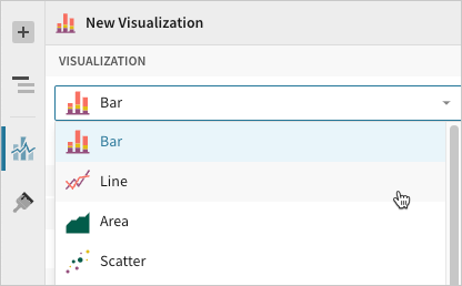
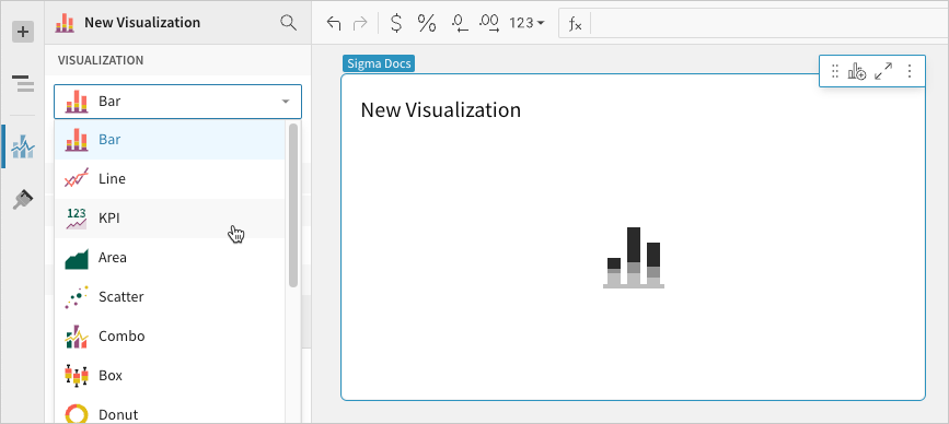
Select the visualization type
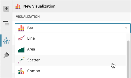
Once you add a new visualization to a Dashboard, select the visualization type:
- In the Visualization property, click the dropdown field and select Line from the list.
Define the x-axis categories
Configure a source column to define the x-axis categories.
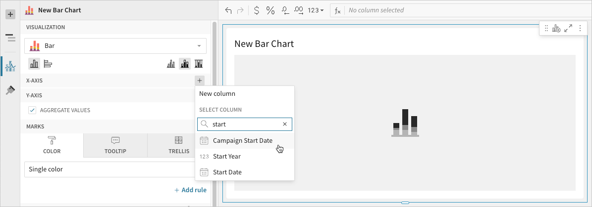
- In the X-axis property, click Add column and select an option from the menu:
- To generate categories based on distinct values in an existing column, search or scroll the Select column list and select the preferred column name.
- To generate categories based on a custom formula, select New column and enter the formula in the toolbar.
- `[optional]` Control how the source column data is categorized and displayed in the chart:
- Hover over the source column name, then click the caret () to open the column menu.
- Hover over any of the following items, then select the preferred option:
- Truncate date Categorize date values by the selected interval or unit of measure.
- Transform Convert the column to the selected data value type.
- Format Display axis and data labels in the selected format.
Define the y-axis variable
Configure a source column to define the y-axis variable. Lifesight automatically aggregates values associated with the same x-axis category.
- In the Y-axis property, click Add calculation and select an option from the menu:
- To aggregate values of an existing column, search or scroll the Aggregate column list and select the preferred column name.
- To calculate values based on a custom formula, select New column and enter the formula in the toolbar.
- To count the number of rows associated with each category, select Row count.
NoteYou can also select an existing column by dragging and dropping a column name from the Columns list to the Y-axis property.
- `[optional]` Control how the source column data is calculated and displayed in the chart:
- Hover over the source column name, then click the caret () to open the column menu.
- Hover over any of the following items, then select the preferred option:
- Set aggregate Calculate values based on the selected aggregation method.
- Transform Convert the column to the selected data value type.
- Format Display axis and data labels in the selected format.
NoteTo plot the source column data without aggregating values, clear the Aggregate values checkbox in the Y-axis property. If this results in an incomplete chart that exceeds the 25,000 data point limit, reaggregate the values or apply data filters to reduce the number of data points.
- `[optional]` Repeat the previous steps to configure multiple y-axis source columns. Lifesight plots each as a separate line series on the chart.
- `[optional]` Lifesight auto-generates source column names and chart titles to reflect the visualized data, but you can customize these fields as needed:
- To rename a source column, double-click the column name in the X-axis or Y-axis property, then enter a new name. Changes are reflected in the default chart title.
- To edit the chart title, double-click the title in the visualization, then enter a new title.
NoteLifesight auto-generates the default chart title only. Once the title is customized, it no longer reflects changes to source columns and their names.
Advanced line chart properties
Lifesight features various properties and format options that give you the flexibility to build advanced line charts and variations, including multi-line, step-line, and dual-axis line charts.
The following sections introduce configurations that can enhance your line charts and help you deliver specific insights with meaningful and actionable information.
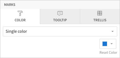
Configure mark colors
Configure line mark colors in the Element properties
Marks > Color tab to differentiate data, highlight associations, or add a color category.
NoteMultiple variables in the y-axis result in a multi-line chart in which each data series represents a measure of a different variable. The By category color setting can also generate a multi-line chart, but the resulting series represent sub-categories (within the x-axis categories) that measure the same variable.
Customize line style
Customize line styles in the Element format
Line Style section. When the line chart contains multiple y-axis variables, you can modify the different data series individually or together.
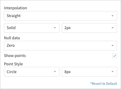
In addition to customizing the line pattern (solid, dashed, or dotted) and weight (1-5px), you can choose the type of interpolation path:
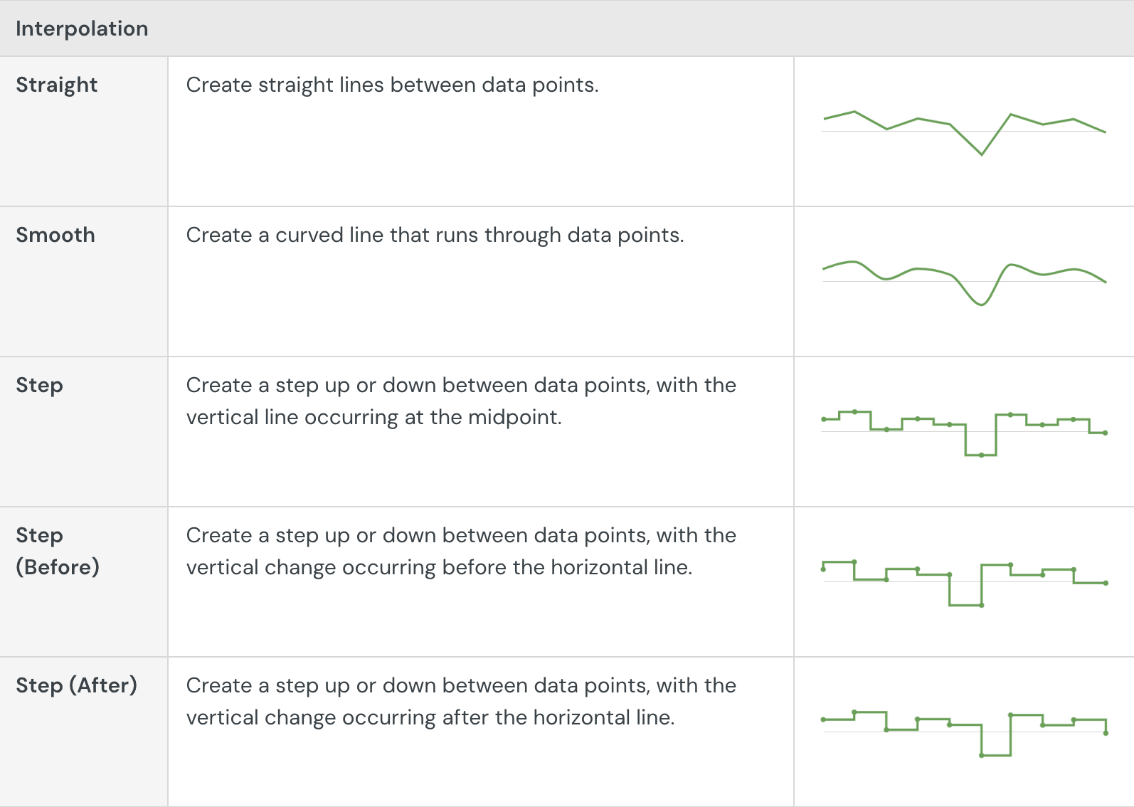
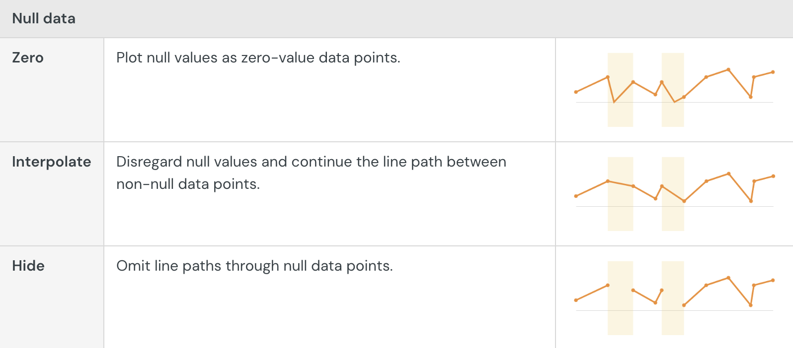
You can also show or hide individual data points and control how the line chart handles null values:
By default, line charts hide distinct data points between line connections. If you select the Show points checkbox, you can display the points and customize their size (2-15px) and shape:
Build a KPI chart
NoteLifesight's KPI visualization element has replaced the Single Value visualization (SVV) option.
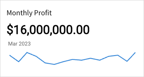
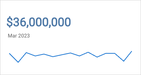
Key performance indicator (KPI) charts highlight single metric values typically used to measure performance or progress toward goals. Create a KPI chart to summarize the total value of a metric for a specific period, or include additional data to compare the metric’s value over time and measure it against a benchmark or target value.
NoteUse cases example:
- Marketing analytics: Track click-through rates to highlight email campaign performance over time.
- Executive Dashboarding: Measure monthly year-over-year revenue to understand how the current month’s revenue compares to the previous year benchmark.
- Manufacturing analytics: Report cycle time to analyze the amount of time it takes a product to complete the manufacturing process.
User requirements
The ability to create KPI charts and other visualizations requires the following:
- You must be assigned an account type with the Edit Dashboard and/or Explore Dashboard permission enabled.
- You must be the Dashboard owner or be granted Can explore or Can edit Dashboard permission.
NoteIf you’re granted Can explore access to the Dashboard, you can create and modify visualization properties and formatting in Explore mode, but you cannot publish your changes.
KPI chart variations
Lifesight’s KPI charts allow you to track and display metrics in various ways depending on how you configure the element properties.
Static variations
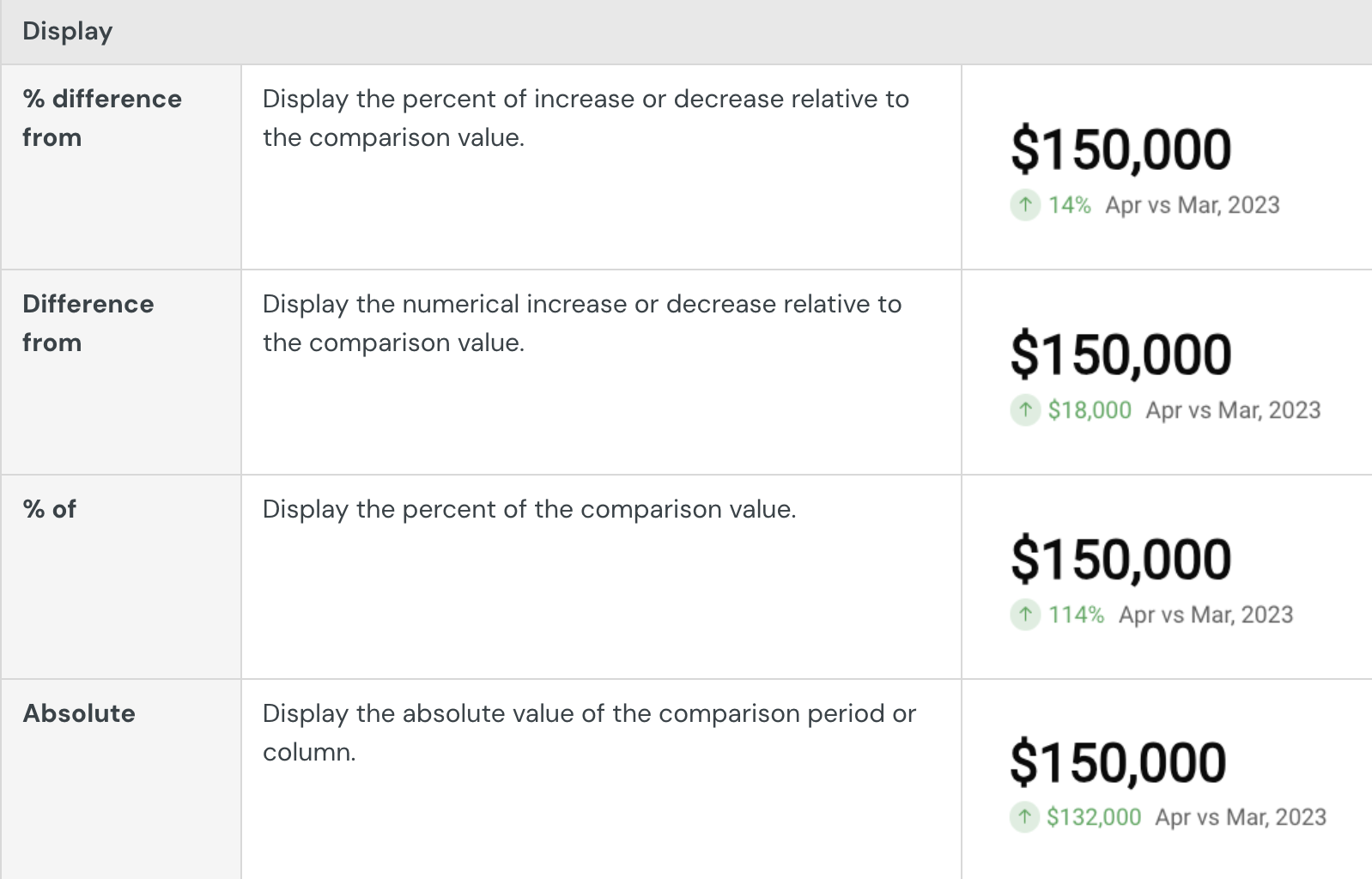
Summary value
Summarize the metric's global value to understand overall performance or magnitude.
The KPI chart highlights the global summary, which aggregates the metric values across the entire dataset.
Required element properties:
Value
Benchmark summary comparison
Summarize a metric's global value against a benchmark or target value. Assess relative performance and gain insight into patterns, relationships, and correlations.
The KPI chart highlights the global summary, which aggregates the metric values across the entire dataset. It also displays a comparison as a percentage, delta, or absolute value.
Required element properties:
Value
Comparison (Column)
Time series variations
Period value
Measure a metric's period value to analyze performance during a specific time interval (like week, month, or year).
The KPI chart highlights the latest period value or global summary, and it can display a trend line that illustrates patterns and changes across sequential time periods.
Required element properties:
Value
Timeline
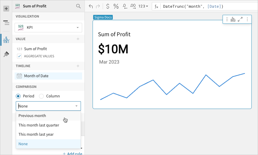
Period comparison
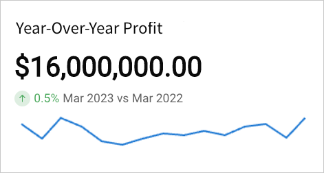
Measure a metric’s value in one period (like week, month, or year) against another to perform a sequential or period-over-period comparison.
The KPI chart highlights the latest period value or global summary, and it can display the comparison as a percentage, delta, or absolute value. It can also include a trend line that illustrates patterns and changes over time.
Required element properties:
Value
Timeline
Comparison (Period)
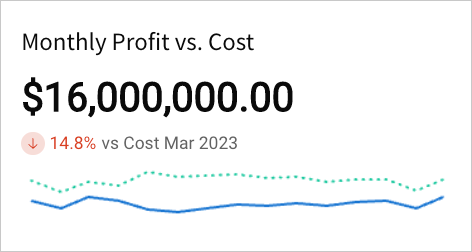
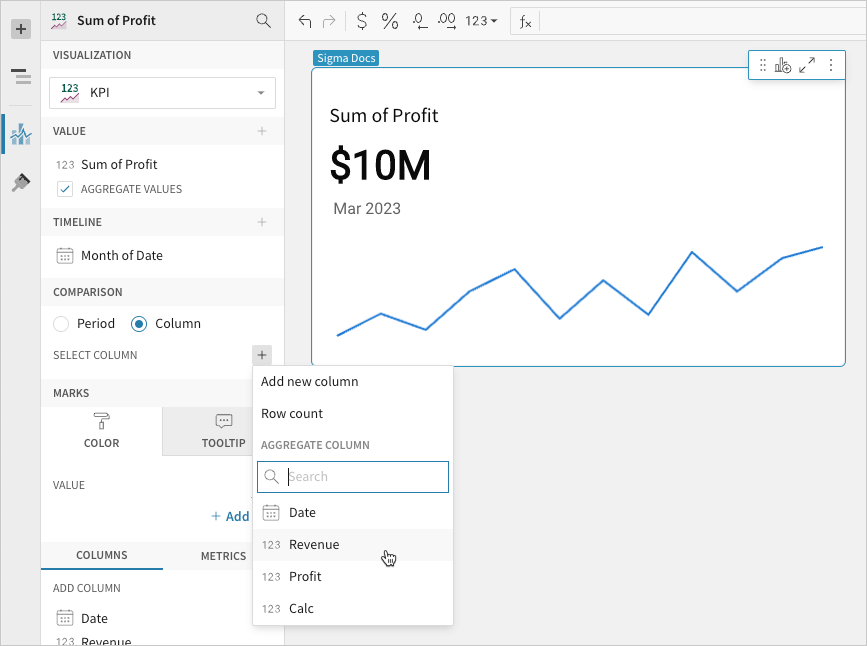
Benchmark period comparison
Compare a metric's period value against a benchmark or target to assess relative performance and gain insight into patterns, relationships, and correlations.
The KPI chart highlights the latest period value or global summary, and it can display a comparison as a percentage, delta, or absolute value. It can also include a trend line for both values to illustrate patterns and changes over time.
Required element properties:
Value
Timeline
Comparison (Column)
NoteWhen loading or refreshing a Dashboard, Lifesight typically sends a separate query for each data element. If the Dashboard contains multiple static KPI charts (summary value and benchmark summary comparison variations) that share a data source, Lifesight employs query batching. This consolidates the data requests from all applicable KPI charts into a single query to reduce query processing overhead and optimize performance. Time series KPI charts (period value, period comparison, and benchmark period comparison variations) send separate queries to the database and aren't included in query batching.
Basic KPI chart configurations
Build a basic KPI chart by configuring the following element properties:
- Chart Chart type displayed in the Dashboard
- Value Calculation that determines the metric value
- Timeline Date data that defines the reporting period
- Comparison Period or calculation that defines the comparison value
NoteAt the core of every visualization element is its underlying data, which supplies the information the chart visualizes. As you build a KPI chart, Lifesight automatically calculates and structures your data to associate element properties with columns ("source columns") in the underlying data table.
When you configure a property by aggregating an existing column, adding a custom formula or value, or applying the row count, Lifesight creates a new source column.
For information about how to view the underlying data while you configure the chart, see Maximize or minimize a data element.
Add a KPI chart element
Create a visualization element and designate it as a KPI chart.
NoteYou can also create a new KPI chart directly from a summary value in a table element. Right-click the table summary to open the menu, then select Create KPI element.
- Open a Dashboard in Explore or Edit mode and add a new visualization element.
- In the Visualization property, click the dropdown field and select KPI from the list.
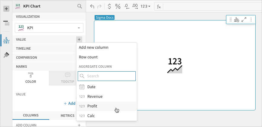
Calculate the metric
Configure the Value property to calculate the metric. This configuration is required to build any KPI chart variation.
- In the Value property, click Add calculation, then use one of the following methods to calculate the metric:
- To aggregate the values of an existing column, search or scroll the Aggregate column list and select the preferred column.
- To add a custom calculation or value, select Add new column, then enter the calculation or value in the formula bar.
- To count the number of rows in the underlying dataset, select Row count.
When the Timeline property is not configured, the chart displays the metric's global summary value, which aggregates all data points in the resulting Value property source column. If you deselect the Aggregate values checkbox, one value from the column is selected and displayed instead of a global summary.
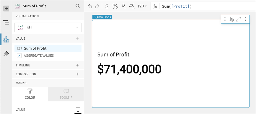
When you add a metric, the values are automatically aggregated and the Aggregate values checkbox is selected
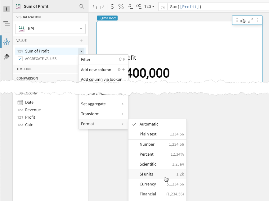
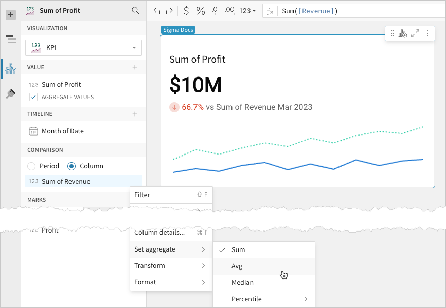
- `[optional]` If you want to control how the metric is measured and formatted, leave the Aggregate values checkbox selected and adjust the aggregate, data type, or format of the metric value using the column menu or formula toolbar:
- In the Value property, hover over the column name, then click the caret () to open the column menu.
- Hover over any of the following items and select the preferred option:
- Set aggregate Measure the metric based on the selected aggregation method.
- Transform Convert the column to the selected data value type.
- Format Display the metric value in the selected format.
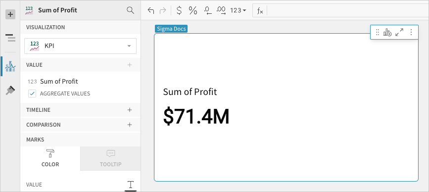
For example, you can format a sum of profit KPI to display using SI units:
Define the reporting period
Configure the Timeline property to define the reporting period for the time series. This configuration is required to build a period value, period comparison, or benchmark period comparison KPI chart.
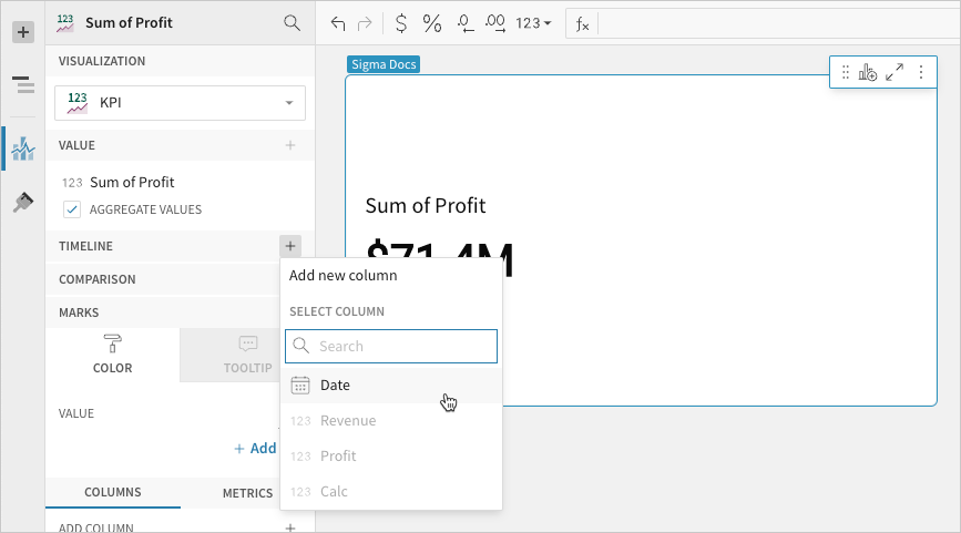
- In the Timeline property, click Add column, then use one of the following methods to define the reporting period:
- To derive the period from an existing date column, search or scroll the Select column list and select the preferred column.
- To create a period based on a new date column, select Add new column, then enter a date function or value in the formula bar.
NoteThe Timeline property supports date columns only. You cannot select or create a column that does not contain date data.
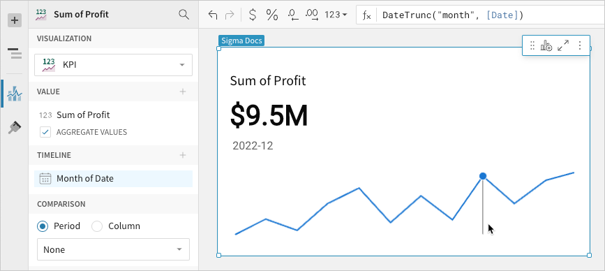
When a source column is added to the Timeline property, two changes occur in the chart:
- The chart now displays the metric's latest period value, which aggregates the Value property source column data for the most recent period. To change the default display value to the global summary, proceed to the next step.
- If the element layout size allows, the chart displays a trend line, which you can hover over to view previous period values.
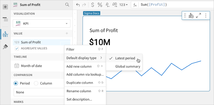
- `[optional]` Change the default display type (the value displayed when not interacting with the trend line):
-
In the Value property, hover over the source column name, then click the caret () to open the column menu.
-
Hover over Default display type and select an option:
- Latest period Display the aggregate value for the most recent period in the time series.
- Global summary Display the aggregate value for all periods in the time series.
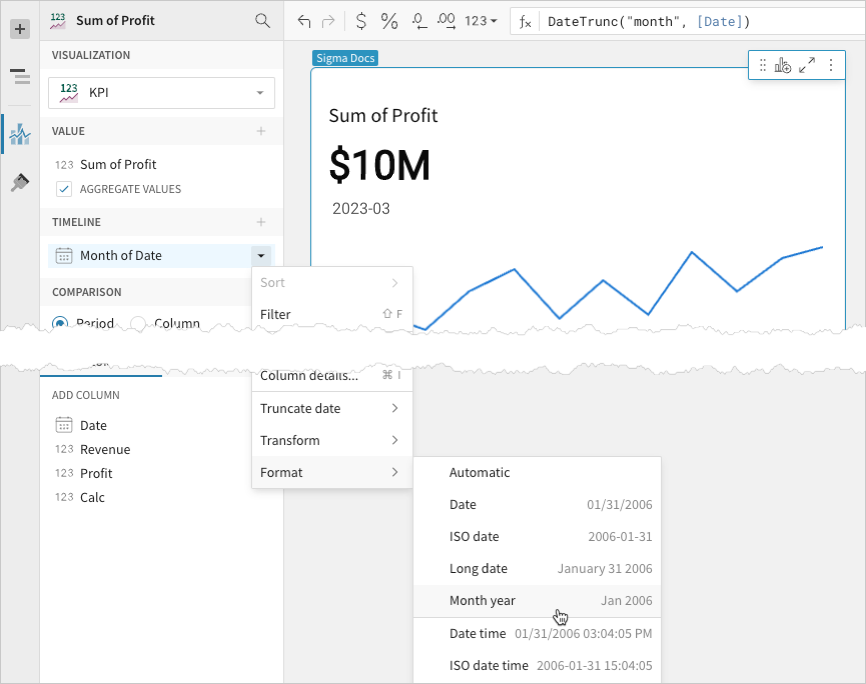
- `[optional]` Control how the period is measured and formatted:
- In the Timeline property, hover over the column name, then click the caret () to open the column menu.
- Hover over any of the following items and select the preferred option:
- Truncate date Measure the metric value based on the selected period.
- Format Display the period date in the selected format.
Select a comparison period
Configure the Comparison > Period property to measure a sequential or period-over-period comparison for the metric. This configuration is required to build a period comparison KPI chart.
When the benchmark or target value is null (for example, the first week in a sequential week-over-week analysis), the comparison value and label are hidden.
- In the Comparison property, enable the Period option. If a source column is configured in the Timeline property, the option is automatically enabled.
- Open the dropdown and select a type of period comparison.
NoteConfiguring a column in the Timeline property automatically engages the Comparison property. To build a KPI chart that highlights the period value of a metric without displaying a comparison, ensure the dropdown is set to None.
By default, a comparison value displays as a percentage. To instead display a delta or absolute value, customize the comparison in the Element format panel.
Select a comparison value
Configure the Comparison > Column property to measure the metric against a benchmark or target value. This configuration is required to build a benchmark summary comparison or benchmark period comparison KPI chart.
- In the Comparison property, click Add calculation, then use one of the following methods to calculate the benchmark or target value:
- To aggregate values in an existing column, search or scroll the Aggregate column list and select the preferred column.
- To add a custom calculation or value, select Add new column, then enter the calculation or value in the formula bar.
- To count the number of rows in the underlying dataset, select Row count.
By default, a comparison value displays as a percentage. To instead display a delta or absolute value, customize the comparison in the Element format panel.
- `[optional]` Control how the benchmark or goal is measured and formatted:
-
In the Comparison property, hover over the column name, then click the caret () to open the column menu.
-
Hover over any of the following items and select the preferred option:
- Set aggregate Measure the metric based on the selected aggregation method.
- Transform Convert the column to the selected data value type.
Advanced KPI chart properties and formatting
Lifesight features various properties and format options that give you the flexibility to build detailed KPI charts.
The following sections introduce configurations that can enhance your charts and help you deliver specific insights with meaningful and actionable information.
Change the value color
Change the metric value’s font color in the Element properties > Marks > Color tab. This determines the default color of the metric value, which can be overridden by conditional formatting rules.
NoteThe Color property (including conditional formatting) applies to the metric value only and doesn’t affect the element title or comparison font.
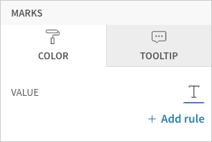
Add conditional formatting
Configure formatting rules rules (click + Add rule) in the Element properties > Marks > Color tab to change the metric value’s font color according to value-based conditions. This allows you to highlight or emphasize the value when it meets the specified conditions.
Customize the value font
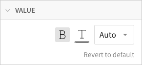
Customize the metric value’s font weight, color, and size in the Element format > Value section.
NoteThe Value format settings apply to the metric value only and don’t affect the element title or comparison font. If you change the font color in this section, the font color is also changed in the element’s Color property.
Customize the comparison display
Customize the comparison display in the Element format > Comparison section.

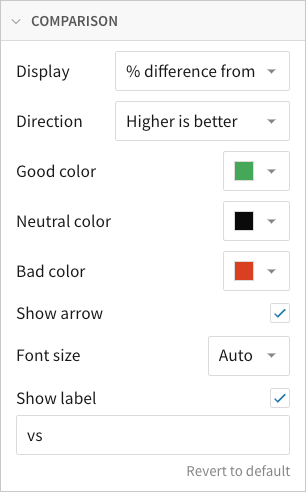
In addition to modifying the color indicators, you can change the font size of the comparison value, show or hide the label, and customize the label content.
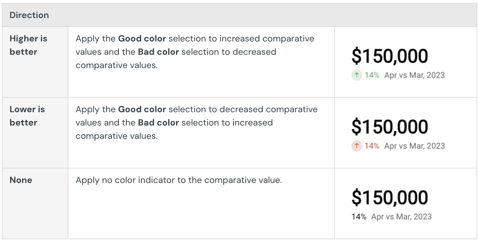
You can also select the type of comparison displayed and identify the favorable direction of the comparison. The Direction setting determines when the Good color, Neutral color, and Bad color indicators apply to the comparison value.
Customize the trend line
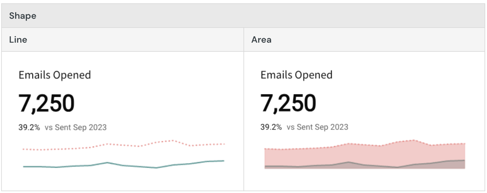
Customize the trend line in the Element format > Trend section.
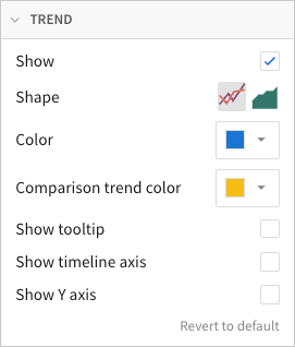
In addition to showing and hiding the trend line, you can select the trend line shape (line or area) and customize its colors.
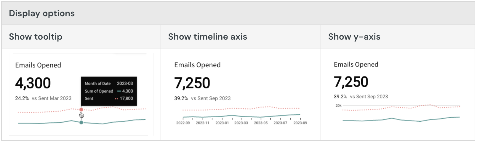
You can also enable tooltips on hover, display the x-axis with timeline tick marks and labels, and display the y-axis with grid lines and labels.
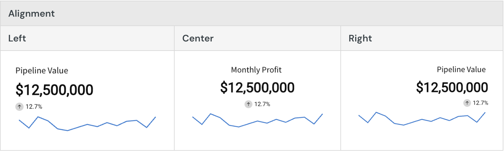
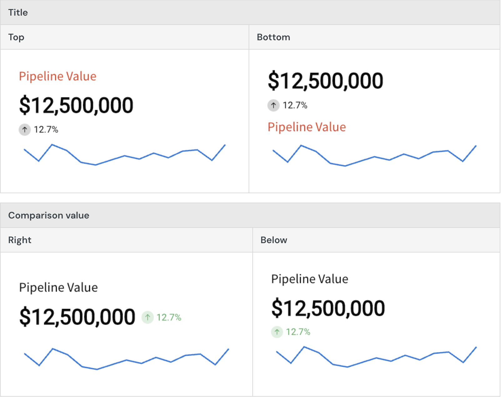
Customize the chart layout
Customize the chart layout in the Element format > Layout section.
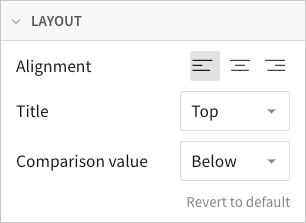
Change the alignment of the text components, and select the location of the title and comparison value.
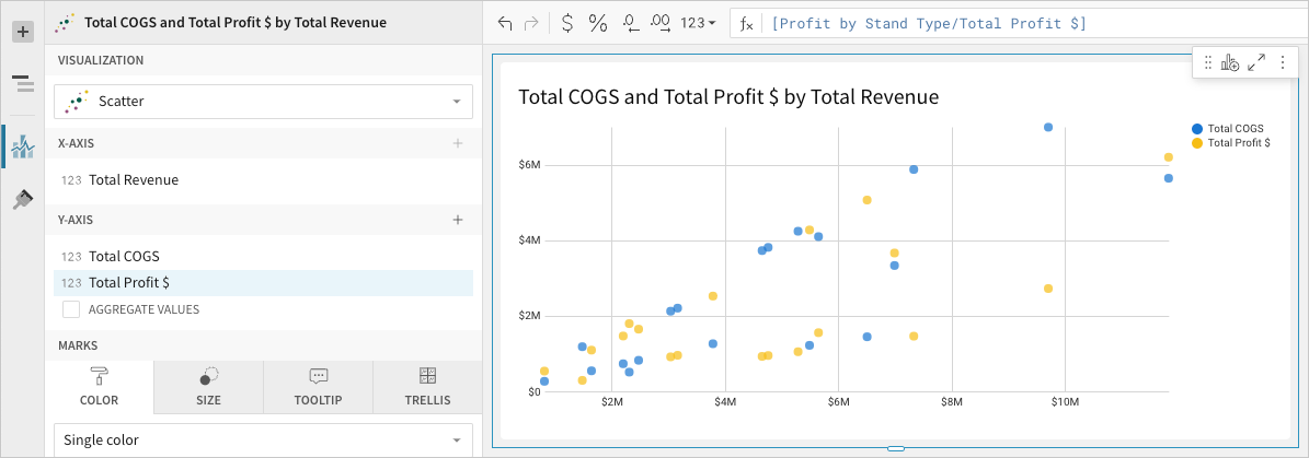
Build a scatter plot
Scatter plots are typically used to demonstrate a correlation (or lack thereof) between two different variables. Create basic scatter plots to assess patterns, trends, and outliers in your dataset. You can also build advanced charts to include additional variables, plot trend lines, and display data points across quadrants.
This document details basic scatter plot requirements and introduces key properties and format options to help you enhance your Dashboard visualizations.

Example use cases:Education analytics: Assess college grades and post-college income to determine a possible correlation between academic performance and job earnings.
Environmental health analytics: Compare metro health index scores by neighborhood air pollution amount to analyze patterns and identify areas needing intervention.
Retail analytics: Track price changes and sales amounts by profit to understand consumer response to price changes and identify where pricing did not affect profit.
User requirements
The ability to create scatter plots and other visualizations requires the following:
- You must be assigned an account type with the Edit Dashboard and/or Explore Dashboard permission enabled.
- You must be the Dashboard owner or be granted Can explore or Can edit Dashboard permission.
Dashboard prerequisite
Before you can build a scatter plot, you must add a new visualization element and select a data source.
At the core of every visualization is an underlying data table (derived from the data source) that supplies the information visualized by the chart. As you build a scatter plot, Lifesight automatically groups, aggregates, and calculates the underlying data to create source columns for various visualization properties. You can view the underlying data table while configuring the chart to see how the data is applied.
Scatter plots support up to 25,000 data points. If the configurations result in a data set that exceeds this limit, the chart displays the first 25,000 data points, and a warning message indicates that the chart is incomplete. To reduce the number of data points, aggregate the values or apply data filters to the visualization or source element.
Basic scatter plot requirements
To display a scatter plot, configure the following properties in the Element properties tab:
- Visualization - chart type displayed in the Dashboard
- X-axis - source column that defines the x-axis (horizontal axis) variable
- Y-axis - source column that defines the y-axis (vertical axis) variable
In a scatter plot, data points express the intersection of different variables on the x- and y-axis (like revenue and COGS, temperature and precipitation, page views and clicks).
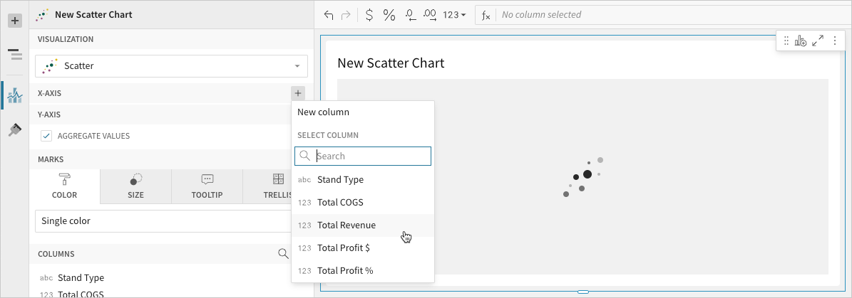
Select the visualization type
Once you add a new visualization to a Dashboard, select the visualization type:
- In the Visualization property, click the dropdown field and select Scatter from the list.
You can also use this dropdown field to convert an existing visualization to a different type. Lifesight retains all property and format configurations shared by the initial and new type. Unshared properties and formatting are not saved or restored if you further convert the visualization.
Define the x-axis variable
Configure a source column to define the x-axis variable.
- In the X-axis property, click + Add column and select an option from the menu:
- To plot values from an existing column, search or scroll the Select column list and select the preferred column name.
- To plot values based on a custom formula, select New column and enter a formula in the toolbar.
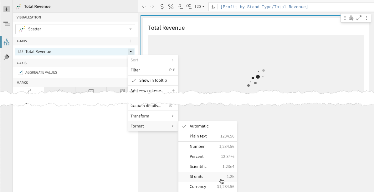
- [optional] Control how the source column data is grouped and displayed in the chart:
- Hover over the source column name, then click the caret () to open the column menu.
- Hover over any of the following items, then select the preferred option
- Truncate date - Group date values by the selected interval or unit of measure.
- Transform - Convert the column to the selected data value type.
- Format - Display axis and data labels in the selected format.
Availability of column menu items and corresponding options varies depending on the column’s data value type (for example, Truncate date is available for date values only).
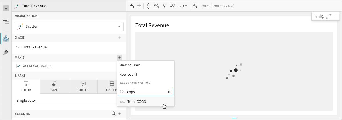
Define the y-axis variable
Configure a source column to define the y-axis variable. Lifesight aggregates y-axis values that correlate with the same x-axis value.
- In the Y-axis property, click + Add calculation and select an option from the menu:
- To aggregate values of an existing column, search or scroll the Aggregate column list and select the preferred column name.
- To calculate values based on a custom formula, select New column and enter the formula in the toolbar.
- To count the number of rows associated with each category, select Row count.
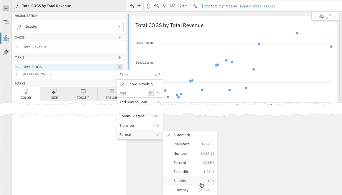
- [optional] Control how the source column data is calculated and displayed in the chart:
- Hover over the source column name, then click the caret () to open the column menu.
- Hover over any of the following items, then select the preferred option:
- Set aggregate - Calculate values based on the selected aggregation method.
- Transform - Convert the column to the selected data value type.
- Format - Display axis and data labels in the selected format.
To plot the source column data without aggregating values, clear the Aggregate values checkbox in the Y-axis property. If this results in an incomplete chart that exceeds the 25,000 data point limit, reaggregate the values or apply data filters to reduce the number of data points.
- [optional] Repeat the previous steps to add multiple y-axis source columns. Lifesight plots each as a separate point series on the chart.
- [optional] Lifesight auto-generates source column names and chart titles to reflect the visualized data, but you can customize these fields as needed:
- To rename a source column, double-click the column name in the X-axis or Y-axis property, then enter a new name. Changes are reflected in the default chart title.
- To edit the chart title, double-click the title in the visualization, then enter a new title.
Advanced scatter plot properties and formatting
Lifesight features various properties and format options that give you the flexibility to build advanced scatter plots and variations, including bubble charts and quadrant charts.
The following sections introduce configurations that can enhance your scatter plots and help you deliver specific insights with meaningful and actionable information.
Configure mark colors
Configure point mark colors in the Element properties > Marks > Color tab to differentiate data, add a color category, or create a color scale.
Multiple variables in the y-axis result in a multi-series scatter plot in which each data series represents a measure of a different variable. The By category color setting can also generate a multi-series scatter plot, but the resulting series represent sub-categories that measure the same variable.💡As with axis variables, you can control how color category and color scale source column data is calculated and displayed in the chart.
Add conditional formatting
When you select Single color in the Element properties > Marks > Color tab, you can configure formatting rules (+ Add rule) that determine point mark colors according to value-based conditions. This creates exceptions to the single-color selection, allowing you to highlight values that meet the specified conditions.
Example:
Configure mark size
Configure point mark size in the Element properties > Marks > Size tab to add a size variable and create a bubble chart.
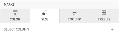
Select a source column to define the size variable. Lifesight aggregates values that correlate with the same x-axis value, then proportions the points based on an auto-generated size range. To modify the relative sizing, see Customize Point Style below.
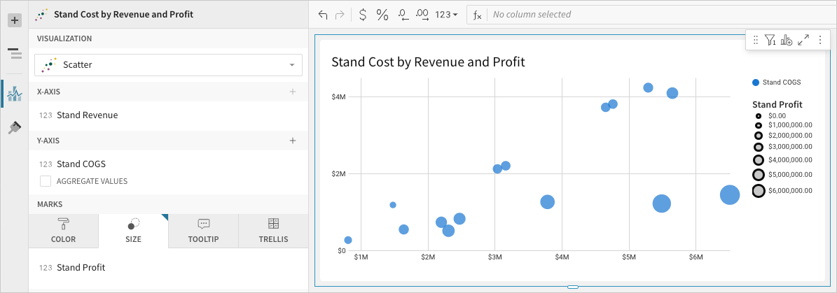
As with the axis variables, you can control how the size variable source column data is calculated and displayed in the chart.
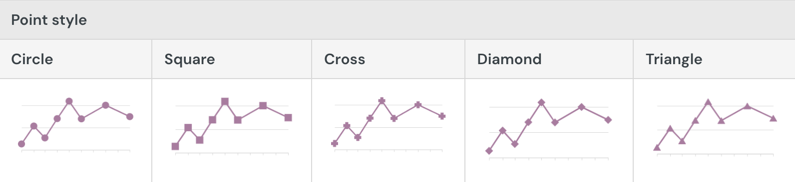
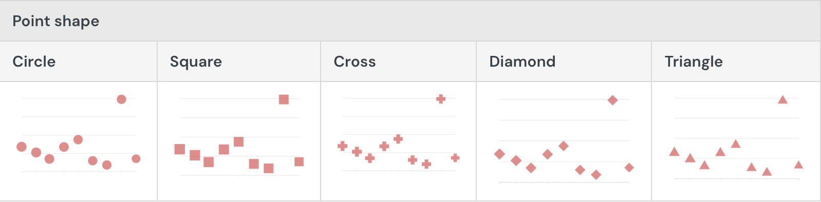
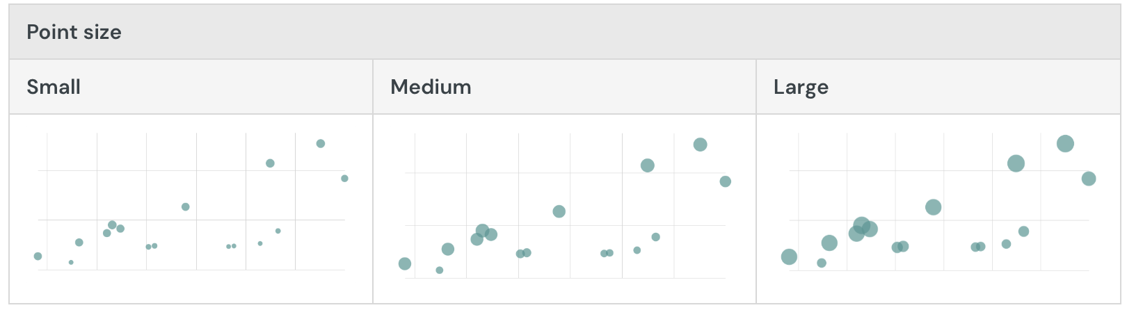
Customize point style
Customize point styles in the Element format > Point style section. When the scatter plot contains multiple y-axis variables, you can modify the different data series individually or together.
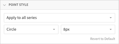
By default, scatter plot points are circular. You can change the point shape to differentiate multiple data series:
If the chart doesn’t include a size variable, you can customize the point size in pixels (2-15px) to optimize readability. Otherwise, you can apply relative sizing to change the minimum point size in the range:
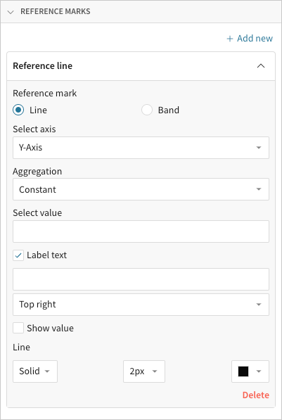
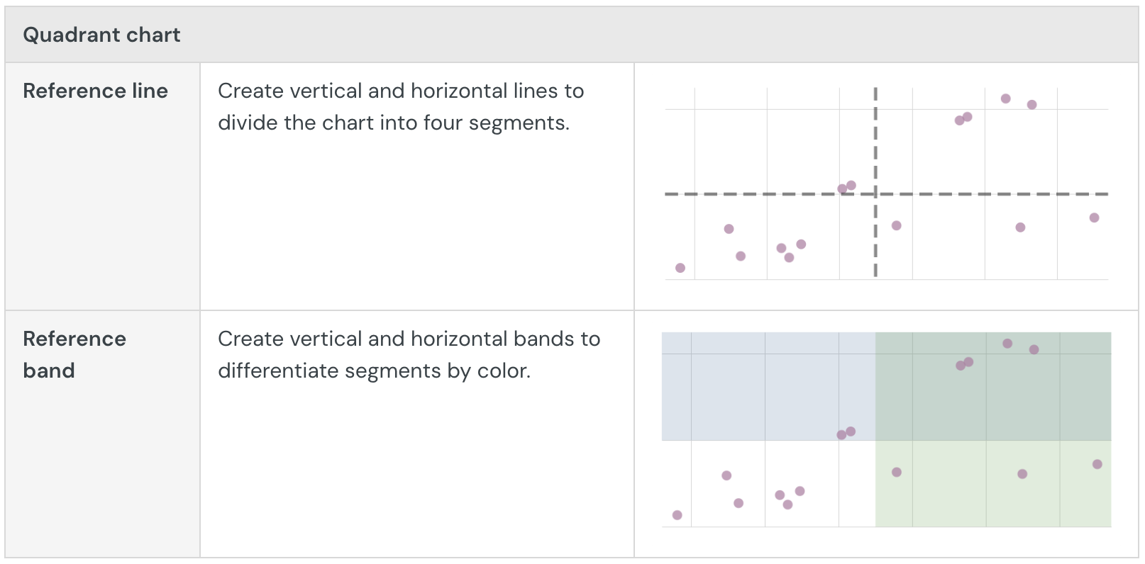
Add reference marks
Add reference marks in the Element format > Reference marks section to demarcate goals, baselines, or other benchmarks. With scatter plots, you can also use reference marks to create quadrant charts.
Build a Sankey diagram
Sankey diagrams are typically used to assess the flow and change of data between stages in a process or system. Create simple Sankey diagrams to demonstrate data distribution, workflows, networks, and more, or build advanced multi-level diagrams to analyze complex data relationships and identify changes in variables across stages, categories, or periods.
This document details basic Sankey diagram requirements and introduces key properties and format options to help you enhance your Dashboard visualizations.
Example use cases:
- Energy analytics: Measure electricity load and consumption to understand facility performance and gain insight into the origins and transformation of energy.
- Financial analytics: Track annual spend by department, division, and expense category to understand the flow of money and analyze budget vs. spend distribution.
- Marketing analytics: Follow website visitor activity by parent domain and subsequent page visits to understand user navigation and assess website architecture deficiencies.
User requirements
The ability to create Sankey diagrams and other visualizations requires the following:
- You must be assigned an account type with the Edit Dashboard and/or Explore Dashboard permission enabled.
- You must be the Dashboard owner or be granted Can explore or Can edit Dashboard permission.
Dashboard prerequisite
Before you can build a Sankey diagram, you must add a new visualization element and select a data source.
At the core of every visualization is an underlying data table (derived from the data source) that supplies the information visualized by the chart. As you build a Sankey diagram, Lifesight automatically groups, aggregates, and calculates the underlying data to create source columns for various visualization properties. You can view the underlying data table while configuring the chart to see how the data is applied.
Sankey diagrams support up to 25,000 data points. If the configurations result in a data set that exceeds this limit, the chart displays the first 25,000 data points, and a warning message indicates that the chart is incomplete. To reduce the number of data points, aggregate the values or apply data filters to the visualization or source element.
Basic Sankey diagram requirements
To create a Sankey diagram, configure the following properties in the Element properties panel:
- Visualization - chart type displayed in the Dashboard
- Stages - source columns that define the stages and categories
- Value - source column that defines the data path variable
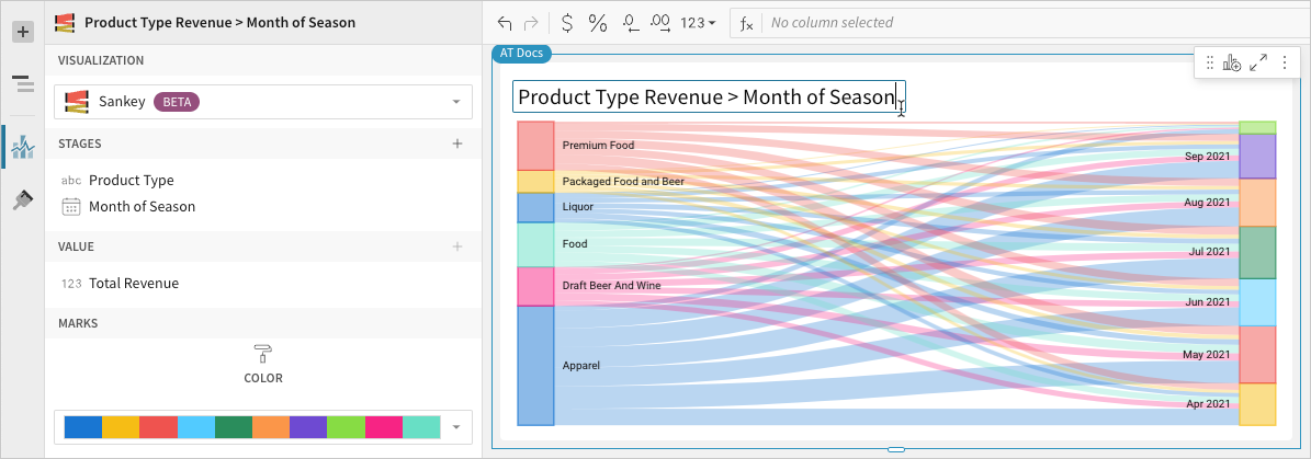
In a Sankey diagram, stages consist of categories presented as individual rectangular nodes that represent data flow start and end points. Data paths illustrate the direction and quantity of data (like energy consumption, expense, page visitors) flowing between categories, with path widths proportional to the value of the data path variable.
Select the visualization type
Once you add a new visualization to a Dashboard, select the visualization type:
In the Visualization property, click the dropdown field and select Sankey from the list.
You can also use this dropdown field to convert an existing visualization to a different type. Lifesight retains all property and format configurations shared by the initial and new type. Unshared properties and formatting are not saved or restored if you further convert the visualization.
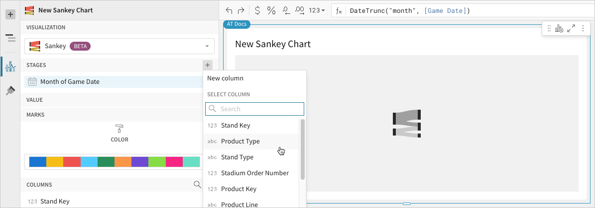
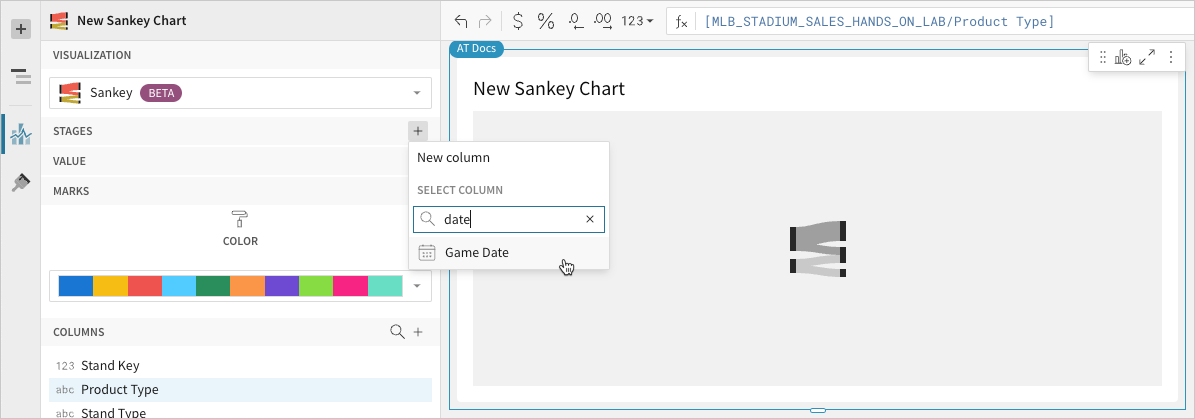
Define the stages and categories
Configure source columns to define the stages and categories.
- In the Stage property, click Add column and select an option from the menu:
- To generate stage categories based on distinct values in an existing column, search or scroll the Select column list and select the preferred column name.
- To generate stage categories based on a custom formula, select New column and enter the formula in the toolbar.
You can also select or replace an existing column by dragging and dropping a column name from the Columns list to the Stage property.

- [optional] Control how the source column data is categorized and displayed in the chart:
- Hover over the source column name, then click the caret () to open the column menu.
- Hover over any of the following items, then select the preferred option:
- Truncate date - Categorize date values by the selected interval or unit of measure.
- Transform - Convert the column to the selected data value type.
- Format - Display data labels in the selected format.
Availability of column menu items and corresponding options varies depending on the column’s data value type (for example, Truncate date is available for date values only).
- Repeat the previous steps to configure additional stages (a minimum of two stages are required).
Lifesight charts the stages (as start and end points) in order of precedence, from top to bottom. Drag and drop source column names in the Stage property to reorder them as needed.
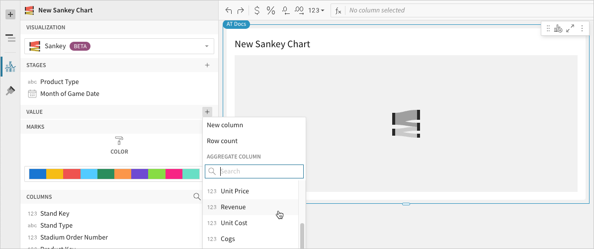
Define the variable
Configure a source column to define the data path variable. Lifesight automatically aggregates column values associated with the initial stage categories to measure the data flow starting points. Within each of these categories, Lifesight aggregates values associated with the subsequent stage categories, then plots these measures as data paths to the end points.
-
In the Value property, click Add calculation and select an option from the menu:
- To aggregate values of an existing column, search or scroll the Aggregate column list and select the preferred column name.
- To calculate values based on a custom formula, select New column and enter a formula in the toolbar.
- To count the number of rows associated with each stage name, select Row count.
 You can also select an existing column by dragging and dropping a column name from the Columns list to the Value property.
 -
[optional] Control how the source column data is calculated and displayed in the chart:
- To open the column menu, click the caret () to the right of the source column name.
- Hover over any of the following items and select the preferred option:
- Set aggregate - Calculate values based on the selected aggregation method.
- Transform - Convert the column to the selected data value type.
- Format - Display data labels in the selected format.
You can also use the toolbar to change the aggregation method (using the formula) and data label format. If the configurations results in an incomplete chart that exceeds the 25,000 data point limit, apply data filters to reduce the number of data points.
-
[optional] Lifesight auto-generates source column names and chart titles to reflect the visualized data, but you can customize these fields as needed:
- To rename a source column, double-click the column name in the Stage or Value property, then enter a new name. Changes are reflected in the default chart title.
- To edit the chart title, double-click the title in the visualization, then enter a new title.
Lifesight auto-generates the default chart title only. Once the title is customized, it no longer reflects changes to source columns and their names. For information about title customization, see Customize element title.
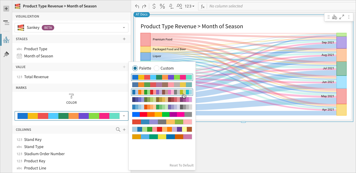
- [optional] In the Element properties > Marks > Color section, select or customize a color palette to apply to the category nodes and paths.
Build a funnel chart
Funnel charts are typically used to measure values across sequential stages in a linear process. Create funnel charts to evaluate inputs across each stage and discover potential issues and bottlenecks in a workflow.
This document details basic funnel chart requirements and introduces key properties and format options to help you enhance your Dashboard visualizations.

Example use cases:
- Marketing analytics: Monitor an email campaign pipeline to understand where most prospects are being lost, then assess opportunities for greater conversion.
- Sales analytics: Track the number of prospects in each stage of the sales cycle to identify where most prospects are currently held, then assess investments in specific sales motions.
- HR analytics: Analyze recruiting process stages by demographics (like age, gender, and application submitted) to measure pipeline dropoff rate for specific candidate groups, then determine if dropoff exceeds expectations and indicates a need for process refinement.
User requirements
The ability to create funnel charts and other visualizations requires the following:
- You must be assigned an account type with the Edit Dashboard and/or Explore Dashboard permission enabled.
- You must be the Dashboard owner or be granted Can explore or Can edit Dashboard permission.
If you're granted Can explore access to the Dashboard, you can create and modify visualization properties and formatting in Explore mode, but you cannot publish your changes.
Dashboard prerequisite
Before you can build a funnel chart, you must add a new visualization element and select a data source.
At the core of every visualization is an underlying data table (derived from the data source) that supplies the information visualized by the chart. As you build a funnel chart, Lifesight automatically groups, aggregates, and calculates the underlying data to create source columns for various visualization properties. You can view the underlying data table while configuring the chart to see how the data is applied.
Basic funnel chart requirements
To display a funnel chart, configure the following properties in the Element properties panel:
- Chart - chart type displayed in the Dashboard
- Stage - source column that defines the stages
- Value - source column that defines the variable
In a funnel chart, stages reference nominal categories (like campaign pipeline, sales pipeline, recruitment stages) presented as a horizontal bars. A variable measures a value (like number of leads, prospects, candidates) for each stage and determines the width of each bar.
The first stage, shown at the top of the chart, typically represents the initial input of the process and corresponds with the largest stage value (and widest bar). Because value dropoff occurs as data flows through the process, each stage measures a subset of the previous stage value. As a result, the chart progressively narrows and creates a funnel shape.
Select the chart type
Once you add a new chart to a Dashboard, select the chart type:
- In the Visualization property, click the dropdown field and select Funnel from the list.
Define the stages
Select a source column to define the stages.
When your data source includes a single column with stage names as values, follow the steps below and add this column to the Stage property. Alternatively, if the data source breaks down each stage as a distinct column of data, skip this step and aggregate the individual stage columns in the Value property (see Define the Variable).
- In the Stage property, click + Add column and select an option from the menu:
- To generate stage names based on distinct values in an existing column, search or scroll the Select column list and select the preferred column name.
- To generate stage names based on a custom formula, select New column and enter a formula in the toolbar.
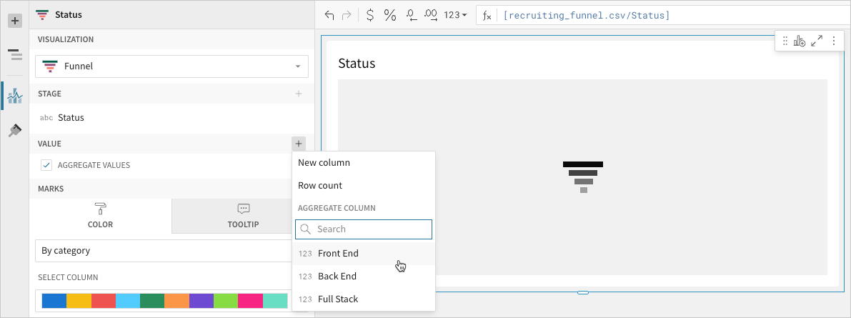
Define the variable
Configure a source column to define the variable. Lifesight automatically aggregates column values associated with the same stage.
-
In the Value property, click + Add calculation and select an option from the menu:
- To aggregate values of an existing column, search or scroll the Aggregate column list and select the preferred column name.
- To calculate values based on a custom formula, select New column and enter a formula in the toolbar.
- To count the number of rows associated with each stage, select Row count.
-
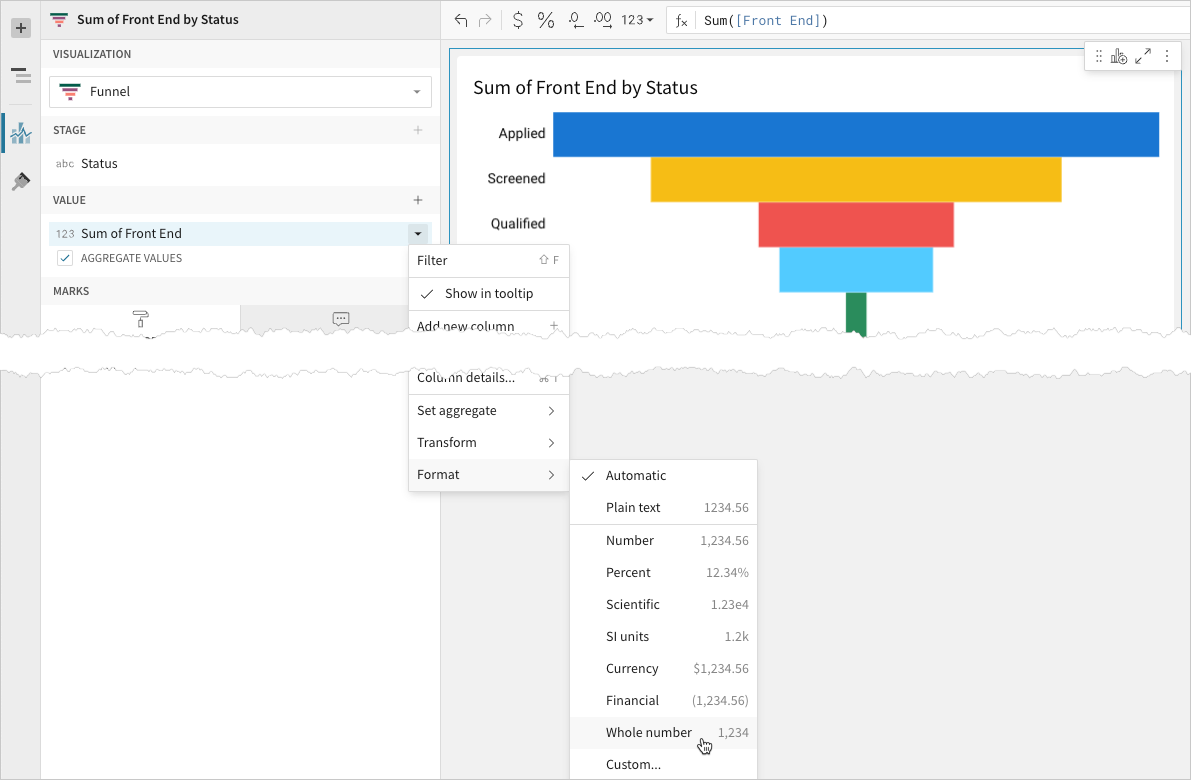
[optional] Control how the source column data is calculated and displayed in the chart:
- Hover over the source column name, then click the caret () to open the column menu.
- Hover over any of the following items and select the preferred option:
- Set aggregate - Calculate values based on the selected aggregation method.
- Transform - Convert the column to the selected data value type.
- Format - Display data labels in the selected format.
To plot the source column data without aggregating values, clear the Aggregate values checkbox in the Value property. If this results in an incomplete chart that exceeds the 25,000 data point limit, reaggregate the values or apply data filters to reduce the number of data points.
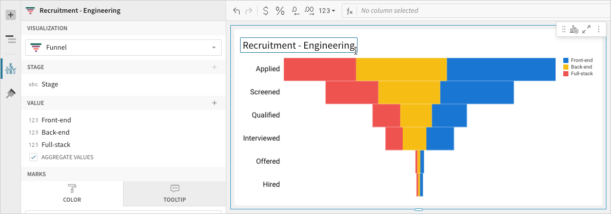
- [optional] Repeat the previous steps to configure multiple stage value source columns. Lifesight plots the columns as stacked series on the chart.
- [optional] Lifesight auto-generates source column names and chart titles to reflect the visualized data, but you can customize these fields as needed:
- To rename a source column, double-click the column name in the Stage or Value property, then enter a new name. Changes are reflected in the default chart title.
- To edit the chart title, double-click the title in the visualization, then enter a new title.
Advanced funnel chart properties and formatting
Lifesight features various properties and format options that give you the flexibility to build detailed funnel charts.
The following sections introduce configurations that can enhance your charts and help you deliver specific insights with meaningful and actionable information.
Configure mark colors
Configure chart mark colors in the Element properties > Marks > Color tab to differentiate data.
Customize data labels
Customize data labels representing conversion rates, stage values, and stage names in the Element format > Data labels section.
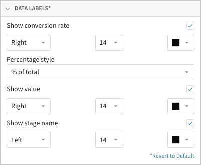
In addition to showing or hiding the different types of data labels, you can customize the font size and color of each.
You can also select the position of each data label type relative to the chart marks:
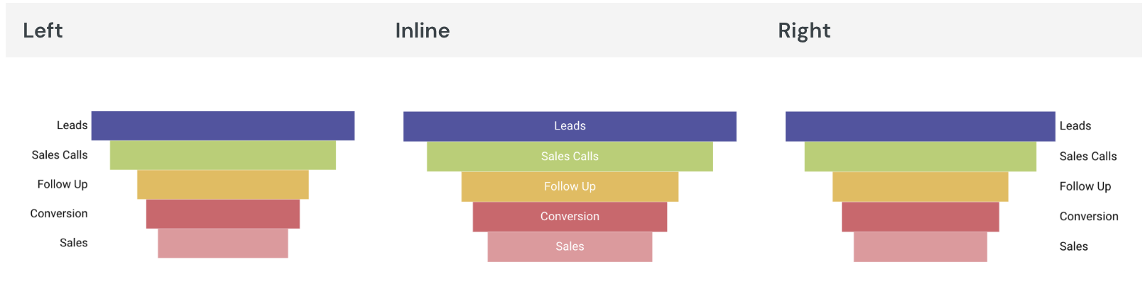
The funnel chart’s Color property may determine the availability of specific data labels and positions. For example, stage names can only be displayed inline when the chart features categorical colors that represent stages (see the By category details in Configure mark colors).
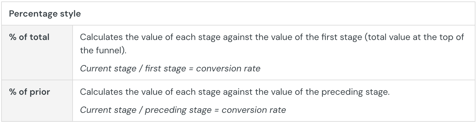
When you show conversion rates, you can choose a Percentage style option to determine how conversion rates are calculated:
Build a gauge chart
Gauge charts are typically used to display a measurable value against a radial scale. Create gauge charts to evaluate growth, assess performance, or track progress toward a goal.
This document details basic gauge chart requirements and introduces key properties and format options to help you enhance your Dashboard visualizations.

Example use cases:
- IT analytics: Measure implementation completion (as a percentage) to track a project’s progress.
- Manufacturing analytics: Track machine uptime (as a percentage) to monitor equipment performance.
- Customer experience (CX) analytics: Measure the net promoter score (NPS) for individual stores or customer service teams to gain insight into customer engagement and loyalty.
User requirements
The ability to create gauge charts and other visualizations requires the following:
- You must be assigned an account type with the Edit Dashboard and/or Explore Dashboard permission enabled.
- You must be the Dashboard owner or be granted Can explore or Can edit Dashboard permission.
If you're granted Can explore access to the Dashboard, you can create and modify visualization properties and formatting in Explore mode, but you cannot publish your changes.
Dashboard prerequisite
Before you can build a gauge chart, you must add a new visualization element and select a data source.
At the core of every visualization is an underlying data table (derived from the data source) that supplies the information visualized by the chart. As you build a gauge chart, Lifesight automatically aggregates the underlying data to calculate values for the visualization properties. You can view the underlying data table while configuring the chart to see the unaggregated data.
Basic gauge chart requirements
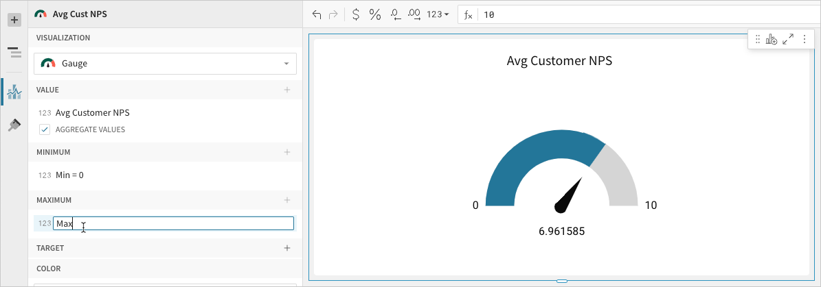
To display a gauge chart, configure the following properties in the Element properties panel:
- Visualization: chart type displayed in the Dashboard
- Value: source column that defines the measurable value
- Minimum: source column that defines the minimum gauge value
- Maximum: source column that defines the maximum gauge value
In a gauge chart, a single value is measured on a radial scale. The minimum and maximum values determine the range of the gauge and provide reference points for assessing the measurable value.
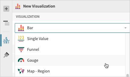
Select the visualization type
After you add a new visualization to a Dashboard, select the visualization type:
- In the Visualization property, click the dropdown field and select Gauge from the list.
You can also use this dropdown field to convert an existing visualization to a different type. Lifesight retains all property and format configurations shared by the initial and new type. Unshared properties and formatting are not saved or restored if you further convert the visualization.
Define the measurable value
Configure a source column to define the measurable value.
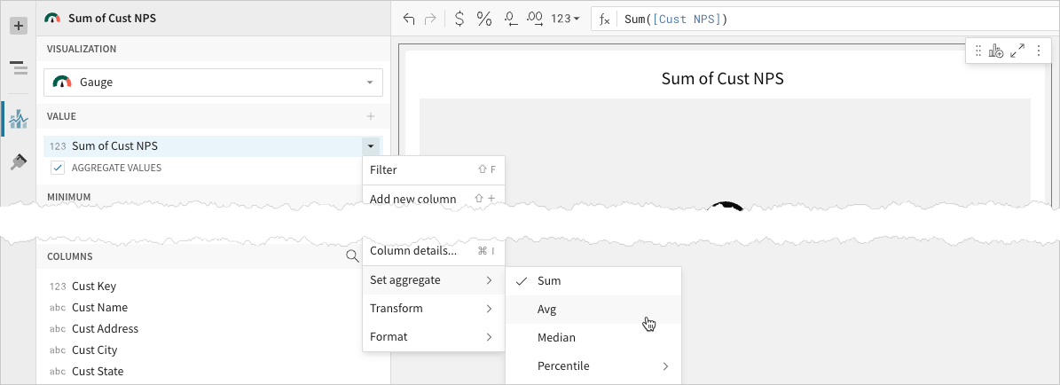
- In the Value property, click + Add calculation and select an option from the menu:
- To aggregate the values of an existing column, search or scroll the Aggregate column list and select the preferred column name.
- To apply a custom formula or constant value, select New column and enter the formula or value in the toolbar.
- To count the number of rows in the data source, select Row count.
You can also select or replace an existing column by dragging and dropping a column name from the Columns list to the Value property. - [optional] Control how the data is calculated and displayed in the chart:
-
Hover over the source column name, then click the caret () to open the column menu.
-
Hover over any of the following items, then select the preferred option:
- Set aggregate - Calculate the value based on the selected aggregation method.
- Transform - Convert the column to the selected data value type.
- Format - Display the data label in the selected format.
-
You can also use the toolbar to change the aggregation method (using the formula) and data label format.
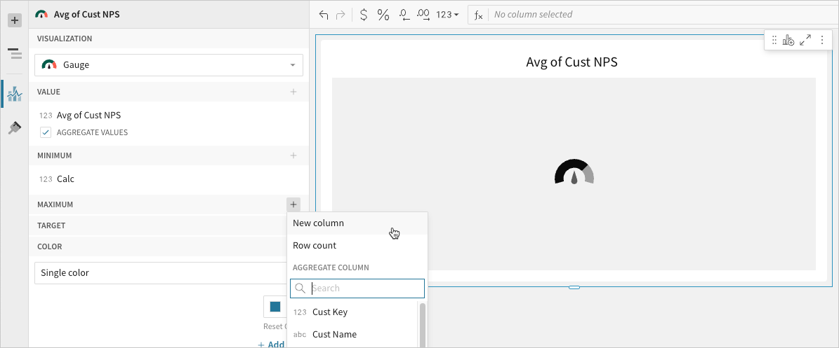
Define the gauge range
Configure a source column to define the minimum and maximum gauge values.
- In the Minimum property, click + Add calculation and select an option from the menu:
- To aggregate the values of an existing column, search or scroll the Aggregate column list and select the preferred column name.
- To apply a custom formula or constant value, select New column and enter the formula or value in the toolbar.
- To count the number of rows in the data source, select Row count.
You can also select or replace an existing column by dragging and dropping a column name from the Columns list to the Minimum property.
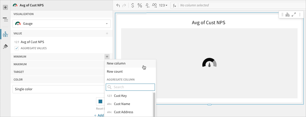
- In the Maximum property, click Add calculation and select an option from the menu:
- To aggregate the values of an existing column, search or scroll the Aggregate column list and select the preferred column name.
- To apply a custom formula or constant value, select New column and enter the formula or value in the toolbar.
- To count the number of rows in the data source, select Row count.
You can also select or replace an existing column by dragging and dropping a column name from the Columns list to the Maximum property.
- To aggregate the values of an existing column, search or scroll the Aggregate column list and select the preferred column name.
- [optional] Lifesight auto-generates source column names and chart titles to reflect the visualized data, but you can customize these fields as needed:
- To rename a source column, double-click its name in the Value, Minimum, or Maximum property, then enter a new name. Changes to the Value property are reflected in the default chart title.
- To edit the chart title, double-click the title in the visualization, then enter a new title.
Lifesight auto-generates the default chart title only. Once the title is customized, it no longer reflects changes to the Value property.
Advanced gauge chart properties and formatting
Lifesight features various properties and format options that give you the flexibility to build detailed gauge charts.
The following sections introduce configurations that can enhance your charts and help you deliver specific insights with meaningful and actionable information.
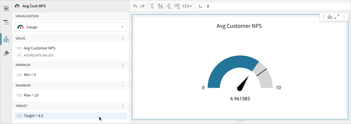
Configure target value
Configure a target value in the Element properties > Target property to mark a goal or benchmark on the gauge. The Target property can be configured in the same way as the Value, Minimum, and Maximum properties.
Configure chart colors
Configure chart colors in the Element properties > Color property.
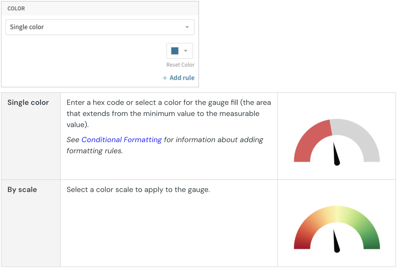
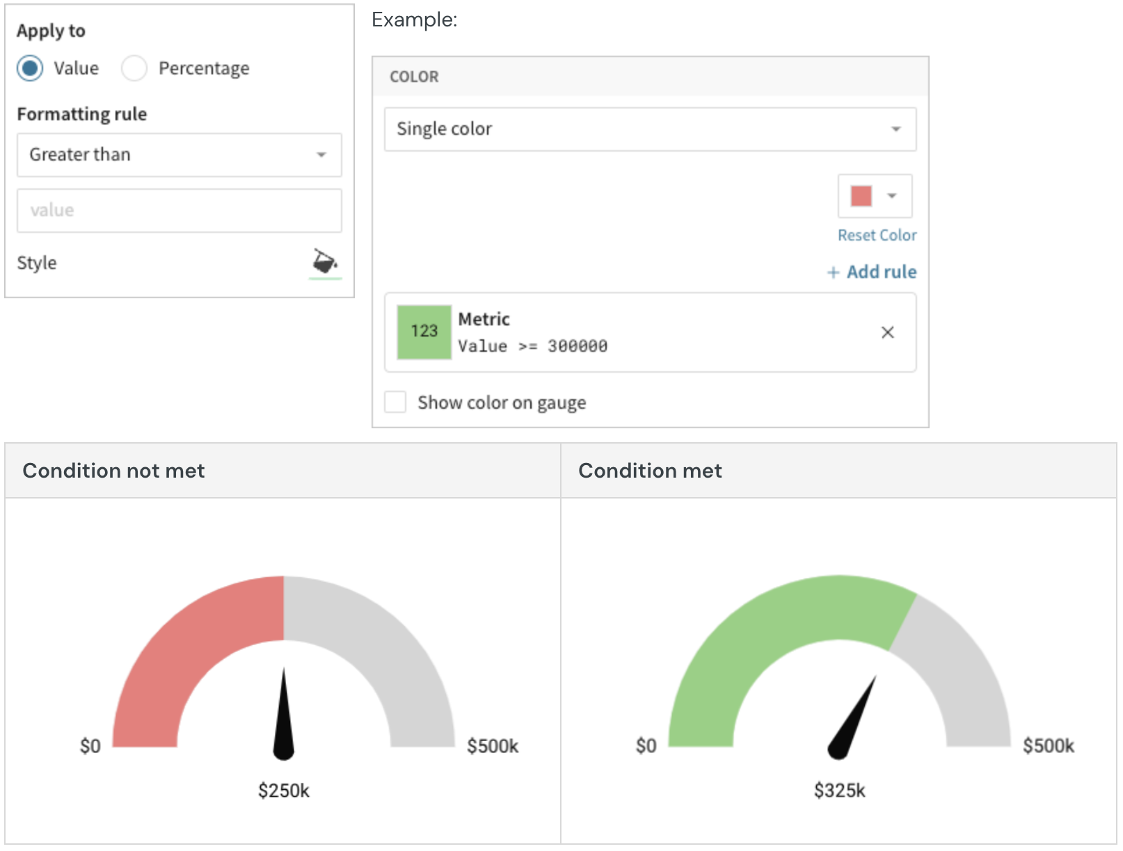
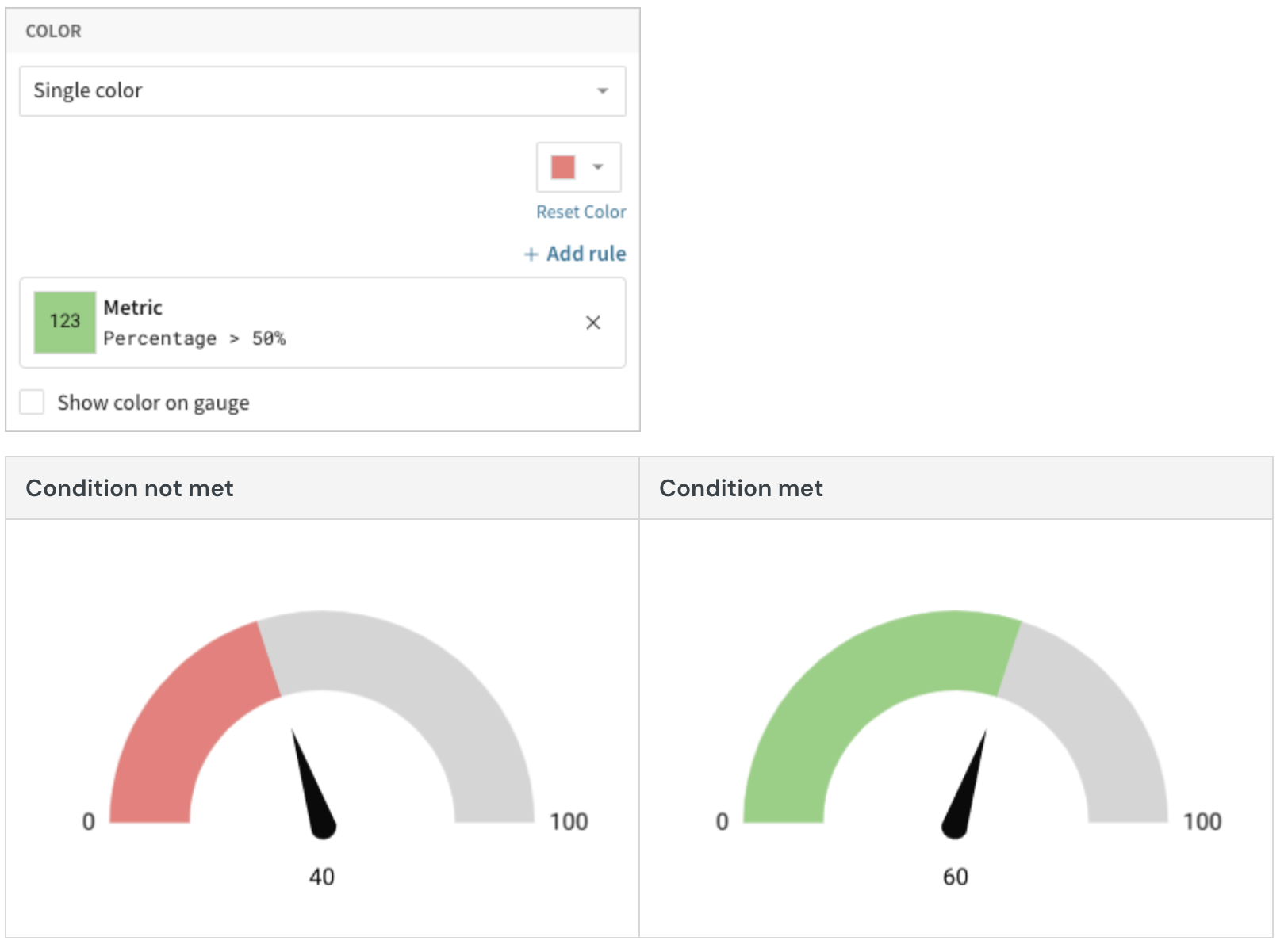
Add conditional formatting
When you select Single color in the Element properties > Color property, you can configure formatting rules (+ Add rule) that determine the gauge fill or gauge scale color according to value- or percentage-based conditions.
By default, conditional formatting applies to the gauge fill color (representing the measurable value), but you can apply rules to the gauge scale by selecting the Show color on gauge checkbox. This option hides the gauge fill and conditionally formats segments of the gauge based on values or percentages along the radial scale.
Example:
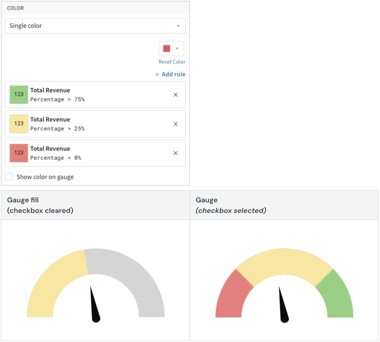
When the conditions of multiple rules are met, Lifesight applies the formatting rules in order of precedence, from top to bottom. Drag and drop rule blocks to reorder them as needed.
When you create a value-based rule, Lifesight evaluates the measure or gauge scale value. If the value meets the conditions defined in the Formatting rule fields, the color selected in the Style field applies to the gauge fill or gauge scale.
Example:
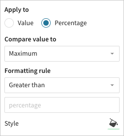
When you create a percentage-based rule, Lifesight evaluates the measure or gauge scale value relative (as a percentage) to the maximum or target value, depending on the rule configuration. If the percentage meets the conditions defined in the Formatting rules field, the color selected in the Style field applies to the gauge fill or gauge scale.
Example:
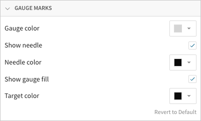
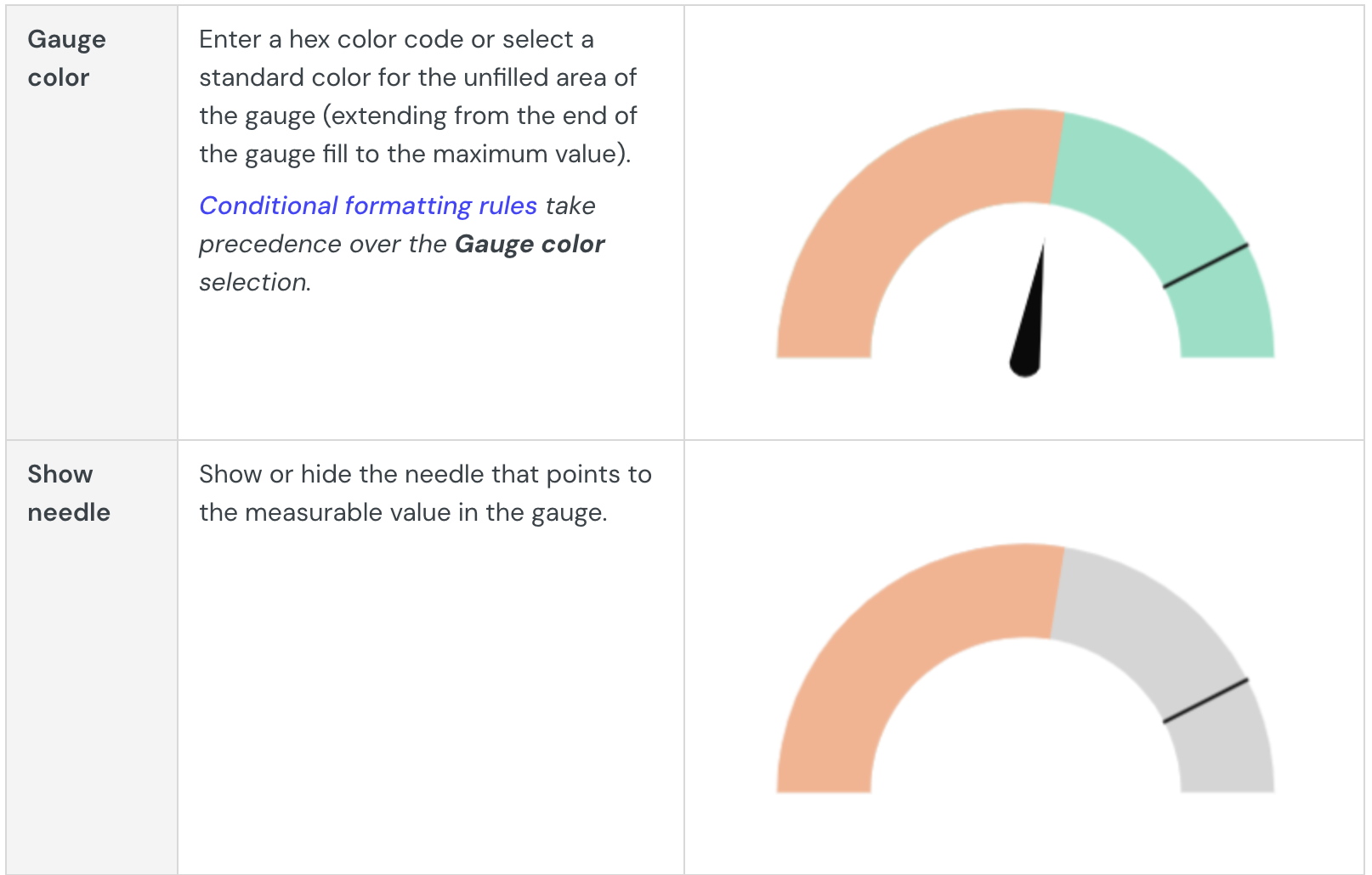
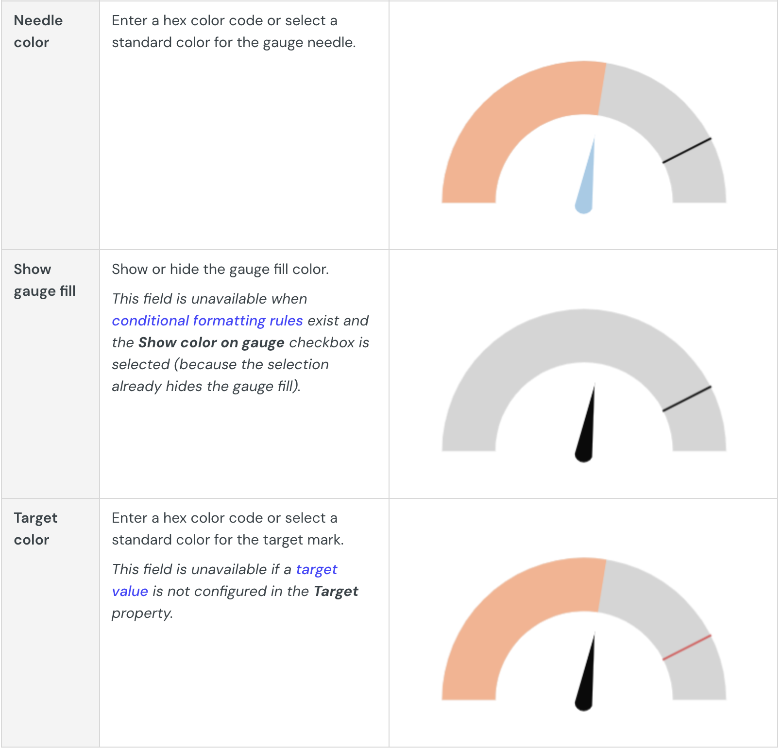
Customize gauge marks
Customize gauge marks (gauge, needle, and target) in the Element format > Gauge marks section.
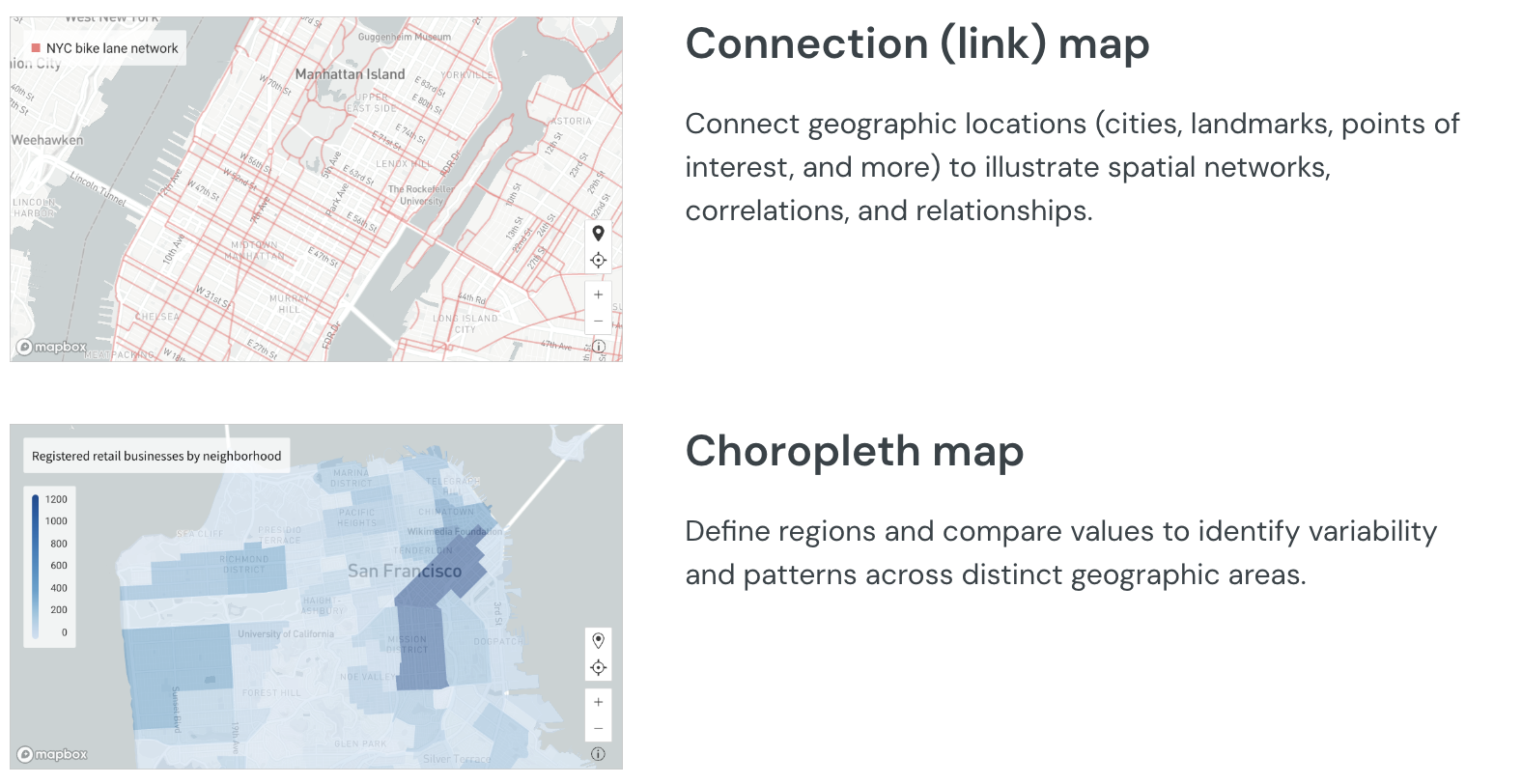
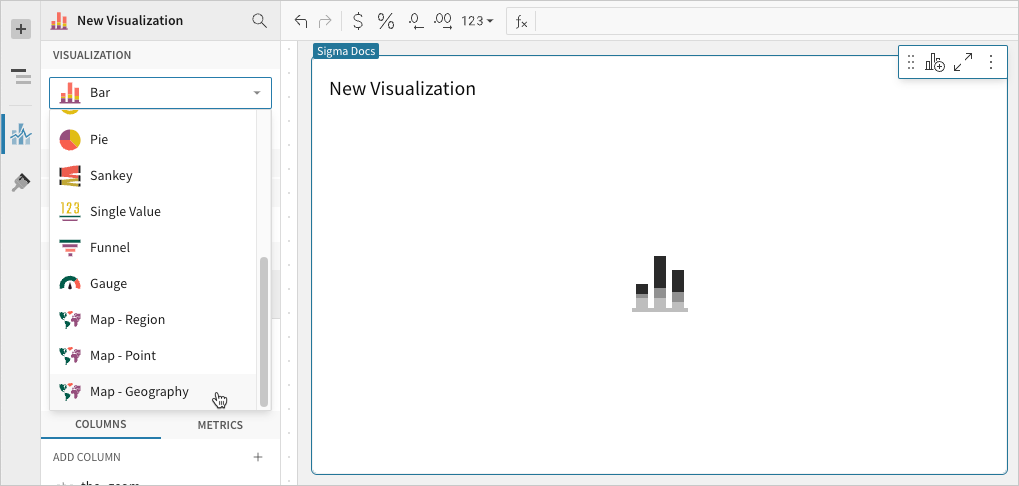
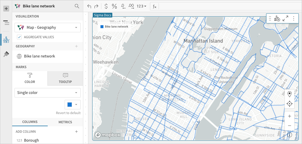
Build a geography map
Geography maps (Map - Geography visualization type) support datasets with geography data (WKT format) or variant data (GeoJSON format) and are typically used to illustrate geospatial objects on a map. Create a connection map to display spatial networks, correlations, and relationships, or build a choropleth map to identify variability and patterns across distinct geographic areas.
Example use cases:
- Land use analytics: Represent land parcels by zoning code to identify land use patterns and conflicts with proximal areas
- Marketing analytics: Quantify customers across specific regions to analyze customer distribution and understand market reach.
- Environmental analytics: Map oil and gas pipelines to assess proximity to residential areas and natural resources.
User requirements
The ability to create geography maps and other visualizations requires the following:
- You must be assigned an account type with the Create, edit, and publish Dashboards and/or Explore Dashboards permission enabled.
- You must be the Dashboard owner or be granted Can explore or Can edit Dashboard permission.
If you’re granted Can explore access to the Dashboard, you can create and modify visualization properties and formatting in Explore mode, but you cannot publish your changes.
Data prerequisites
A geography map requires one of the following data types:
- Geography data (WKT)
- Variant data (GeoJSON)
If your dataset isn’t compatible, you may be able to use functions (such as type or geography functions) to convert data to a supported type. Alternatively, when building a choropleth map, you can also use the Map - Region visualization.
Geography map variations
The Map - Geography visualization doesn't support point (link) maps.However, you can build point maps using the Map - Point visualization if your dataset contains geospatial data that represents points.
If points are represented by the geography data type, use the Latitude and Longitude functions to extract the coordinates from the WKT format. If points are represented by the variant data type, select the Extract columns option in the column menu to extract the coordinates from the GeoJSON format. You can then plot the extracted data in the Map - Point visualization.
Basic geography map configurations
Geography maps require the following element properties:
- Visualization: chart type used to illustrate the data
- Geography: source column that defines the geospatial objects
At the core of every visualization is an underlying data table (derived from the data source) that supplies the information visualized by the chart. As you build a geography map, Lifesight automatically calculates and structures the data to map the element properties to source columns in the underlying data table. For information about how to view the underlying data while you configure the chart, see Maximize or Minimize a Data Element.
Add a geography map
Create a new visualization element and designate it as a geography map.
- Open a Dashboard in Explore or Edit mode and add a new visualization element.
- In the new element’s Visualization property, click the dropdown field and select Map - Geography from the list.
Define the geospatial objects
Configure a source column that defines the geospatial objects (lines or polygons) representing landmarks, routes, regions, or other features. The column must contain geography data in WKT format or variant data in GeoJSON format.
-
In the Geography property, click Add column and select an option from the menu:
- To map objects from an existing column, search or scroll the Select geography/variant column list and select the column name.
- To create a new column using a custom formula, select Add new column and enter the formula or value in the toolbar.
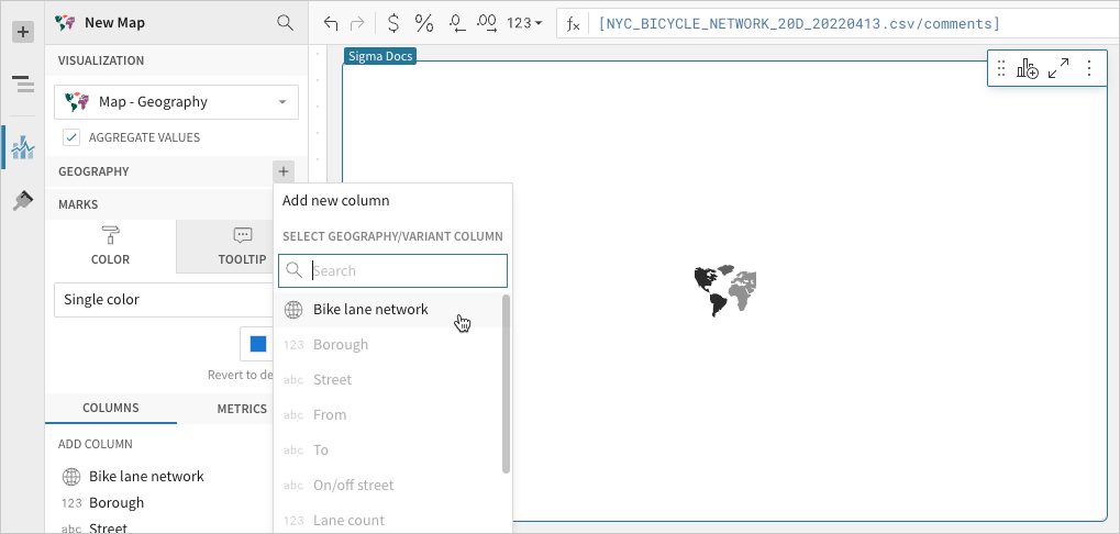
When the Geography property is configured, the map illustrates the geospatial objects represented by the source column data.
Advanced geography map properties and formatting
Configure mark colors
Configure the line or polygon mark colors in the Element properties > Marks > Color tab to visualize patterns, highlight variations, improve readability, and more.
Customize tooltip fields
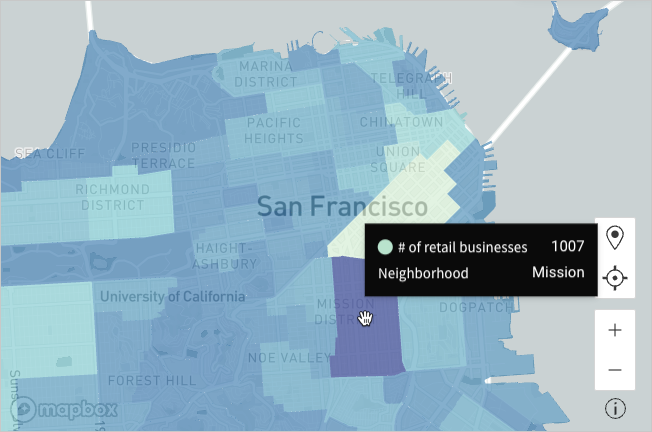
Configure source columns in the Element properties > Marks > Tooltip property to add fields to the map tooltips.
If a source column is configured in the Marks > Color property, its values are automatically displayed in the tooltips. For information about changing tooltip defaults and adding fields, see Customize chart mark tooltips fields.
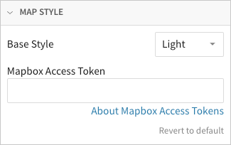
Change map style
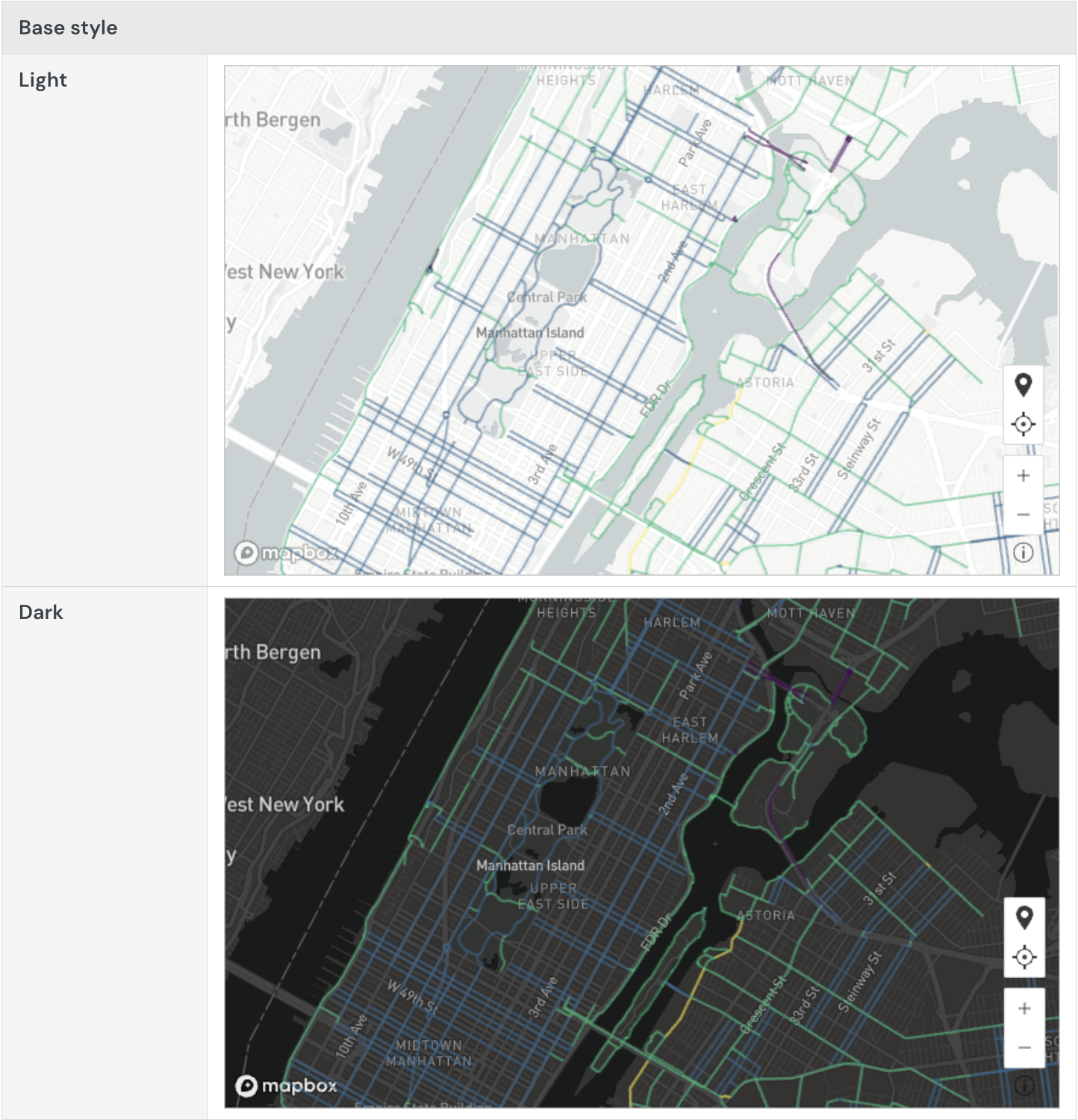
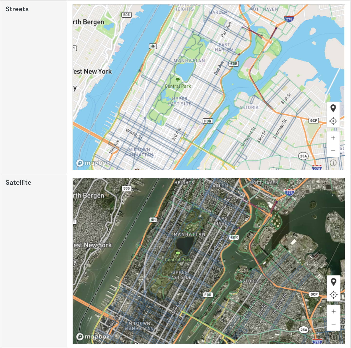
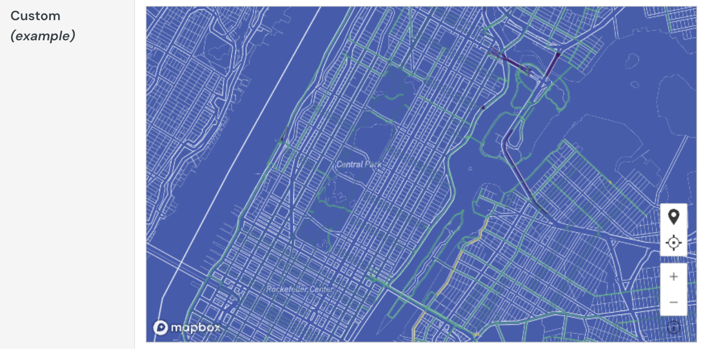
Change the base style of your map in the Element format > Map style section.
Build a waterfall chart
Waterfall charts are typically used to show changes in one or two categories of data over a period.
This document details basic waterfall chart requirements and introduces key properties and format options to help you enhance your Dashboard visualizations.
Example use cases:
- Accounting analytics: Measure the positive and negative contributions to an overall budget.
- Financial analytics: Track revenue and spend for a project, department, or an entire organization.
- Retail analytics: Track positive and negative foot traffic over time for a store or region.
- HR analytics: Measure employee retention rates as part of total employee headcount tracking.
User requirements
The ability to create waterfall charts and other visualizations requires the following:
- You must be assigned an account type with the Edit Dashboard and/or Explore Dashboard permission enabled.
- You must be the Dashboard owner or be granted Can explore or Can edit Dashboard permission.
Basic waterfall chart requirements
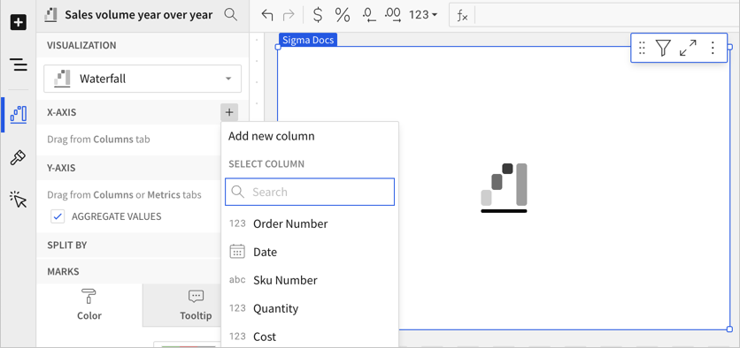
To plot a waterfall chart, configure the following properties in the Element properties tab:
- Visualization: Chart type displayed in the Dashboard
- X-axis: Source column that defines the x-axis (horizontal axis) categories or variable
- Y-axis: source column that defines the y-axis (vertical axis) categories or variable
In a waterfall chart, one axis typically represents ordinal or nominal categories (like stages, regions, departments) presented as vertical or horizontal bars. The other axis represents a variable that measures a value (like sales, leads, expenses) for each category and determines the height of the corresponding bar. The type of data affiliated with each axis depends on the chart orientation, which you can modify at any time.
At the core of every visualization is an underlying data table (derived from the data source) that supplies the information visualized by the chart. As you build your chart, Lifesight automatically calculates and structures the data to map the element properties to source columns in the underlying data table.
Add a waterfall chart
Create a new visualization element and designate it as a waterfall chart.
- Open a Dashboard in Explore or Edit mode and add a new visualization element.
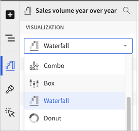
- In the Visualization property, click the dropdown field and select Waterfall from the list.
You can also use this dropdown field to convert an existing visualization to a different type. Lifesight retains all property and format configurations shared by the initial and new type. Properties and formatting not shared by the new type are not retained.
Define the categories
Define the categories for the chart by configuring a source column to use. Because waterfall charts are best for showing change over time, select a date column:
- In the X-axis property, click Add column and select an option from the menu:
- To generate categories based on distinct values in an existing column, search or scroll the Select column list and select the column name.
- To generate categories based on a custom formula, select New column and enter the formula in the toolbar.
Select or replace an existing column by dragging and dropping a column name from the Columns list to the applicable axis property.
- [optional] Adjust how the source column data is categorized and displayed in the chart:
- Hover over the source column name, then click the caret () to open the column menu.
- Hover over any of the following items, then select option you want to use:
- Truncate date - Categorize date values by the selected interval or unit of measure.
- Transform - Convert the column to the selected data value type.
- Format - Display axis and data labels in the selected format.
Availability of column menu items and corresponding options varies depending on the data type of the column. For example, Truncate date is only available for date values.
Define the variable
Define the chart variable, or what has changed over time, by configuring a source column. When you add a source column, Lifesight automatically aggregates values associated with the same chart category.
- In the Y-axis property, click Add calculation and select an option from the menu:
- To aggregate values of an existing column, search or scroll the Aggregate column list and select the column name.
- To calculate values based on a custom formula, select New column and enter the formula in the toolbar.
- To use a count the number of rows associated with each category, select Row count.
This visualization supports up to 25,000 data points. If the configurations result in a data set that exceeds this limit, the visualization displays the first 25,000 data points, and a warning message indicates that the chart is incomplete. To reduce the number of data points, aggregate the values or apply data filters to the visualization or source element.
- [optional] Adjust how the source column data is calculated and displayed in the chart:
- Hover over the source column name, then click the caret () to open the column menu.
- Hover over any of the following items, then select the option you want to use:
- Set aggregate - Calculate values based on the selected aggregation method.
- Transform - Convert the column to the selected data value type.
- Format - Display axis and data labels in the selected format.
To plot the source column data without aggregating values, clear the Aggregate values checkbox in the Y-axis property. If this results in an incomplete chart that exceeds the 25,000 data point limit, aggregate the values again or apply data filters to reduce the number of data points.
- [optional] Repeat the previous steps to add additional y-axis source columns and create a stacked waterfall chart.
By default, a waterfall chart shows the sum of values over time. If you only have one y-axis source column, you can change the display formatting to show the difference in values across each period. See Customize waterfall shape.
Customize your waterfall chart
Lifesight auto-generates source column names and chart titles to reflect the visualized data, but you can customize these fields as needed:
- To rename a source column, double-click the column name in the X-axis or Y-axis property, then enter a new name. Changes are reflected in the default chart title.
- To edit the chart title, double-click the title in the visualization, then enter a new title.
Lifesight auto-generates a default chart title. After you customize the title, the chart title no longer reflects changes to source columns and their names.
Advanced waterfall chart properties and formatting
Lifesight features various properties and format options that give you the flexibility to build advanced waterfall charts, including stacked waterfall charts.
The following sections introduce configurations that can enhance your charts and help you deliver specific insights with meaningful and actionable information.
Change stacking
When you add multiple source columns, the values are stacked by default. You can change the chart formatting to remove the stacking.
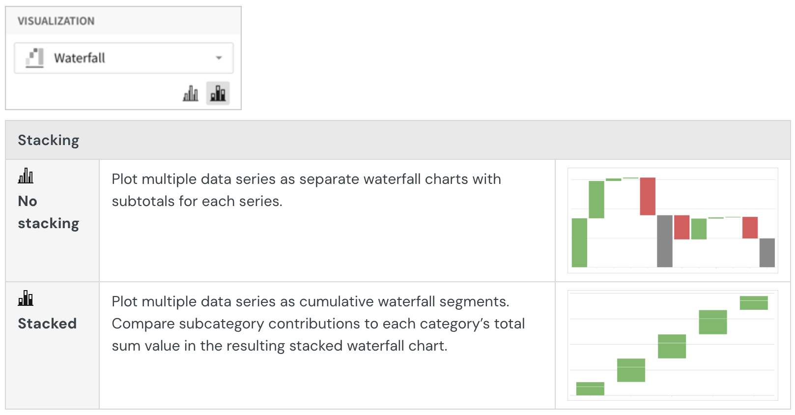
Configure mark colors
Configure waterfall mark colors in the Element properties > Marks > Color tab to differentiate data and highlight specific values.
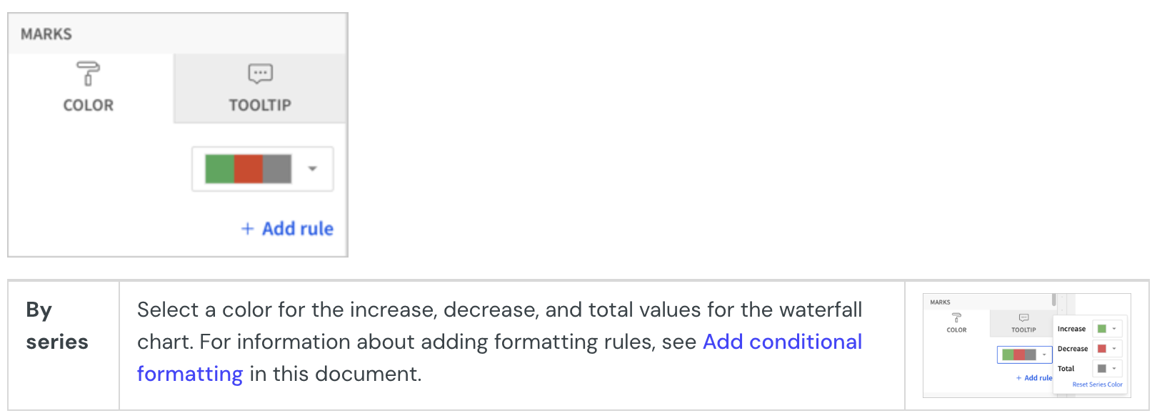
Add conditional formatting
In the Element properties > Marks > Color tab, you can configure formatting rules (+ Add rule) that determine waterfall mark colors according to value-based conditions, in addition to the increase and decrease colors used for the waterfall chart.
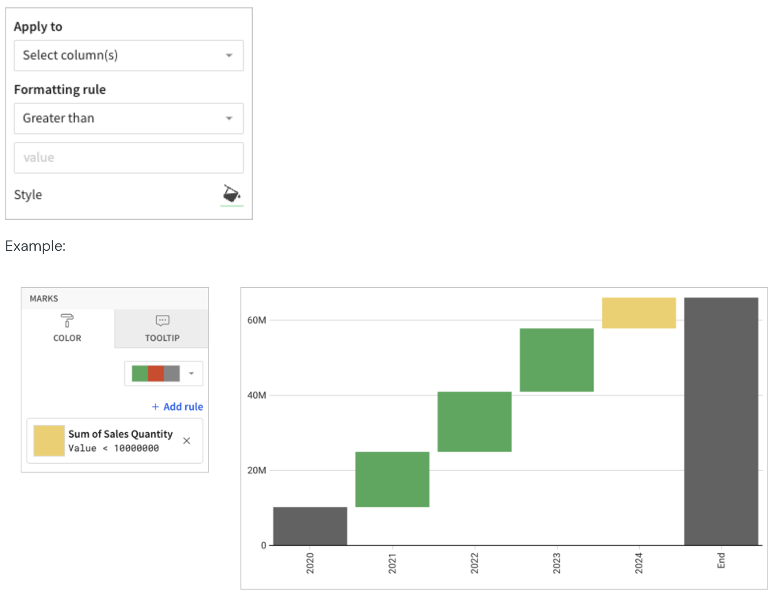
When the conditions of multiple rules are met, Lifesight applies the formatting rules in order of precedence, from top to bottom. Drag and drop rule blocks to reorder them as needed.
Customize tooltip fields and values
Customize chart mark tooltip fields in the Element properties > Marks > Tooltip tab to display the most relevant metrics and data attributes.
For example, you can customize the default tooltip by removing the X-axis chart value from the tooltip and adding a new aggregate column, showing a distinct count of SKU numbers, in the Tooltip tab.
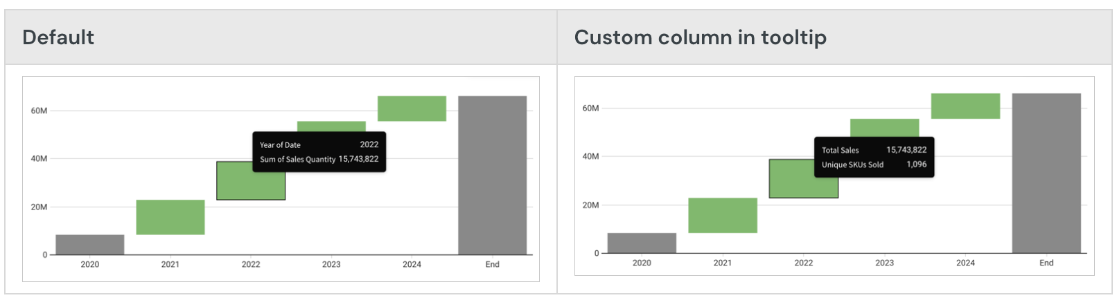
Customize waterfall shape
You can customize the shape of the waterfall. In Element format, select Waterfall shape and configure the available options.
Set the calculation to display
You can only choose the calculation to display for waterfall charts that display one source column (are not stacked).
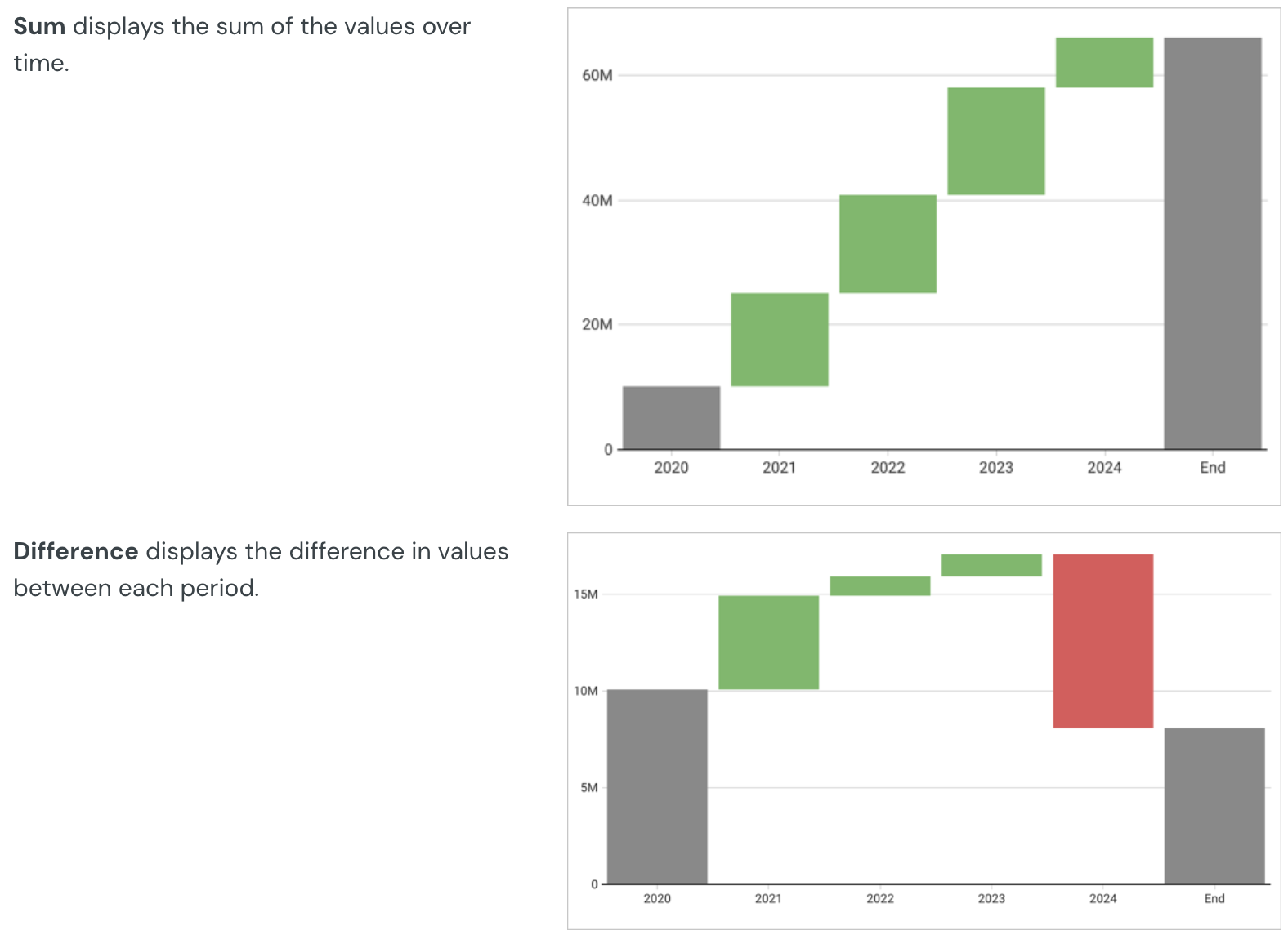
Configure the start value
Choose from several options for the start value of your waterfall chart:
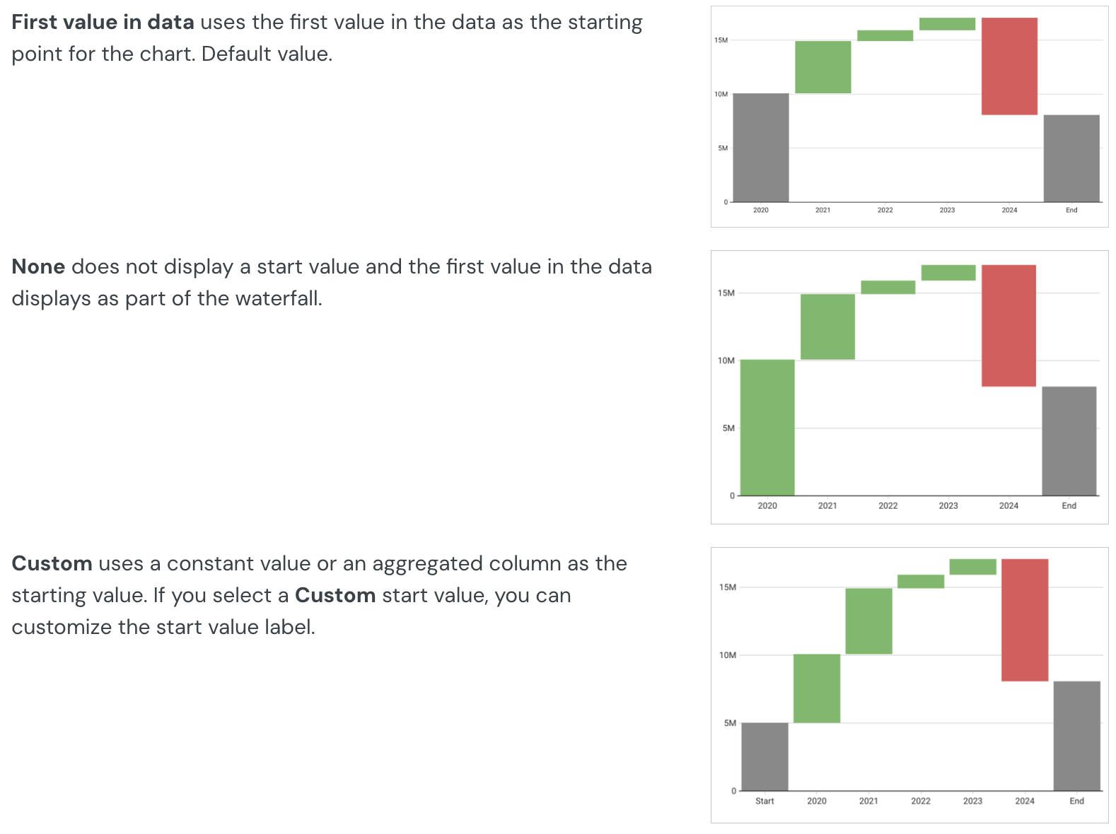
Configure the end value
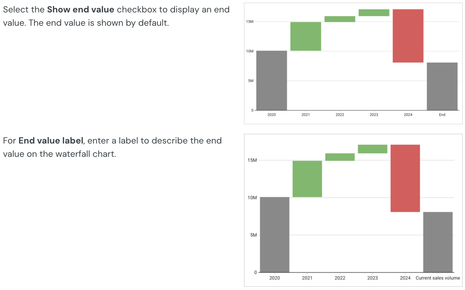
Show connector lines
Select the Show connector line checkbox to show a line connecting the values on the waterfall chart. You can then select a Connector line color.
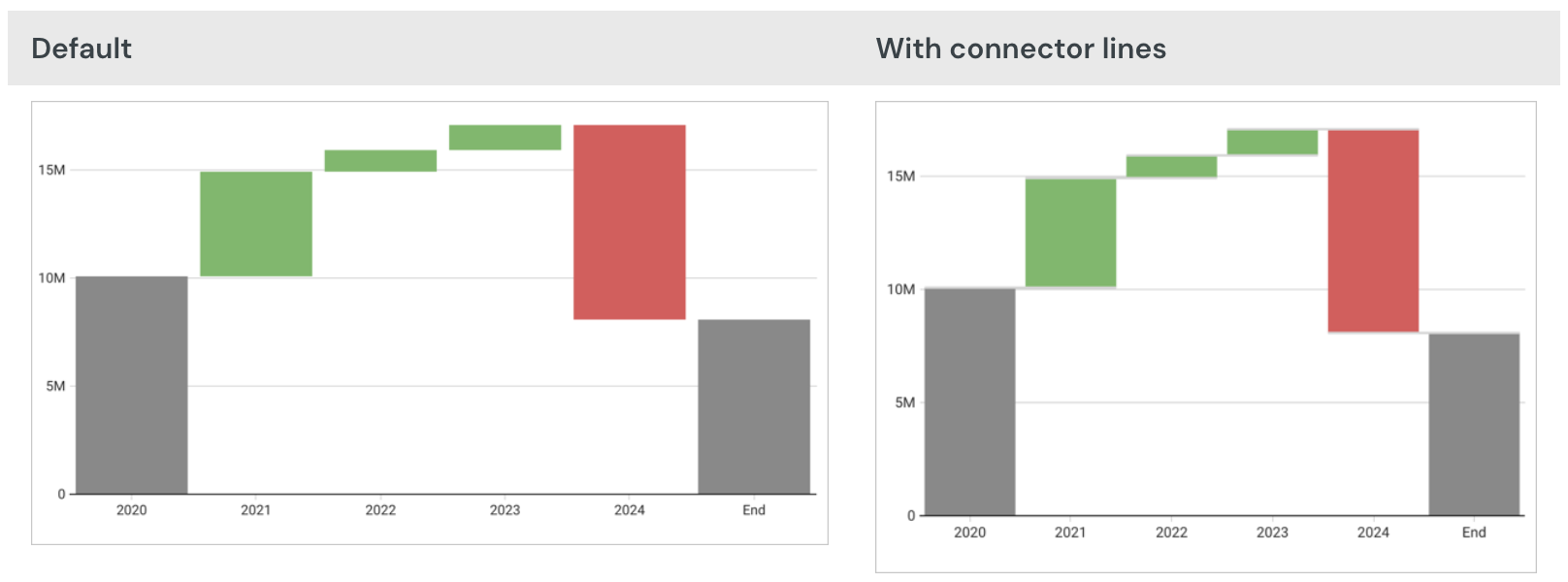
Area charts
Plot an Area Chart
Visualizations can be created via the PAGE ELEMENTS section of your Dashboard's editor panel or directly from an existing data element.
Visualized data will not display on the page canvas until all required plot fields are defined.
Add columns to open fields and marks using either the field's + menu or dragging and dropping the column.
Required Fields
- X-AXIS (1+ columns)
- Y-AXIS (1+ columns)
Columns added to the Y-AXIS field are aggregated by default. Aggregation type (e.g. Sum vs Count) is dependent on the original column’s value type (e.g. text, number, date, etc).
For example, a numeric column such as 'Sales Amount' will create a new calculated column, 'Sum of Sales Amount' (e.g. Sum([Sales Amount])).
Marks
- COLOR
- TOOLTIP
- TRELLIS
Stacked Area Chart Variations
Area charts support three stack variations:
- No Stacking - Areas start from the X axis and might overlap
- Stacked - Areas stack on top of each other
- Stacked 100% - All areas add up to 100% of the area
Create a stacked area chart
Before you start: This action uses the editor panel. If you have not done so already, open the editor panel from either Explore or Edit mode.
- In the editor panel, add a column to the COLOR field.
- [optional] Select one of the three stack options from the top of the chart’s editor panel view.
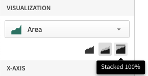
Format Options
To begin editing an visualization’s format options:
Before you start: This action uses the editor panel. If you have not done so already, open the editor panel from either Explore or Edit mode.
- Select Element format in the side navigation
- Select a format option to view and edit its settings.
The following format options are available for area charts:
- Background
- Title
- X-Axis Scale
- X-Axis Scale
- Legend
- Reference Marks
- Area Shape
Combo charts
Combo charts are a type of visualization that uses a mixture of chart types. Lifesight combo charts support bars, lines, areas, and scatter plots.
Requirements
- You must be assigned an account type with the Edit Dashboard and/or Explore Dashboard permission enabled.
- You must be the Dashboard owner or be granted Can explore or Can edit Dashboard permission.
If you're granted Can explore access to the Dashboard, you can create and modify visualization properties and formatting in Explore mode, but you cannot publish your changes.
Plot a combo chart
To plot a combo chart, configure the following properties in the Element properties tab:
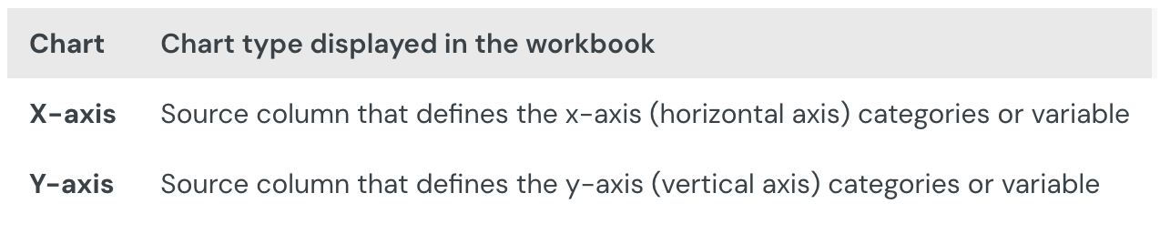
The chart is empty until all properties are configured.
Add a combo chart to a Dashboard
- Open a Dashboard in Explore or Edit mode and add a new visualization element.
- In the Visualization property, click the dropdown field and select Combo from the list.
Define the x-axis categories
Configure a source column to define the x-axis categories.
- In the X-axis property, click Add column and select an option from the menu:
- To generate categories based on distinct values in an existing column, search or scroll the Select column list and select the preferred column name.
- To generate categories based on a custom formula, select New column and enter the formula in the toolbar
- [optional] Control how the source column data is categorized and displayed in the chart:
- Hover over the source column name, then click the caret () to open the column menu.
- Hover over any of the following items, then select the preferred option:
- Truncate date - Categorize date values by the selected interval or unit of measure.
- Transform - Convert the column to the selected data value type.
- Format - Display axis and data labels in the selected format.
Availability of column menu items and corresponding options varies depending on the column’s data value type (for example, Truncate date is available for date values only).
Define the y-axis variable
Configure a source column to define the y-axis variable. Lifesight automatically aggregates values associated with the same x-axis category, and the aggregation type depends on the data type of the column.
By default, the first column placed on the y-axis is displayed as a bar chart and all additional columns are plotted as lines.
- In the Y-axis property, click Add calculation and select an option from the menu
- To aggregate values of an existing column, search or scroll the Aggregate column list and select the preferred column name.
- To calculate values based on a custom formula, select New column and enter the formula in the toolbar.
- To count the number of rows associated with each category, select Row count.
- [optional] Control how the source column data is calculated and displayed in the chart:
- Hover over the source column name, then click the caret () to open the column menu.
- Hover over any of the following items, then select the preferred option:
- Set aggregate - Calculate values based on the selected aggregation method.
- Transform - Convert the column to the selected data value type.
- Format - Display axis and data labels in the selected format.
To plot the source column data without aggregating values, clear the Aggregate values checkbox in the Y-axis property. If this results in an incomplete chart that exceeds the 25,000 data point limit, reaggregate the values or apply data filters to reduce the number of data points.
- [optional] Repeat the previous steps to configure multiple y-axis source columns. Lifesight plots each further column as a separate line series on the chart, but you can change the shape of any plotted column from the column menu. See Change the chart type for a plotted column).
- [optional] Lifesight auto-generates source column names and chart titles to reflect the visualized data, but you can customize these fields as needed:
- To rename a source column, double-click the column name in the X-axis or Y-axis property, then enter a new name. Changes are reflected in the default chart title.
- To edit the chart title, double-click the title in the visualization, then enter a new title.
Lifesight auto-generates the default chart title. After the title is customized, it no longer reflects changes to source columns and their names.
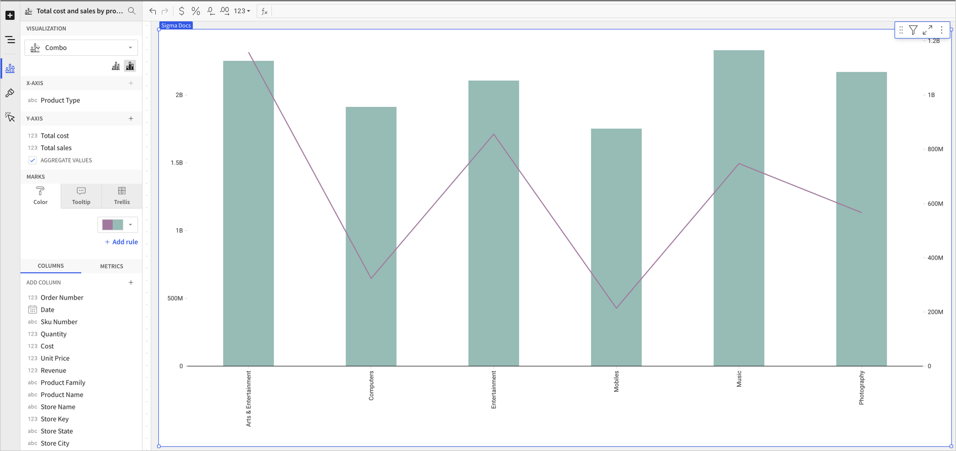
Combo chart properties
You can configure the following properties for combo charts:
- Set up colors.
- Customize tooltip fields and values.
- Use a trellis format.
Configure a chart color by category (Beta)
This documentation describes a public beta feature and is under construction. This documentation should not be considered part of our published documentation until this notice, and the corresponding Beta flag on the feature in the Lifesight service, are removed. As with any beta feature, the feature discussed below is subject to quick, iterative changes. The latest experience in the Lifesight service might differ from the contents of this document.
Beta features are subject to the Beta features disclaimer.
If your combo chart includes bars, you can set a column to use as a category and split the bar colors by category.
Configure combo chart colors in the Element properties > Marks > Color tab.
You can use color to differentiate data, highlight specific column values, and split the chart bars by category.
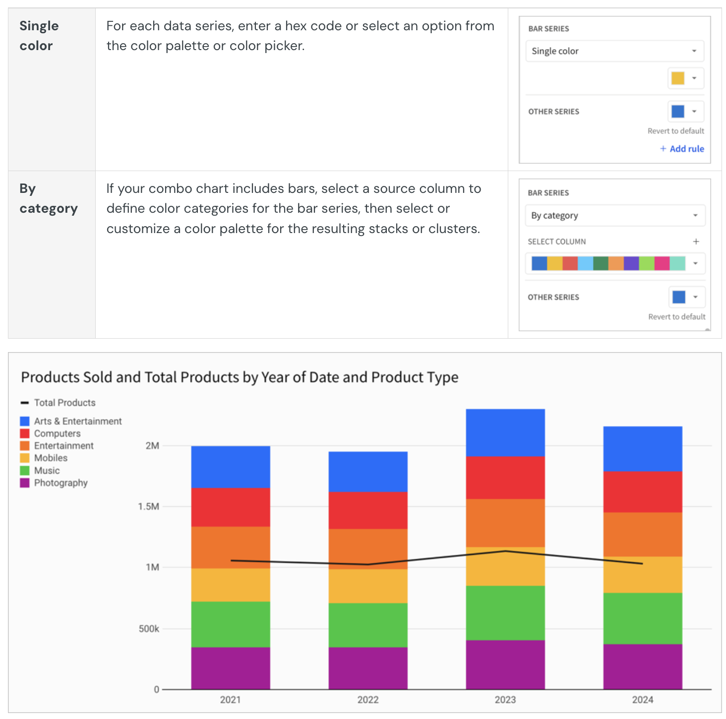
Multiple variables in the y-axis result in a stacked or clustered bar series in which each data series represents a measure of a different variable. The By category color setting can also generate bar stacks or clusters, but the resulting series represent sub-categories within the configured chart categories that measure the same variable.
Change the chart type for a plotted column
The chart type for a column plotted on a combo chart can be one of four options: bar, line, area, or scatter.
Before you start: This action uses the editor panel. If you have not done so already, open the editor panel from either Explore or Edit mode.
To change the chart type, do the following:
- In the editor panel, hover over the column and click the caret.
The column menu opens. - In the Shape submenu, choose Bar, Line, Area, or Point.
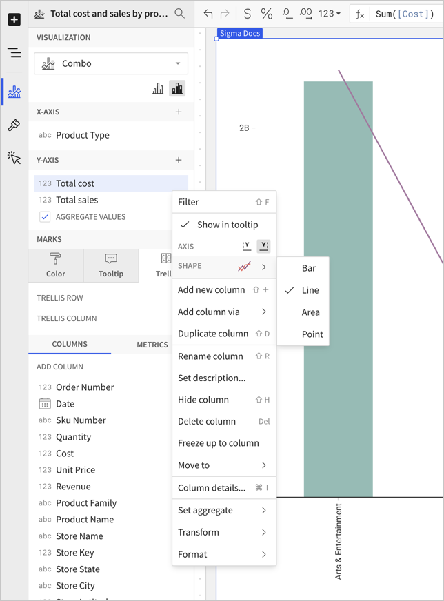
Format options
To begin editing a visualization’s format options:
- Before you start: This action uses the editor panel. If you have not done so already, open the editor panel from either Explore or Edit mode.
- Select Element format in the side navigation.
- Select a format option to view and edit its settings.
Format categories
The following format categories are available for combo charts:
- Element style
- Title
- X-axis
- Y-axis
- You can add a secondary y-axis for a column on the left or right side of the chart.
- Legend
- Gaps
- Reference marks
- Trend lines
- Data labels
- Area/line style
Box and whisker charts
Box and whisker charts display the distribution of a set of values along an axis. They are also commonly known as box plots.
Requirements
To create a data element, you must have Can Edit access to the individual Dashboard and be in Edit mode.
Many exploratory actions are also supported in Explore mode; see Dashboard modes.
Anatomy of a Box & Whisker chart
Box and whisker charts break data into quartiles. The upper quartile, median, and lower quartile make up what we refer to as box. The entire spread from whisker minimum to whisker maximum, including the box, accounts for the statistically central range of data. This is called the interquartile range (IQR) and is calculated as Q3 - Q1. Data points that fall out of the IQR are called outliers.
- Maximum: The data point with the highest value below Q3 + 1.5_IQR
- Upper Quartile: Values contained in the upper 25% of data.
- Median: The data range's midpoint.
- Lower Quartile: Values contained in the lower 25% of data.
- Minimum: The data point with the lowest value above Q1 - 1.5_IQR
- Outliers: Values that fall above or below the IQR. Outliers are calculated as is > Q3 + 1.5_IQR and is < Q1 - 1.5_IQR
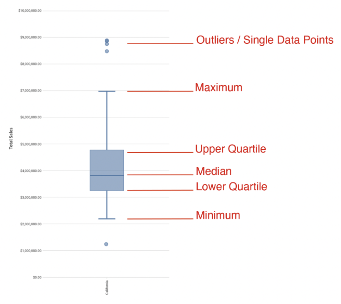
Plot a Box and Whisker Chart
Visualizations can be created via the PAGE ELEMENTS section of your Dashboard's editor panel or directly from an existing data element.
Visualized data will not display on the page canvas until all required plot fields are defined.
Add columns to open fields using either the field's + menu or dragging and dropping the column.
Fields
- X-AXIS (1 column)
Categorical data is first grouped by the column on the X-AXIS. - Y-AXIS (1+ columns)
Columns added to the visualization’s Y-AXIS are aggregated by default. Aggregation type (e.g. Sum vs Count) is dependent on the original column’s value type.
In some cases, you will want to uncheck the AGGREGATE VALUES option. Aggregating the value on the Y-AXIS value will give you an option to SPLIT BY. - SPLIT BY (1 column - optional)
Creates a second grouping under the first grouping (defined on the X-AXIS).
Example: In the screenshot below, the X-AXIS is set to [Store State], grouping the rows of data into states. The column on the Y-AXIS, [Store Sales] defines the numerical range of the plotted data. The column added to SPLIT BY, [Store Name], acts as a grouping below [Store State]. In other words, data is grouped by state and then each state's data is grouped by (aka "split by") individual stores' names. Points on the y-axis represent the aggregate [Store Sales] values listed under the second, "split by", grouping.
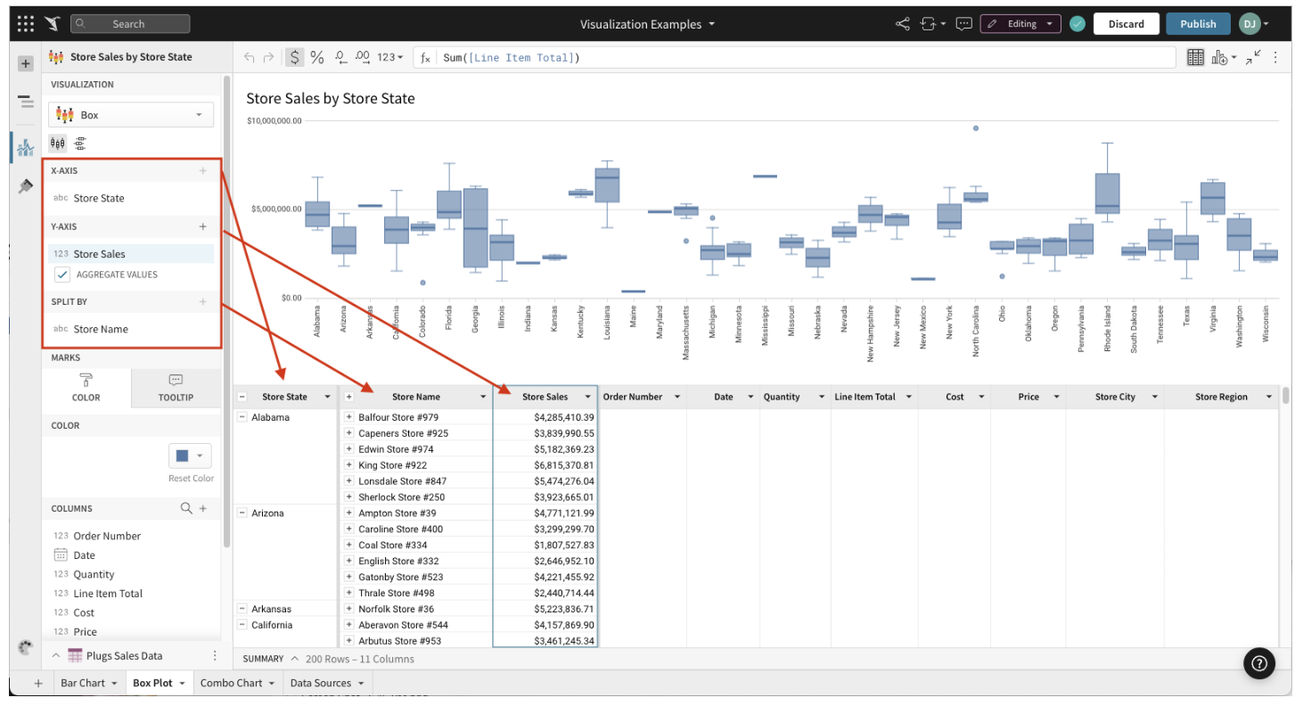
Marks
- COLOR
- TOOLTIP (1+ columns)
Display Orientation (Horizontal vs Vertical)
Box and whisker charts can be displayed both vertically and horizontally.
To select your chart’s orientation, select either the display vertical ( viz-box-vertical.svg ) or display horizontal ( viz-box-horizontal.svg ) icon button in the chart’s editor panel view.
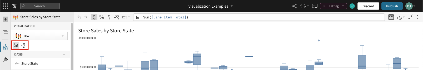
Format Options
Before you start: This action uses the editor panel. If you have not done so already, open the editor panel from either Explore or Edit mode.
To begin editing an visualization’s format options:
- Select Element format in the side navigation.
- Select a format option to view and edit its settings.
The following format categories are available for box and whisker charts:
- BACKGROUND
- TITLE
- X-AXIS
- Y-AXIS
- LEGEND
- BOX SHAPE
- DATA LABELS
- REFERENCE MARKS
Customize Point Display Options
Before you start: This action uses the editor panel. If you have not done so already, open the editor panel from either Explore or Edit mode.
- Select Element format in the side navigation.
- Click BOX SHAPE.
- Select BOX SHAPE formatting from the options presented:
- The Show points checkbox is checked by default. Uncheck to hide all points.
- If Show points is selected, you can choose:
- Outliers only – Shows only the points that fall outside the box.
- All points – Shows all points, regardless of position.
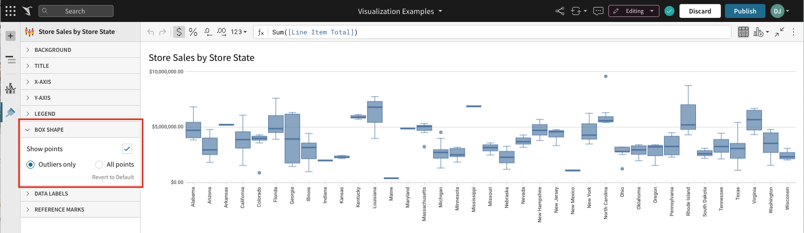
Pie and donut charts
Pie and donut charts are a good way to visualize data as a percentage of a total.
Requirements
- To create a data element, you must have Can Edit access to the individual Dashboard and be in Edit mode.
- Many exploratory actions are also supported in Explore mode.
Plot options
You can create pie and donut charts charts from the PAGE ELEMENTS section of your Dashboard's editor panel, or directly from an existing data element.
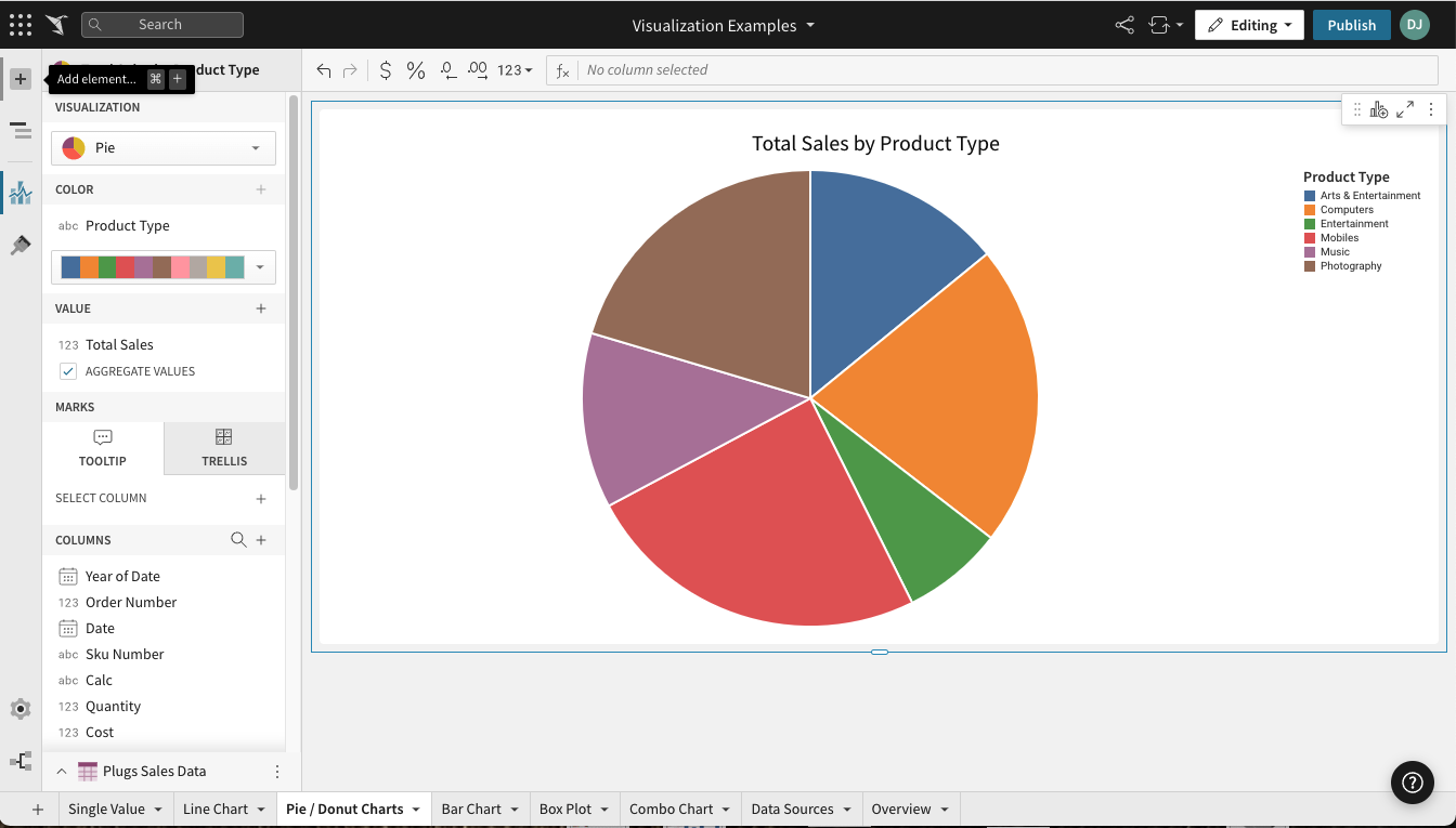
Required fields
- COLOR (1 column)
- VALUE (1+ columns)
Columns added to the VALUE field are aggregated by default. Aggregation type (e.g. Sum vs Count) is dependent on the original column’s value type (e.g. text, number, date, etc).
Example: A numeric column [Sales Amount] will create a new calculated column [Sum of Sales Amount].
Marks
- TOOLTIP: choose columns to show when hovering over points in the chart
- TRELLIS: select columns to serve as Trellis Rows or Columns, splitting the chart into separate charts
Donut hole value
This documentation describes a public beta feature and is under construction. This documentation should not be considered part of our published documentation until this notice, and the corresponding Beta flag on the feature in the Lifesight service, are removed. As with any beta feature, the feature discussed below is subject to quick, iterative changes. The latest experience in the Lifesight service might differ from the contents of this document.
Beta features are subject to the Beta features disclaimer.
If you're creating a donut chart, you can optionally add a KPI to the hole of the donut.
- Select the element.
The editor panel opens to the Element properties section. - For Donut hole value, select the + to add a calculation.
- Add a new column, select the row count, or choose a column to aggregate and display in the donut hole.
The aggregate value appears with the column name as a default label. You can format the value using the format options.
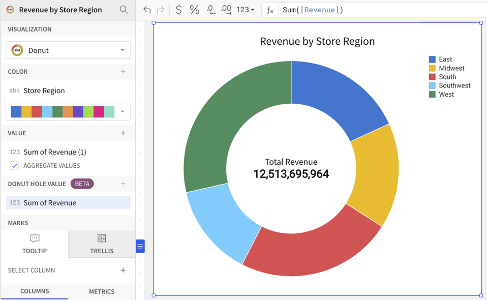
Format options
To start editing the format options for a visualization:
Before you start: This action uses the editor panel. If you have not done so already, open the editor panel from either Explore or Edit mode.
- In the editor panel, select Element format.
- Select a format option to view and edit its settings.
The following format categories are available for pie and donut charts:
- BACKGROUND
- TITLE
- LEGEND
- DATA LABELS
- DONUT HOLE (only for donut charts)
Maps
Plot a map
Maps are visualizations and can be created via the PAGE ELEMENTS section of your Dashboard's editor panel or directly from an existing data element.
Visualized data will not display on the page canvas until all required plot fields are defined.
Add columns to open fields using either the field's + menu or dragging and dropping the column.
Map types
Dashboards support three distinct map types: Region, Point and Geography.
You should choose your map type based on your available data and the results you wish to see. For example, if you want to map a text column [State] with cell values like "Colorado" and "California", you should choose a Region map type.
Map - Region
Region maps require a single text column in the Region property. Column values must match one of the following region types and be consistent within the column.
Region values are not case sensitive. For example, the value for the state of California can be California, california, CA, Ca, or ca. However, all values in the column should use the same supported identifier and capitalization for data consistency.
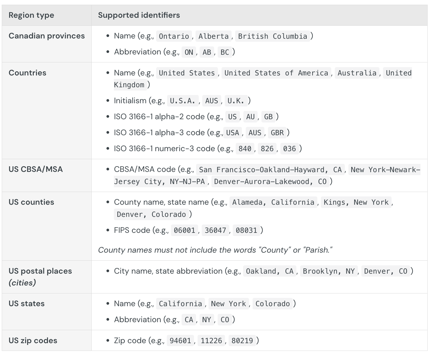
Map - Point
Point maps require a number column on both the map's LATITUDE and LONGITUDE fields.
Map - Geography
WKT and JSON formats allow the storage of more complex geographical data than simple numeric lat/long columns.
Lifesight's Map - Geography visualization requires a geography or variant data column on the map's Geography field. If your WKT or GeoJSON data is stored as a text column (abc), you can convert it using the Geography or Variant function.
GeoJSON data must also have "coordinates" nested within a "geometry" key in order to be plotted. In GeoJSON and our geography type, the coordinate order is always longitude, latitude.
Examples
For example, given the following GeoJSON data:
{ "geometry": {"coordinates": [-94.042964, 33.019219] } }
Below is a non-working example, even though it is valid GeoJSON, as it lacks the "geometry" key:
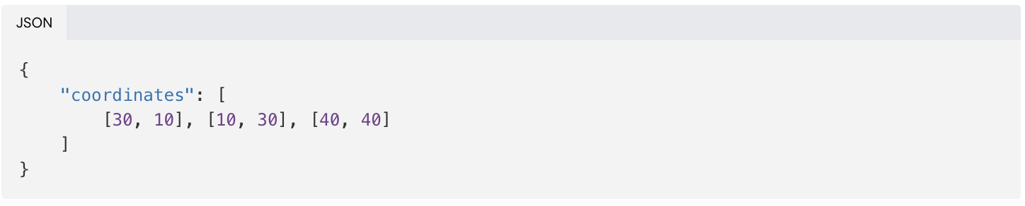
This is a working example:
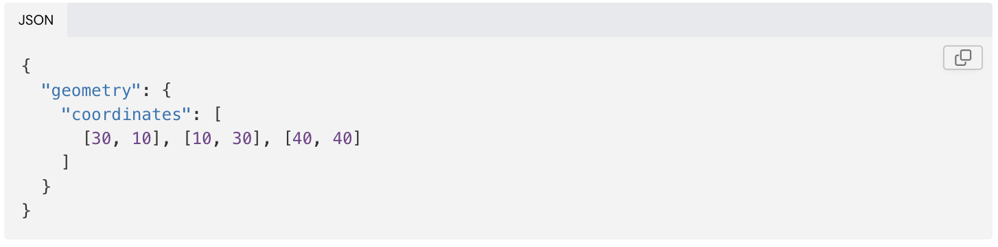
If your GeoJSON is structured like the non-working example, you can use Lifesight's CallVariant passthrough function to prepend the "geometry" key.
This example invokes Snowflake's "object_construct" function to perform this:

Create and format trellis charts
Trellis charts (also known as small multiples or panel charts) allow you to compare and analyze multiple subsets of data within a single visualization element. The subsets are represented by smaller charts (or panels) arranged in rows and columns based on specific data dimensions. The division of data and resulting grid-like structure make it easier to identify patterns, trends, and relationships that can help you uncover valuable insights within large, complex datasets.
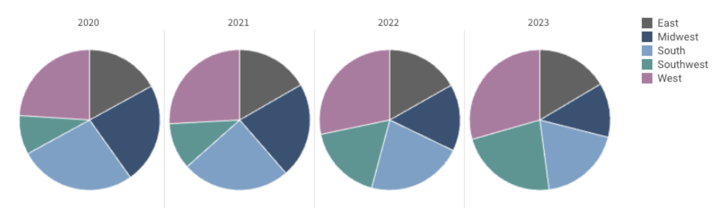
This document introduces the concept and structure of trellis charts and explains how to use them to add clarity and value to your visualizations.
The following visualization types support trellising:
- Bar charts
- Line charts
- Area charts
- Scatter plots
- Pie charts
- Donut charts
- Combo charts
User requirements
The ability to create and format trellis charts requires the following:
- You must be assigned an account type with the Edit Dashboard and/or Explore Dashboard permission enabled.
- You must be the Dashboard owner or be granted Can explore or Can edit Dashboard permission.
Understanding trellis charts
Trellis charts enable you to quickly and effectively visualize multidimensional data subsets and explore them from different angles. Although you could build an individual visualization element for each data subset, you can quickly create a trellis chart that offers several advantages that contribute to data coherence and ease of use, including the following:
- Organization: Data subsets are presented in a logical, organized structure that facilitates systematic comparison and exploration.
- Scalability: Data updates, including new attributes introduced to the dataset, are seamlessly incorporated into the chart’s dimensions.
- Consistency: The shared underlying data ensures consistent application of filters and aggregations, while the use of a single visualization provides uniformity in scale, format, and styling.
Trellis rows and columns
In a trellis chart, rows (vertical divisions) represent one dimension, while columns (horizontal divisions) represent another. The individual panels represent the intersections of specific row and column attributes, which visualize data subsets that are more digestible and easily compared in the context of the dimensions and corresponding attributes.
Non-trellis vs. trellis
The following charts demonstrate how trellising can enhance data visualization.
No trellising: This initial chart shows a basic view that compares total revenue per fiscal year from 2019 to 2023. The stacked bars differentiate revenue for each product family, providing an additional dimension to explore within and across each year.
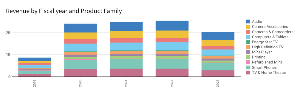
Trellis columns: This second chart incorporates trellis columns to deepen the analysis. You can still analyze total revenue by fiscal year and product family, but the additional dimension allows you to compare these data points within and across smaller data subsets based on store region.
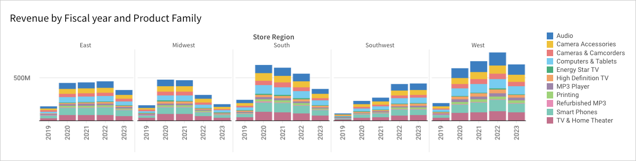
Trellis rows and columns: This final chart incorporates trellis rows and columns for even more granular data subsets. As with the previous chart, you can still analyze total revenue by fiscal year and product family, but the two additional dimensions allow you to compare data points within and across data subsets based on the intersections of store regions and product types.
While the grid structure makes it easy to compare revenue between data subsets that share a common store region or product type (shared attributes across the same row or column), you can also obtain meaningful insights by exploring data points across the complete grid.
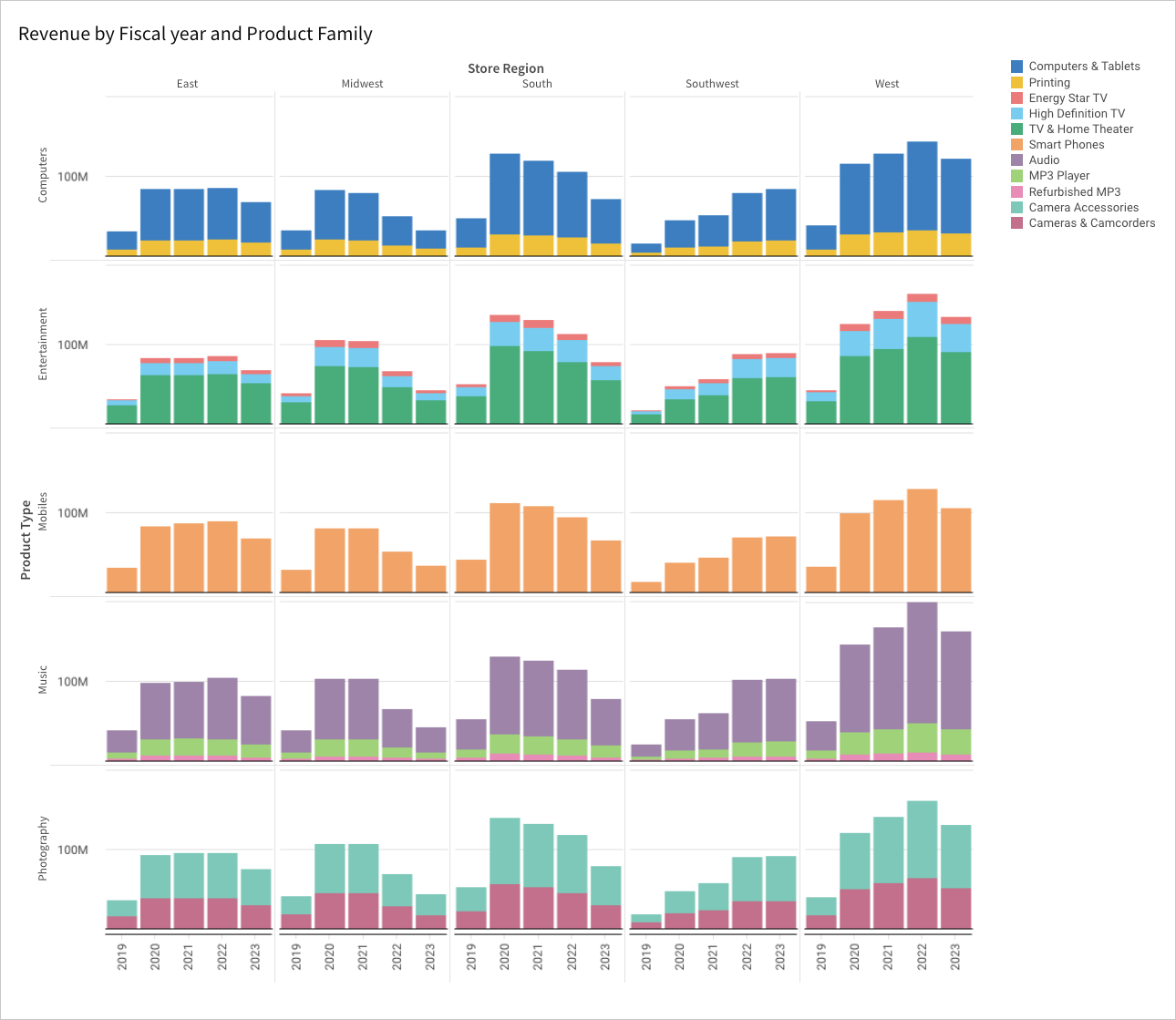
Create a trellis chart
- Open a Dashboard in Explore or Edit mode and build a basic visualization.
- In the Element properties panel, select the Marks > Trellis tab.
- To create a vertical comparison of data subsets, click Add column in the Trellis row property, then use one of the following methods to define the row dimensions:
- To derive dimensions from an existing column in the data source, search or scroll the Select column list and select the preferred option.
- To create dimensions based on a new column, select Add new column, then enter a function or value in the formula bar.
You can also select an existing column by dragging and dropping a column name from the Columns list to the Trellis row property.
- To create a horizontal comparison of data subsets, click Add column in the Trellis column property, then use one of the following methods to define the column dimensions:
- To derive dimensions from an existing column in the data source, search or scroll the Select column list and select the preferred option.
- To create dimensions based on a new column, select Add new column, then enter a function or value in the formula bar.
You can also select an existing column by dragging and dropping a column name from the Columns list to the Trellis column property.
Create a trellis chart with multiple series (Beta)
This documentation describes a public beta feature and is under construction. This documentation should not be considered part of our published documentation until this notice, and the corresponding Beta flag on the feature in the Lifesight service, are removed. As with any beta feature, the feature discussed below is subject to quick, iterative changes. The latest experience in the Lifesight service might differ from the contents of this document.
Beta features are subject to the Beta features disclaimer.
If your chart is a bar, line, area, or scatter chart containing multiple series, such as both Revenue and Cost, you can create a trellis chart for the series:
- Open a Dashboard in Explore or Edit mode and build a chart with at least two data series.
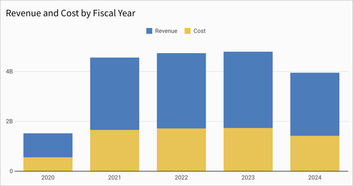
- In the Element properties panel, select the Marks > Trellis tab.
- For Trellis by, select Series.
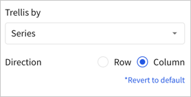
For Direction, select Row (default) or Column.
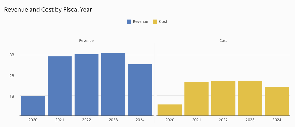
Customize trellis titles and labels
You can change the visibility of trellis titles and labels, customize the chart title, font size, and font color as needed.
- Open a Dashboard in Explore or Edit mode and select the visualization element you want to modify.
- Select Element format in the side navigation, then click Trellis to expand the section.
- Modify the available options for the trellis:
- To modify the size of the trellis tiles within the visualization, modify the Tile size. You can choose Auto or Compact.
- For a trellis chart with rows or columns, you can choose to show or hide a border between rows and columns. To show the border, select the checkbox for Show row border or Show column border. To hide the border, clear the checkbox.
- Configure the title and label for the trellis rows or columns in the chart:
- To show the title, select the checkbox for Show title. To hide the title, clear the checkbox.
- To show the label, select the checkbox for Show label. To hide the label, clear the checkbox.
- If you show a title or label, enter the title or label in the relevant text field.
- To change the font size and color of trellis titles and labels, use the formatting tools:
Customize shared trellis components
By default, Lifesight displays shared x-axis labels for each column (cartesian charts only), shared y-axis labels for each row (cartesian charts only), and a shared legend for the entire grid. You can customize the trellis format to use shared components or display separate labels and legends for each panel.
- Open a Dashboard in Explore or Edit mode and select the visualization element you want to modify.
- Select Element format in the side navigation, then click Trellis to expand the section.
- To change the shared components, configure the X-axis, Y-axis, and Color legends fields:
- To share the axis values or legend, select the checkbox.
- To display the axis values or legend in each panel, clear the checkbox.
Explain visualizations with AI (Beta)
The Explain visualization feature uses AI to instantly generate a description of any chart. Details can include key insights, observations, data distribution summaries, and other context that can enhance your understanding of visualized data and help drive informed decisions.
This document introduces AI-generated explanations for visualizations and explains how to access and utilize the feature.
System and user requirements
The ability to explain a visualization with AI requires the following:
- The OpenAI integration must be configured for your organization.
- If using Azure OpenAI, the GPT-4 Turbo with Vision model (gpt-4-turbo-2024-04-09) must be configured in the OpenAI integration.
- You must be assigned an account type with the Use AI features permission enabled.
About AI-generated explanations
When you use the Explain visualization feature, Lifesight captures a snapshot of the chart and passes this image, along with the chart’s underlying data, to your OpenAI model. The model then processes the information and analyzes the context to generate an explanation of the data visualized by the chart. Lifesight presents this explanation and allows you to provide feedback about the results, which can be used to improve future responses.
Explain a visualization
- Open a Dashboard in any mode.
- Hover over or select the visualization you want to explain.
- In the element toolbar, click More to open the element menu, then select Explain visualization.
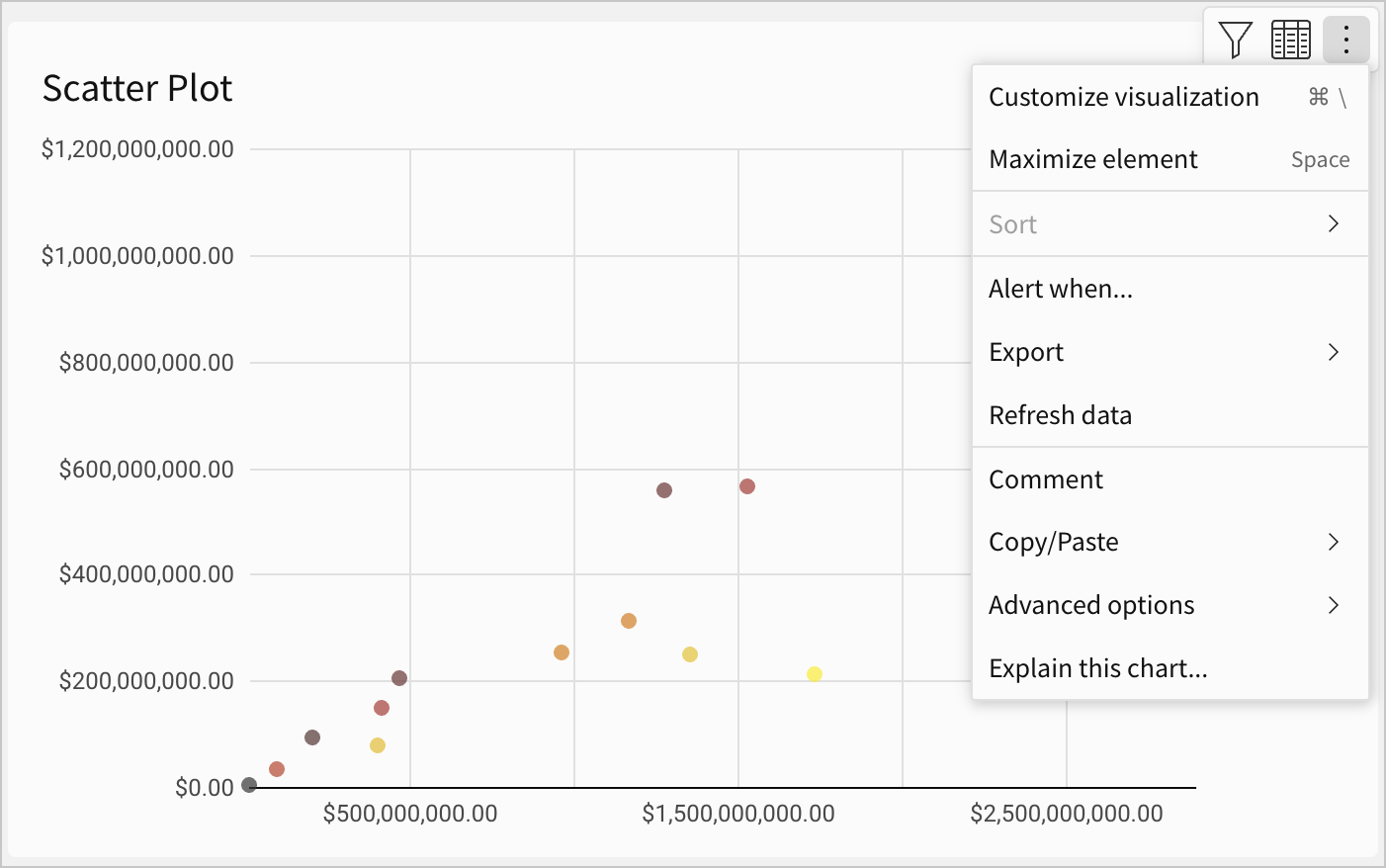
- The Explain visualization modal displays the explanation in real time, as it's generated. Utilize or interact with the results as needed:
- Click Copy text, then save or share the results (for example, paste it into a text element to supplement the visualization).
- Click Helpful or Not helpful and submit additional details to help improve future responses.
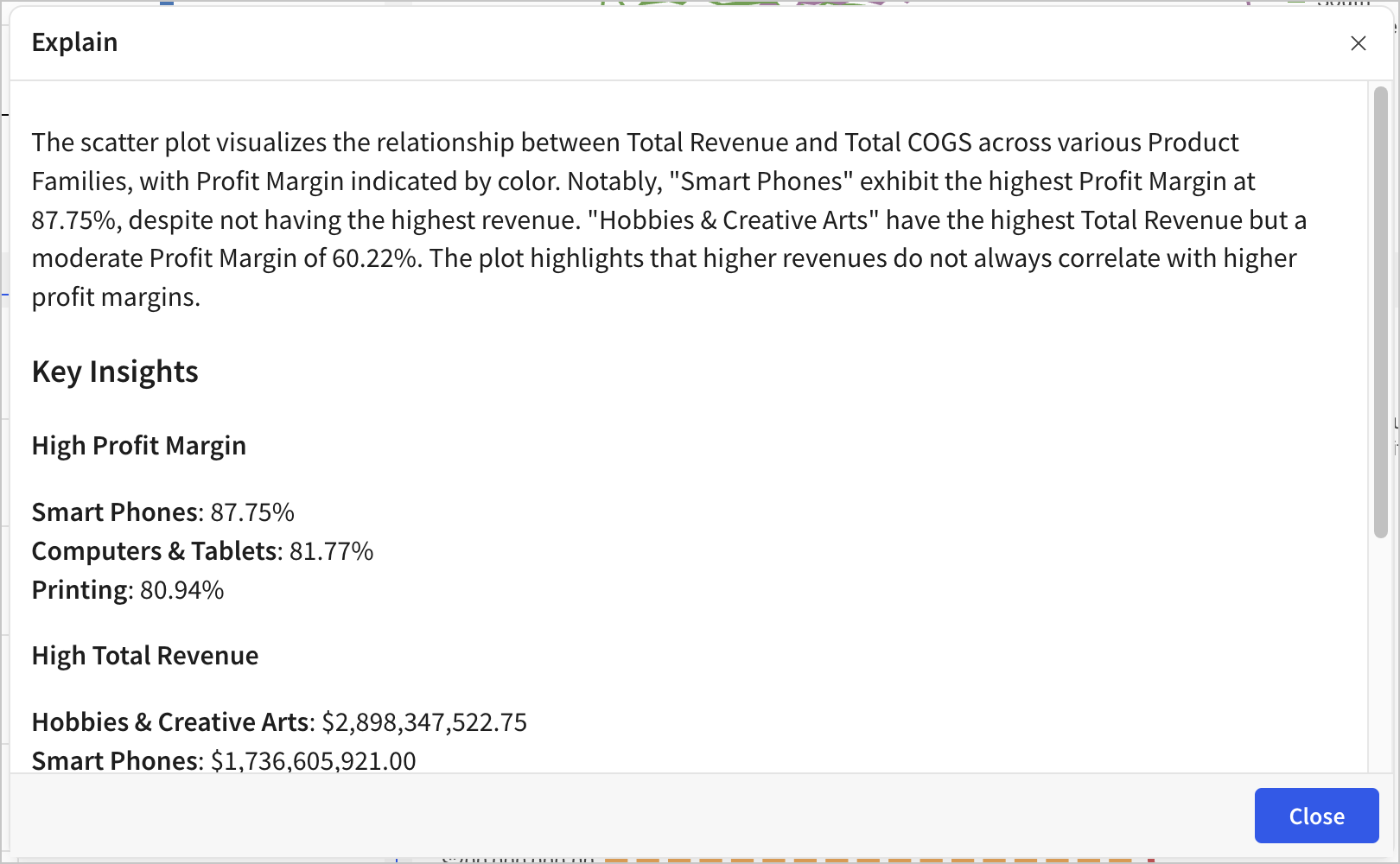
Updated over 1 year ago