Model Overview
Learn to interpret the reports and charts on the Overview tab
In the Overview tab, you can view your overall marketing performance reports and conduct a preliminary analysis based on historical data you have uploaded or integrated. Understanding these reports is crucial for gaining actionable insights into your marketing performance.
Here's a list of the different fields in the MMM Overview tab:
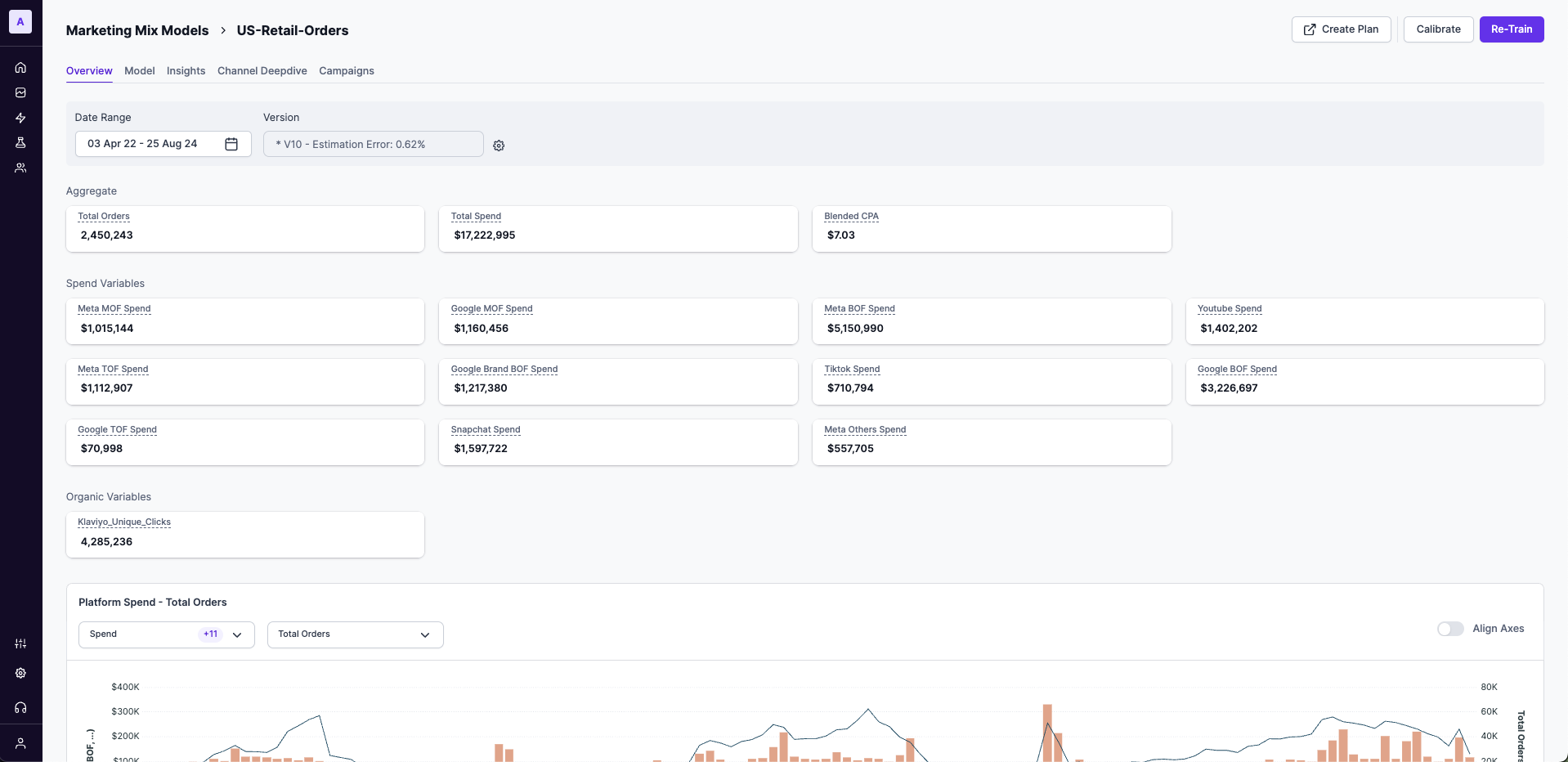
Date range
Select the date range from your MMM input data to view insights for the selected period.

Version
By default, Lifesight selects the most suitable model version and displays it in the Versions tab based on various criteria.
You can select any model from the list of top 5 models based on paid contribution, non- paid contribution, NRMSE, Estimation error. In general, Non-paid contribution would include: Baseline, Contextual, Organic, Seasonality, Trend.
How to change model version?
Click the Settings icon to view the top 5 models. This allows stakeholders to review and select the best model based on their business needs. Learn more about how top models are shortlisted here.
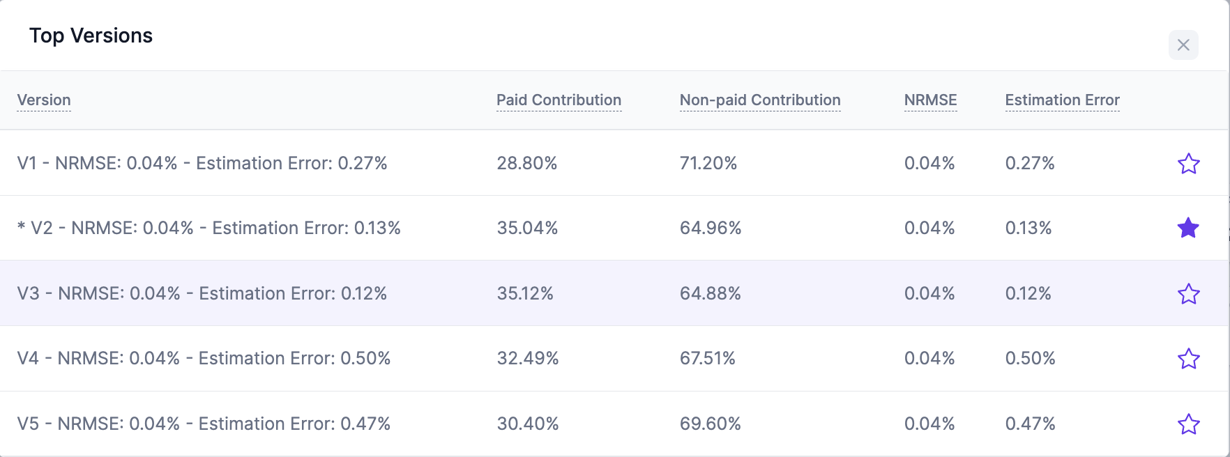
Model versions
These metrics ensure robust model fit and accuracy, helping stakeholders choose the most appropriate model for strategic use.
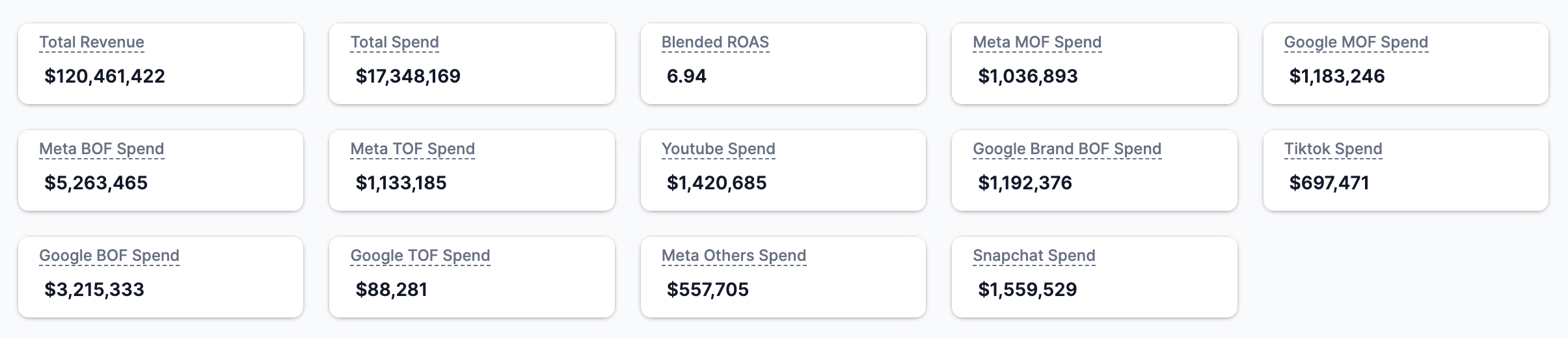
Metrics summary
View a high-level view of key metrics such as total revenue, total spend, blended ROAS and other important metrics.
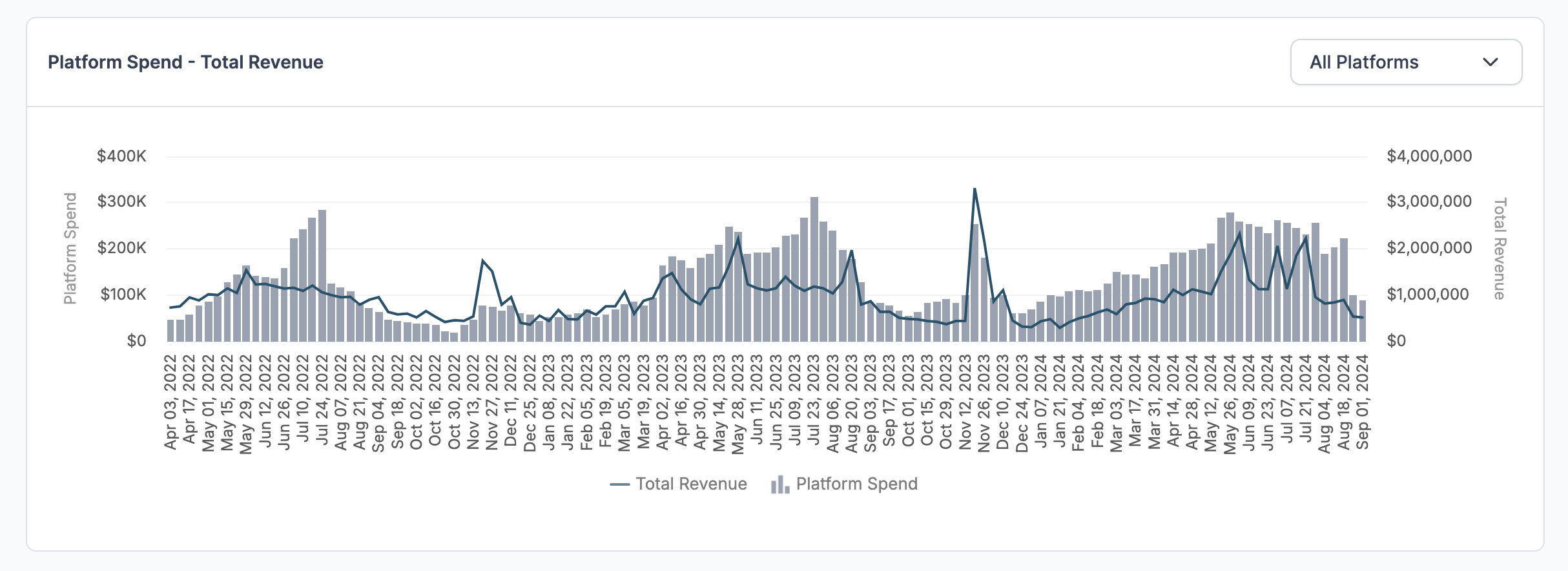
Platform spend vs. KPI
The graph shows your marketing spending from all platforms in columns and overlays the KPI as a line. Select the drop-down filter in the right to filter spends vs revenue by each channel to view the trend over time.
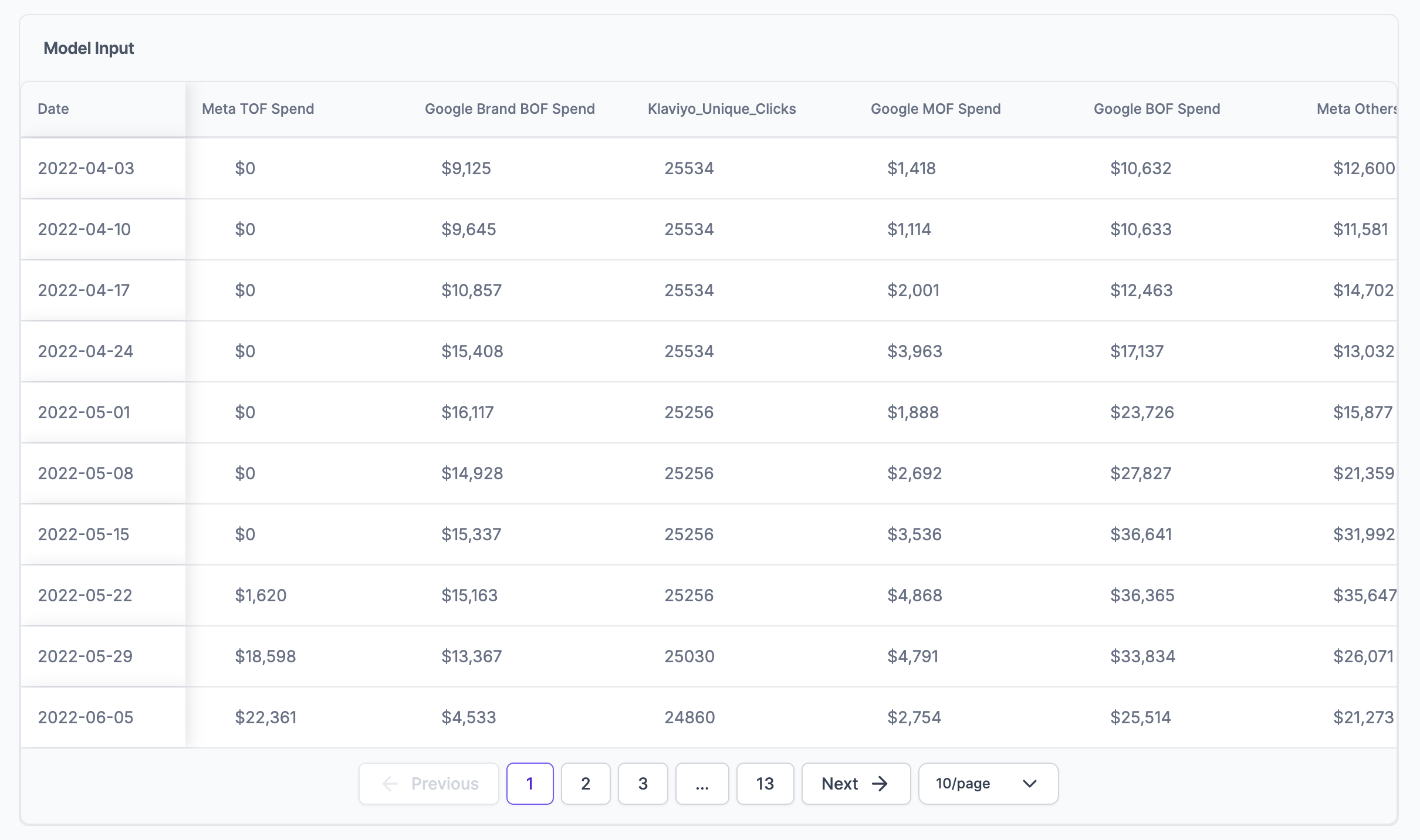
Model Input
The chart shows all the Marketing Mix Model (MMM) input data, including data from integrations, in a simple, date-aligned table. You can use this chart to check data trends and see how the integration inputs perform over different periods.
Correlation Matrix
A correlation matrix is a square matrix chart showing the correlation coefficients between two variables. The matrix shows how all the possible pairs of variables in a table are related to each other. This chart helps in summarizing a large data set and finding and showing correlation-based patterns in the data.
Reading the chart:
Each of your input variables is listed in both the rows and the columns and the correlation coefficient between each pair of variables is written in each cell. The correlation coefficient ranges from -1 to +1, where -1 means a perfect negative correlation, +1 means a perfect positive correlation, and 0 means there is no correlation between the variables.
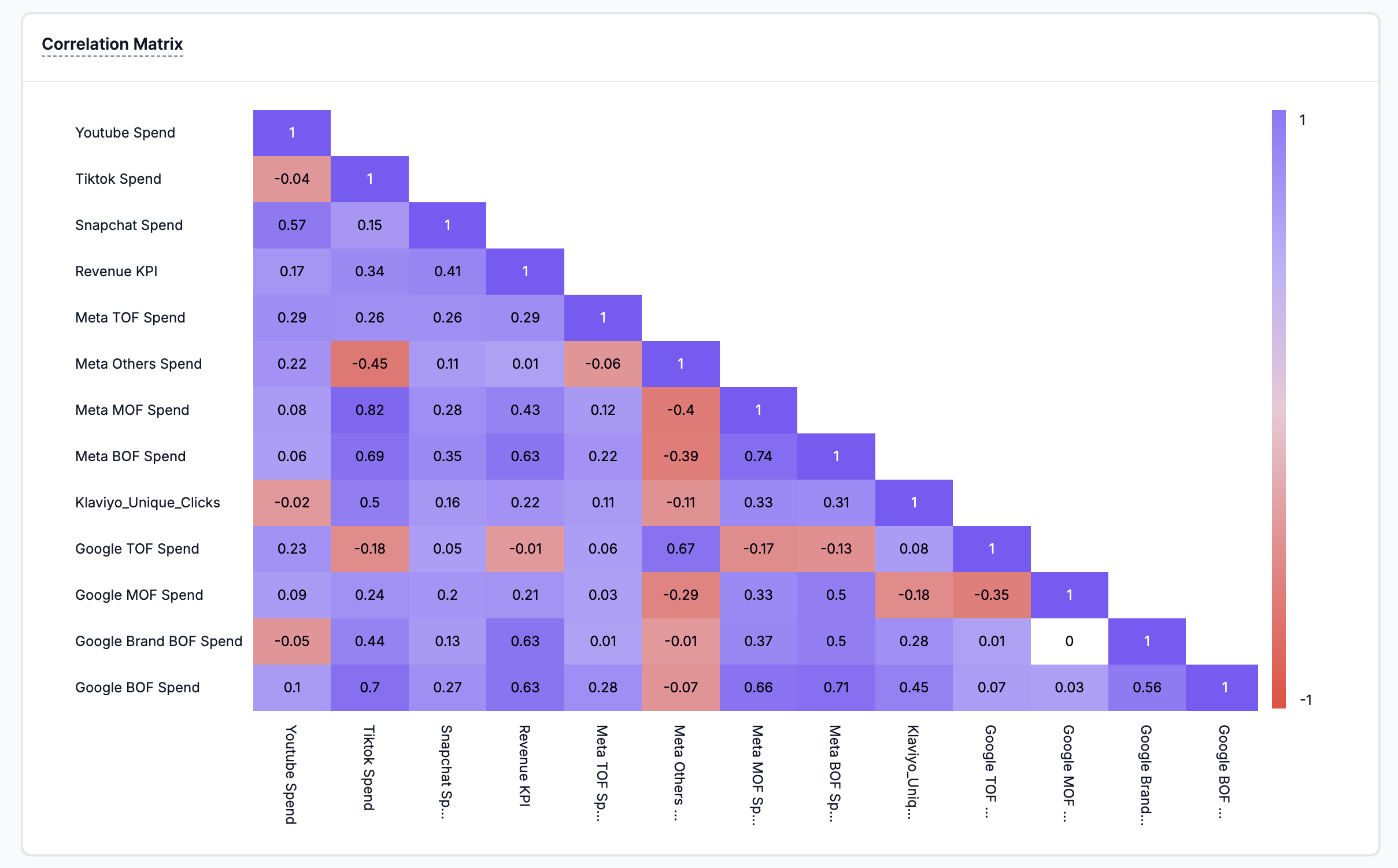
By clicking on a specific cell, you can visualize the detailed correlation scatter plot between two variables.
How to interpret a Scatter Diagram?
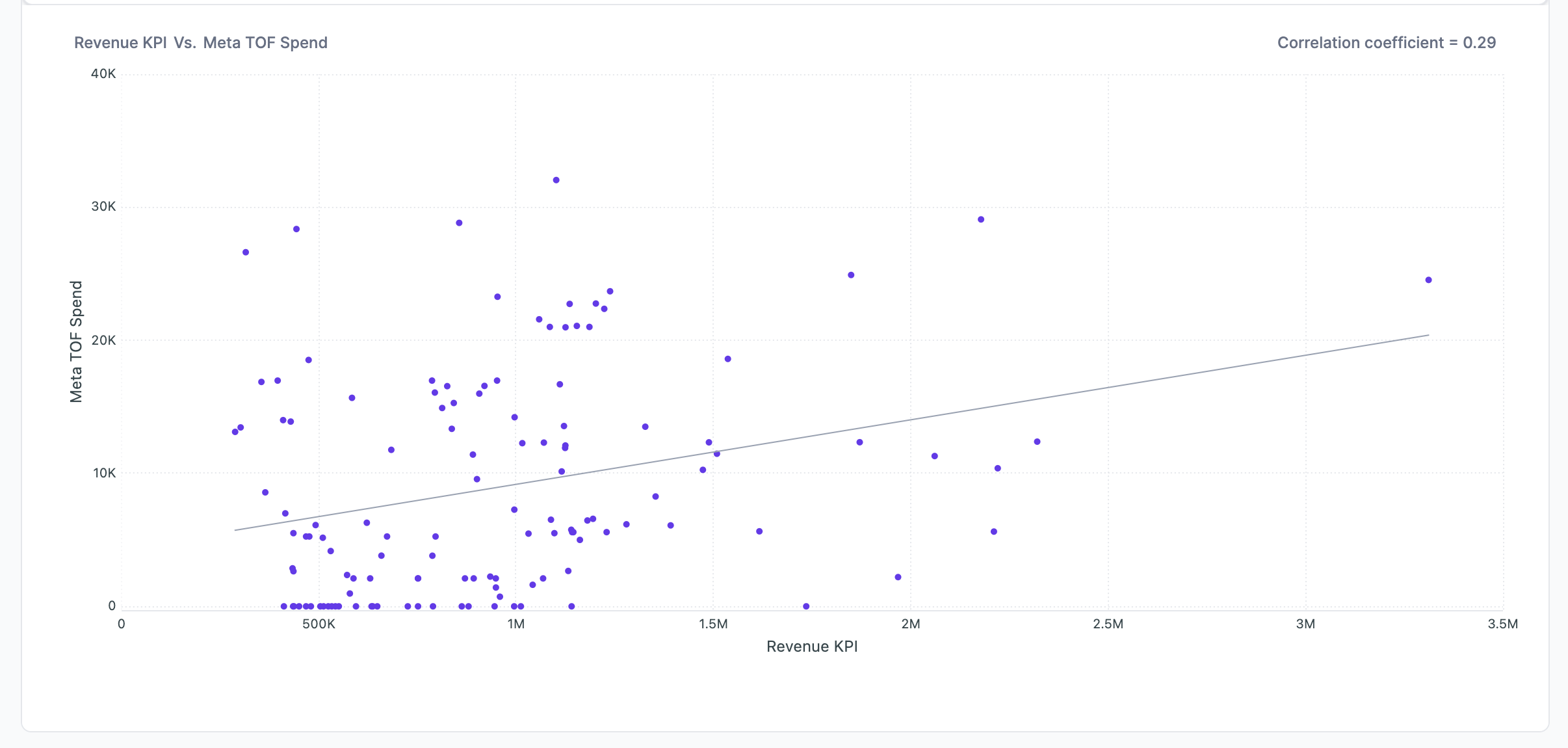
While interpreting a scatter diagram, the given below points should be taken into consideration:
- Dense or Scattered Points: If the plotted points are close to each other, then you can expect a high degree of correlation between the two variables. However, if the plotted points are widely scattered, then you can expect a poor correlation between the variables.
- Trend or No Trend: If the points plotted on the scatter diagram show any trend either upward or downward, then it can be said that the variables are correlated. However, if the plotted points do not show any trend, then it can be said that the variables are not correlated.
- Upward or Downward Trend: If the plotted points show an upward trend rising from the lower left-hand corner of the graph and going upward to the upper right-hand corner, then the correlation is positive. It means that the two variables move in the same direction. However, if the plotted points show a downward trend from the upper left-hand corner of the graph to the lower right-hand corner, then the correlation is negative. It means that the two variables move in the opposite direction.
- Perfect Correlation: If the points plotted on the scatter diagram lie on a straight line and have a positive slope, then it can be said that the correlation is perfect and positive. However, if the points plotted lie on a straight line and have a negative slope, then it can be said that the correlation is perfect and negative.
If most of the points are dense and show a trend, a few outliers may lead to a lower correlation number, but they are well correlated.
Updated 12 months ago